
Journey analytics
Overview
Journey analytics allow you to analyze the performance of your journey.
Sections overview
The „Analytics” section displays the overall results of users' movements throughout the journey, from start to completion.
The "Conversions" section shows the journey's performance in relation to the selected goal.
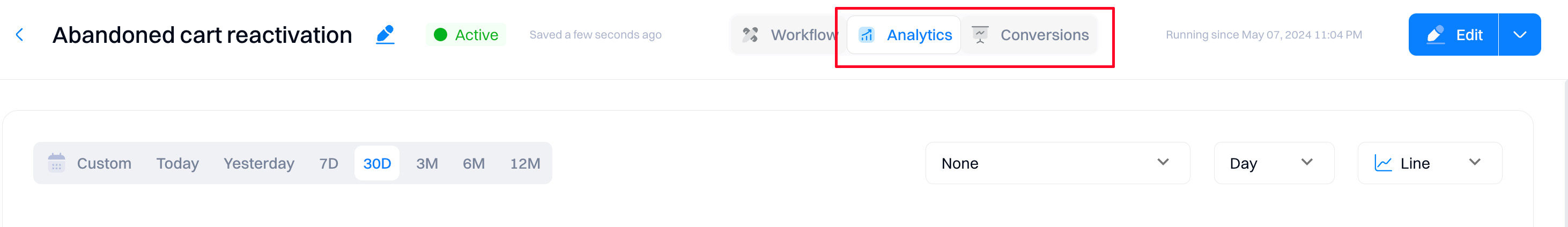
Analytics
The following section explains how to interpret each configuration element.
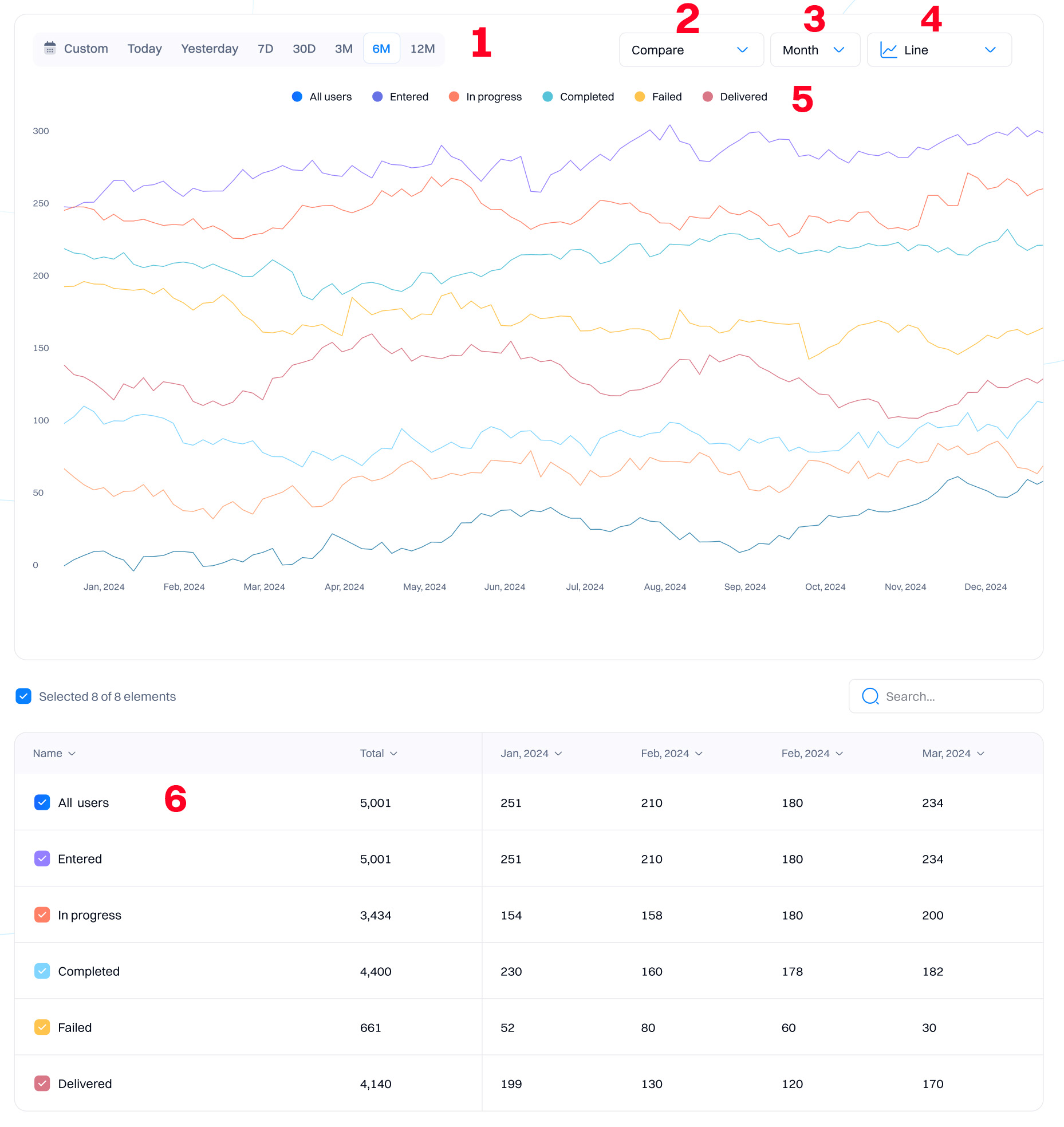
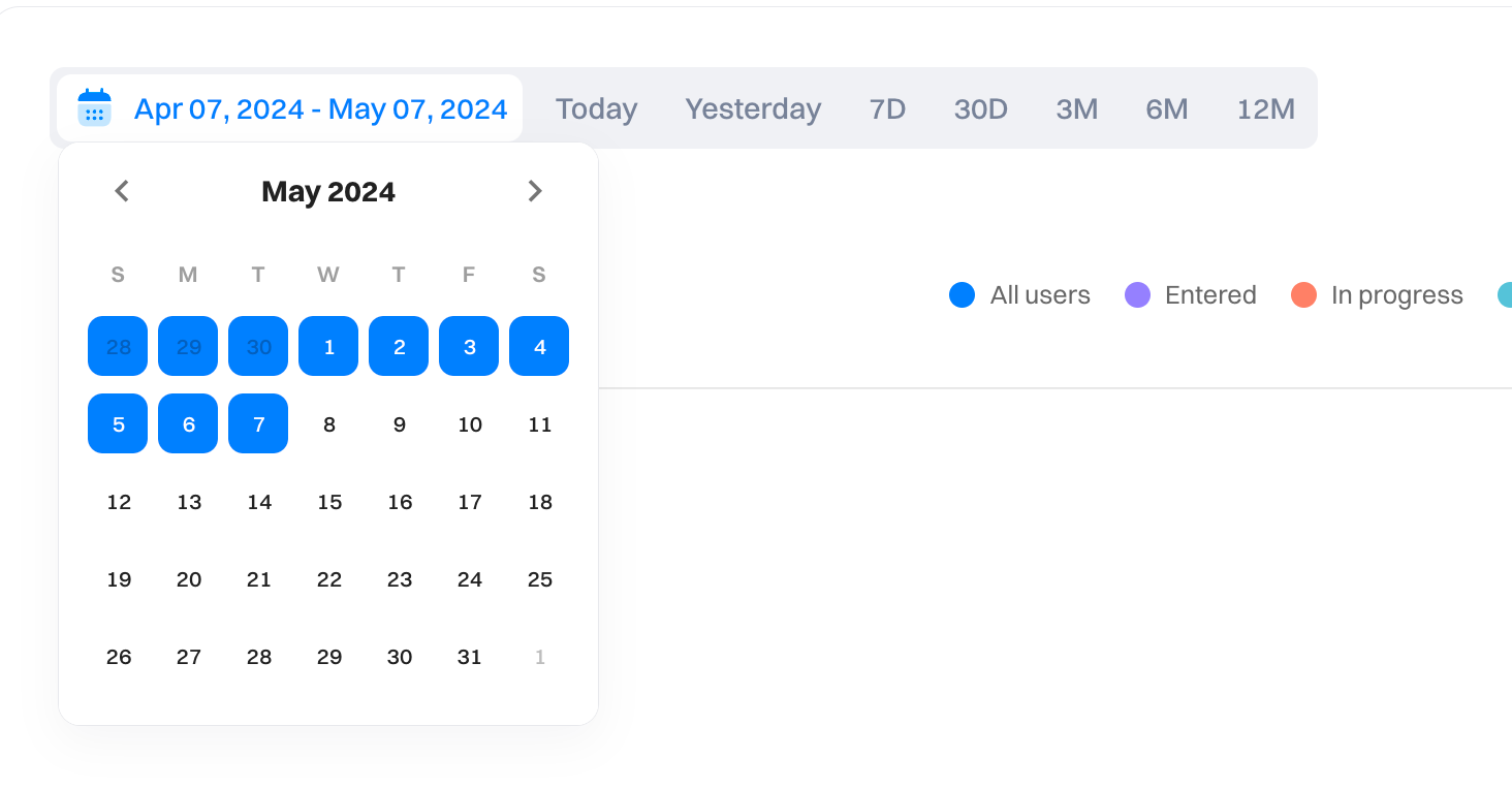
1. Date range
The date range within a journey chart determines the absolute bounds for which journey events you want to include in your graph.
All dates and times in Intempt reflect the project timezone.
| Tab value | Meaning | Description |
|---|---|---|
| Custom | Custom | You can select a specific date range, e.g., May 1 - May 31 |
| Today | Today | Includes the current incomplete day up to the current second. |
| Yesterday | Yesterday | Includes the whole of the previous day from midnight to midnight. |
| 7D | Last 7 days | Last 7 days and the query count from the current incomplete day up to the current second. |
| 30D | Last 30 days | Last 30 days and the query count from the current incomplete day up to the current second. |
| 3M | Last 3 months | Last 3 months and the query count from the current incomplete day up to the current second. |
| 6M | Last 6 months | Last 6 months and the query count from the current incomplete day up to the current second. |
| 12M | Last 12 months | Last 12 months and the query count from the current incomplete day up to the current second. |
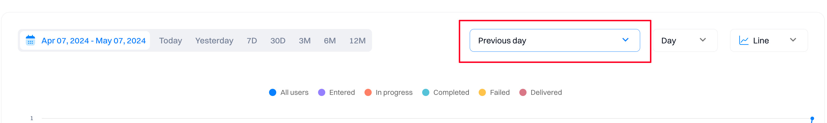
2. Compare
The "Compare" to the previous period option allows you to overlay data from a previous period onto the current period.
You can compare it against the previous day, week, month, quarter, and year. You can also choose a custom time comparison window.
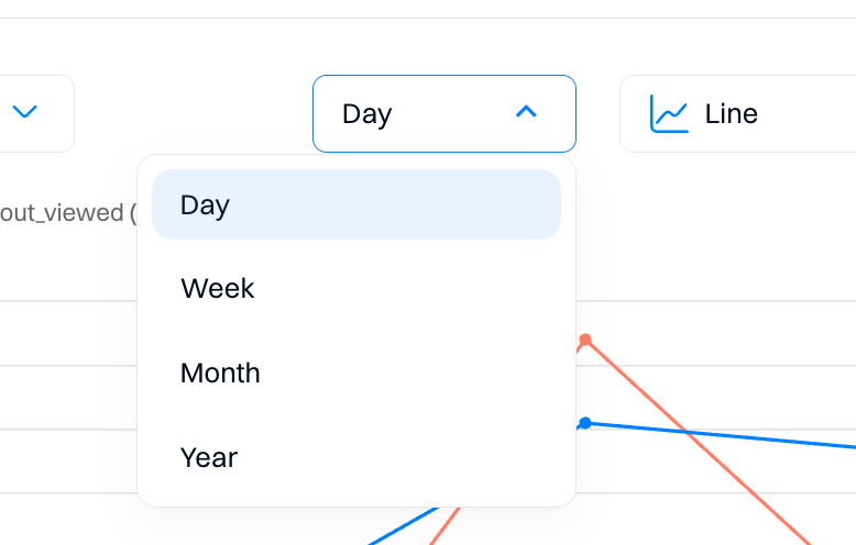
3. Group by
Changing the grouping will alter what Intempt considers a single 'Data point.' For example, when the grouping is set to 'Week,' then each data point on the graph will be one week of events, aggregated using whichever aggregation method you've chosen.
Select a day, week, month, or year as a grouping point.
4. Chart types
Journey analytics have multiple visualizations to help you view the query results in the clearest chart type. By default, reports display the results on the line chart, which helps you understand how data trends over time. However, another chart type might clarify the results—you can get data calculated across the entire period selected in the date picker or on a time-segmented view of the metric (e.g., daily breakdown).
How data is displayed across different charts
| Across the entire time period | Time-segmented |
|---|---|
| Bar chart | Line chart |
| Pie chart | Stacked line chart |
| Doughnut | |
| Metric |
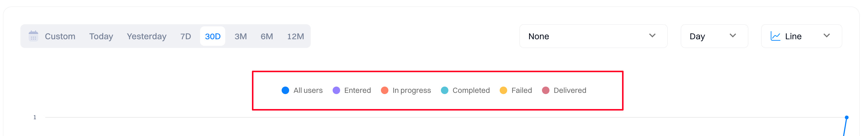
5. Legend
Legend helps users interpret the data presented in the visualization by labeling each data category.
You can disable/enable the display of time series data by clicking on the legend item.
6. Table view
The table displays time-series data for each of the journey metrics.
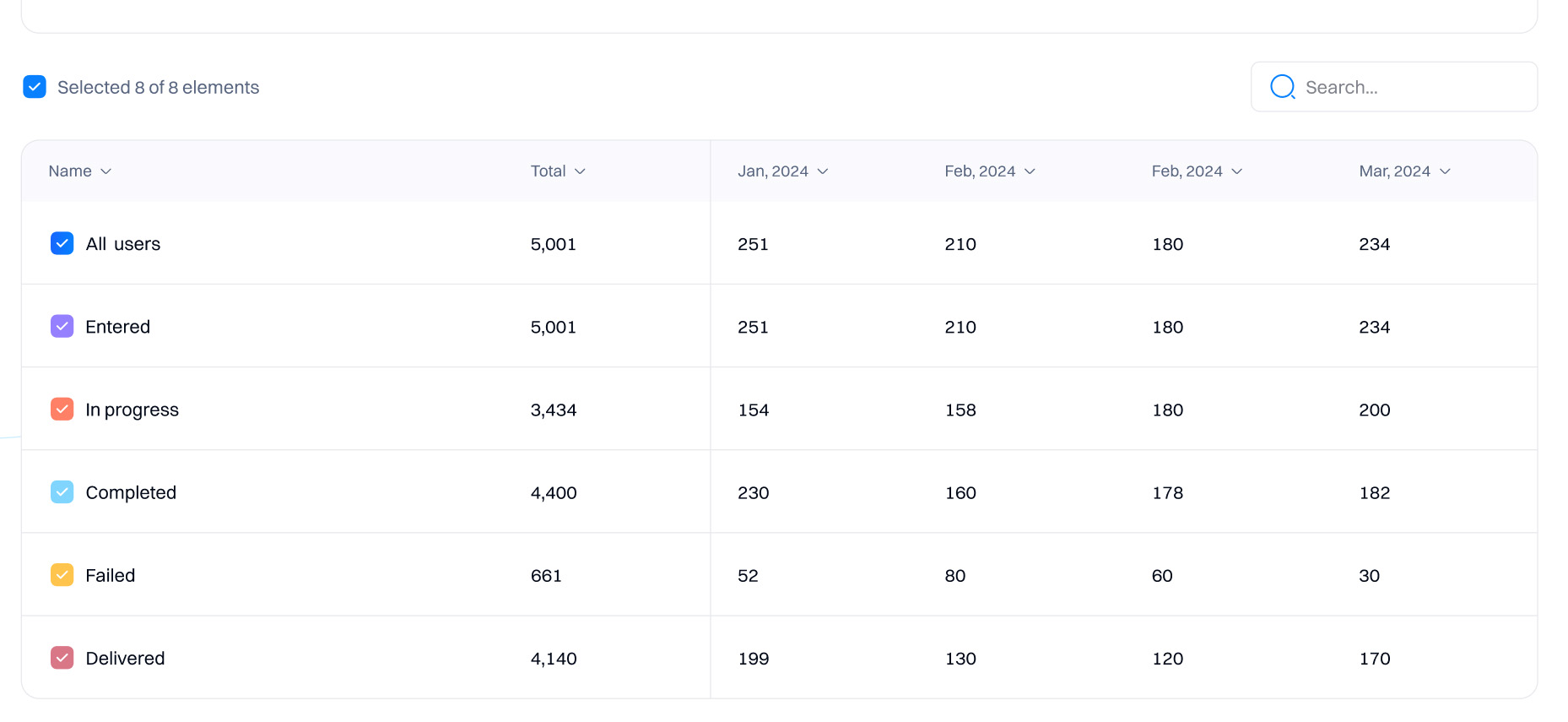
Columns
Each column in the table represents a specific period (monthly in this case), showing the progression and activities of users. This helps you observe trends over time, understand seasonal impacts, or gauge the effectiveness of changes made to the journey.
Good to know
Time-series columns will depend on the "Group by" selected above the chart.
Rows
- All Users. Shows the total number of users who have interacted with the campaign in some capacity.
- Entered. Indicates the number of users who started the journey.
- In Progress. Shows the number of users currently in a journey block but haven't moved to the next step, potentially due to waiting periods or lack of action. Changes in this number across months can reflect different user behaviors or adjustments in the journey's design.
- Completed. Reflects the number of users who completed or exited the journey. Variations across months can indicate how alterations in journey design or external factors influence completion rates.
- Failed. Indicates instances where a journey action failed (e.g., an email not being sent successfully). Useful for identifying technical issues or poorly performing actions within the journey.
- Delivered. Refers to successful deliveries of communications, like emails or notifications, as part of the journey. Increases in deliveries can correlate with higher completion rates if the communications effectively prompt actions.
Interpreting the data
By analyzing these metrics, you can identify what's working well in your campaigns and what might need adjustment to improve user progression and completion rates.
- Stability and change. The consistency in "Entered" users versus the variability in "In Progress" and "Completed" suggests adjustments or user responses are affecting journey progress and completion rates.
- Troubleshooting. The "Failed" row can help identify where your journey is going wrong, potentially impacting its effectiveness.
- Engagement insights. "Delivered" helps gauge the reach of your communications, integral to understanding the engagement level.
Conversions
The "Conversions" section shows the performance of your journey based on the selected goal (e.g., "Placed and order," "Started a subscription").
Good to know
This section will only be visible if you selected a goal before starting a journey.
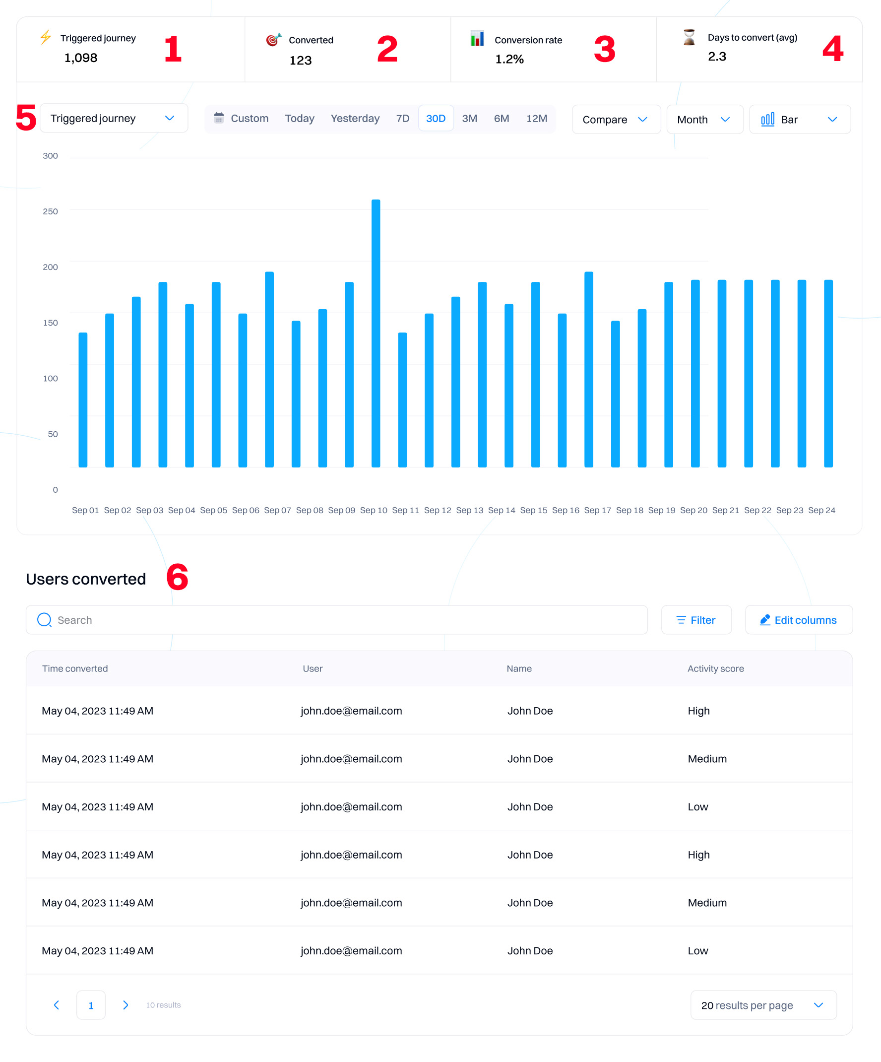
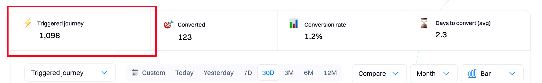
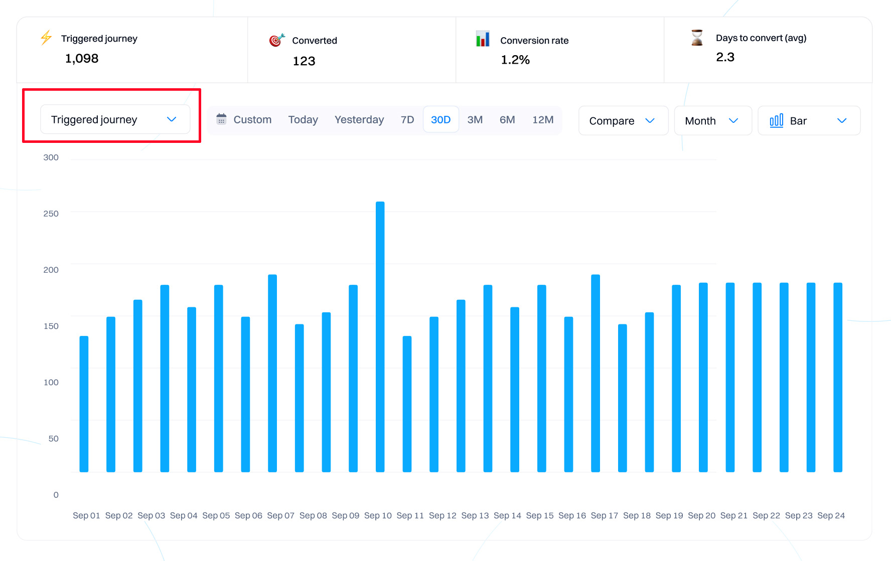
1. Triggered journey
It shows the total number of users who have triggered the journey. This measures the initial engagement level, indicating how many users have started the journey.
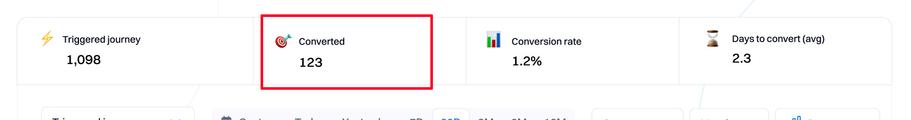
2. Converted
Indicates the total number of users who have completed the conversion event set for this journey (e.g., starting a subscription). It directly measures the effectiveness of the journey in driving users towards the desired action.
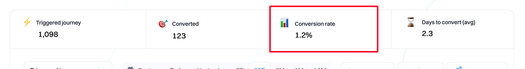
3. Conversion rate
The percentage of users who converted out of those who triggered the journey. It helps evaluate the effectiveness of the journey in converting users. A higher rate suggests a more successful journey.
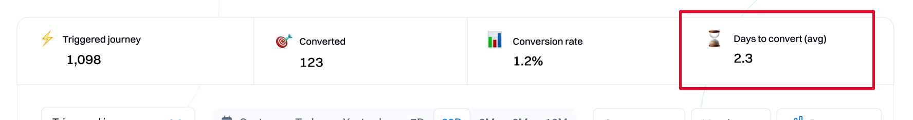
4. Days to convert (Avg)
Shows the average number of days it took for users to convert after triggering the journey. This provides insights into the timing of interactions within the journey, helping to optimize the length and timing of critical actions.
5. View switcher
You can select different metrics to be displayed in the chart as per 1-4: Triggered, Converted, Conversion rate, and Days to convert.
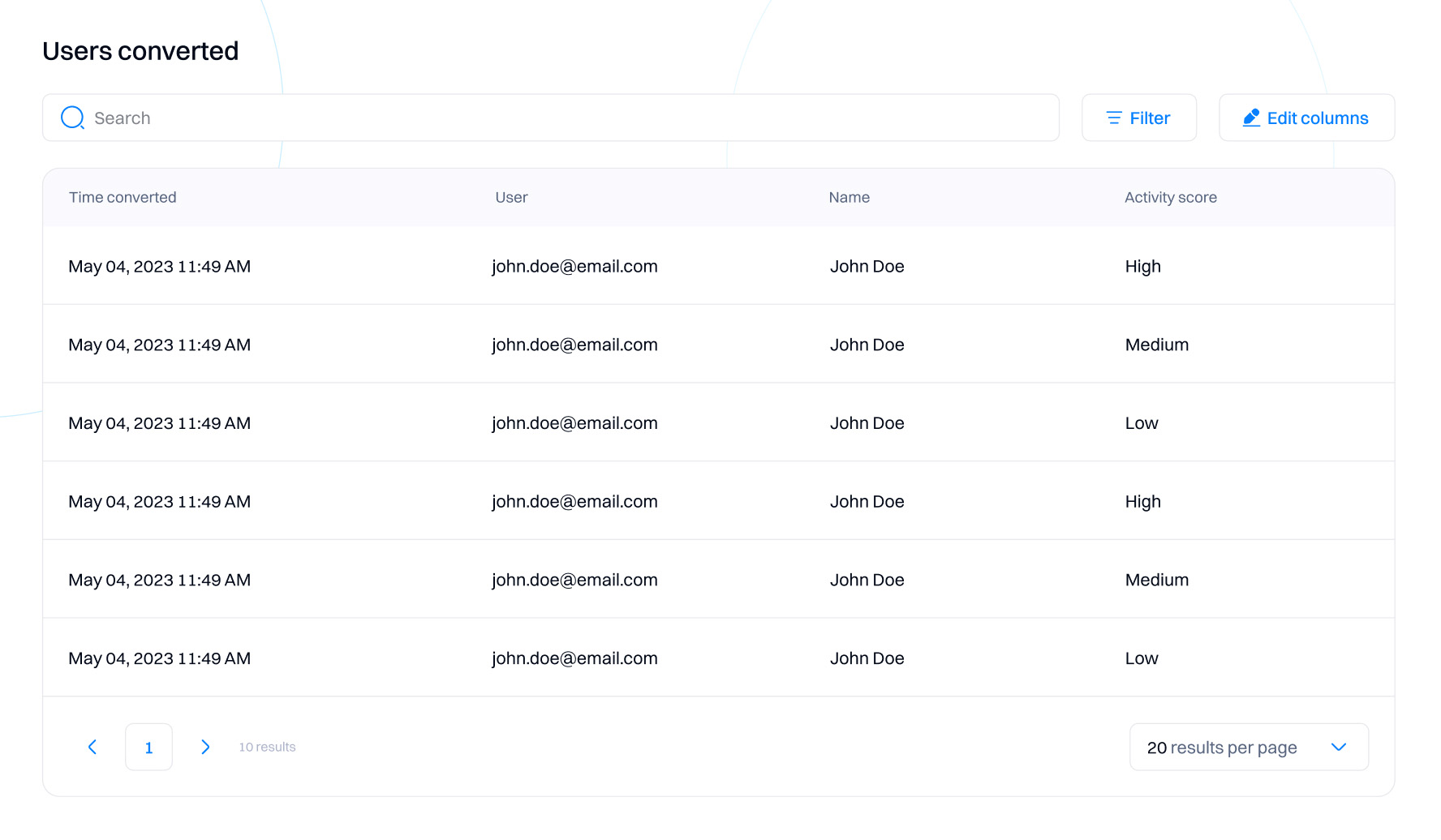
6. Users Converted
Lists all converted users in a table. You can add filters to narrow the list and adjust columns to display a custom view of user data (e.g., industry location, score, etc.)
How to interpret the data
- Engagement and effectiveness. Use 'Triggered journey' and 'Converted' to evaluate initial engagement and the effectiveness in achieving conversions.
- Optimize timing. Utilize 'Days to Convert' to adjust the journey length or timing of actions to enhance conversion rates.
- Visual trends. Analyze the bar chart to understand engagement trends and decide on journey modifications.
- Detailed analysis. Explore the 'Users converted' section for insights into individual user paths, helping to refine existing experiences and get ideas for new journeys.
Updated 9 months ago