
Creating a report
Getting started
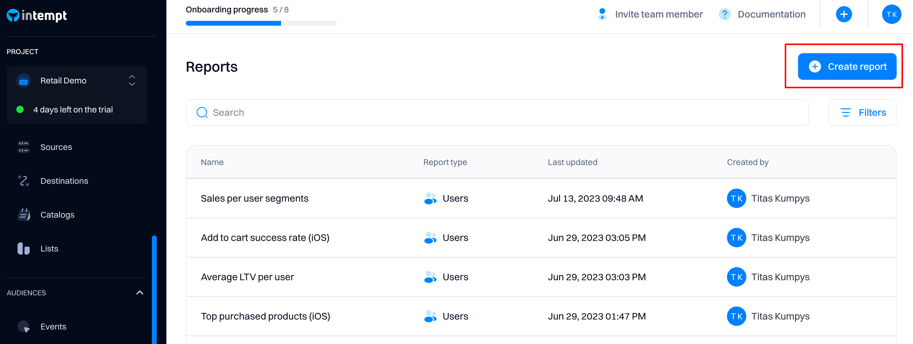
Go to Reports and select "Create report".
Select the level of analysis
As a first step, you need to decide what level you want to create a report.
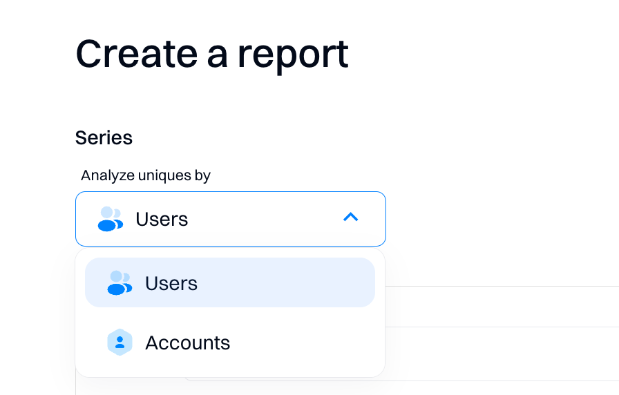
User-based reports
It allows you to analyze the data based on user-level behaviors.
Examples:
- How is my WAU changing over time? (unique users)
- How often are my users getting value? (frequency analysis)
- What is the distribution of my users across regions/devices, etc? (attribute breakdown)
Account-based reports
If you select “Analyze Uniques by Account,” you can visualize trends and compositions aggregated based on user groups like companies.
Good to know
An Account is an object that a set of users might belong to - such as a Company of customers or a team of users. If you are a B2B company, this will help you understand how your accounts interact with your product rather than just seeing the individual users in those companies.
Examples:
- Analyzing how many distinct accounts were active or fired a certain event
- Tracking how many charts are copied, saved, and modified in your organization and then identifying which ones are interacted with most often
- Discovering how conversion rates change between different types of orders
- Determining how many accounts have converted from free trials to paid accounts
- Tracking how many posts are drafted but never published in your social media platform
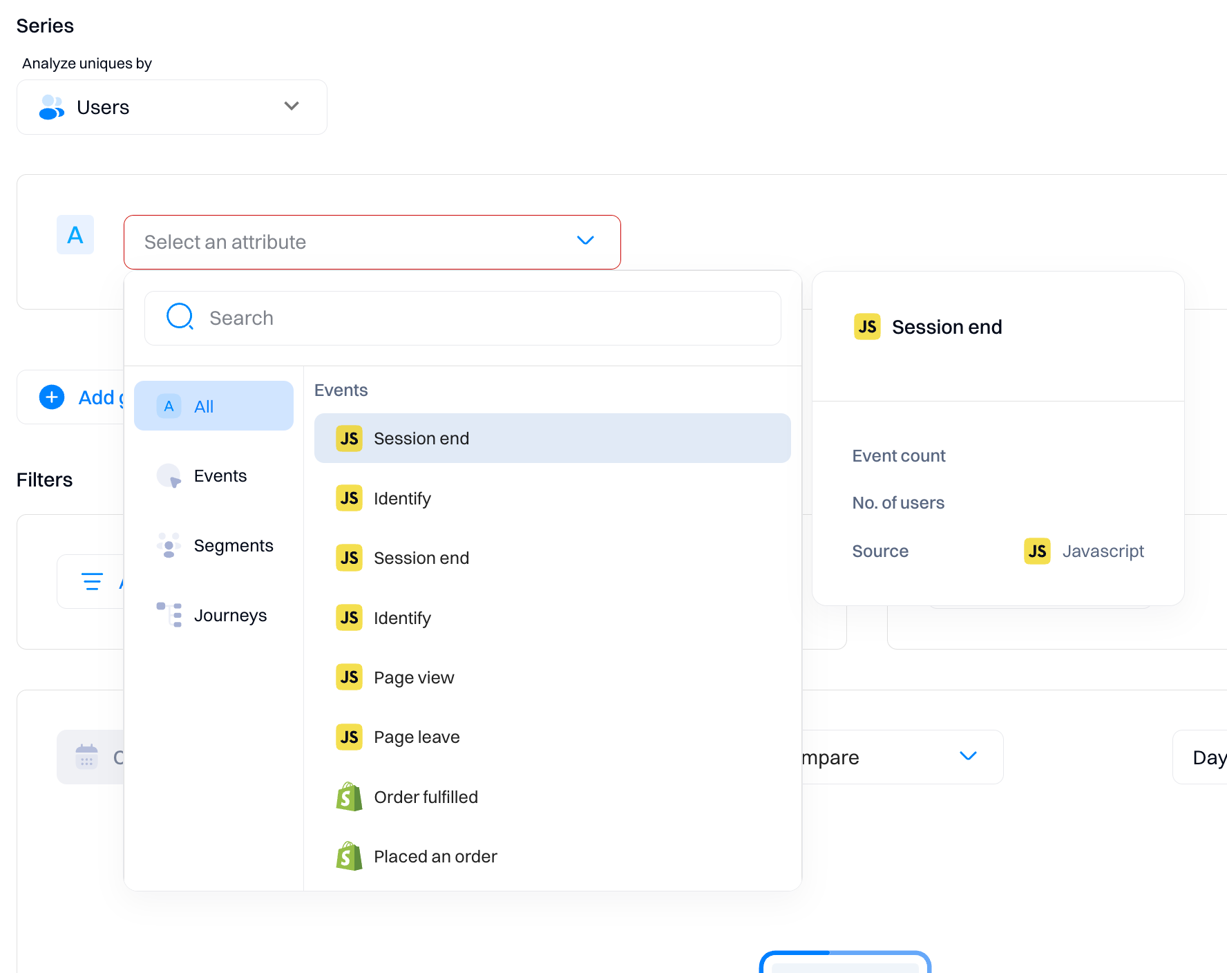
Choose the object to analyze
For each report, you can select these objects to analyze:
| Attribute type | Description |
|---|---|
| Events | Analyze the events that are tracked within your website or application |
| Segments | Analyze user membership trends in specified segments |
| Journeys | Analyze the data on the user entering or exiting the journey |
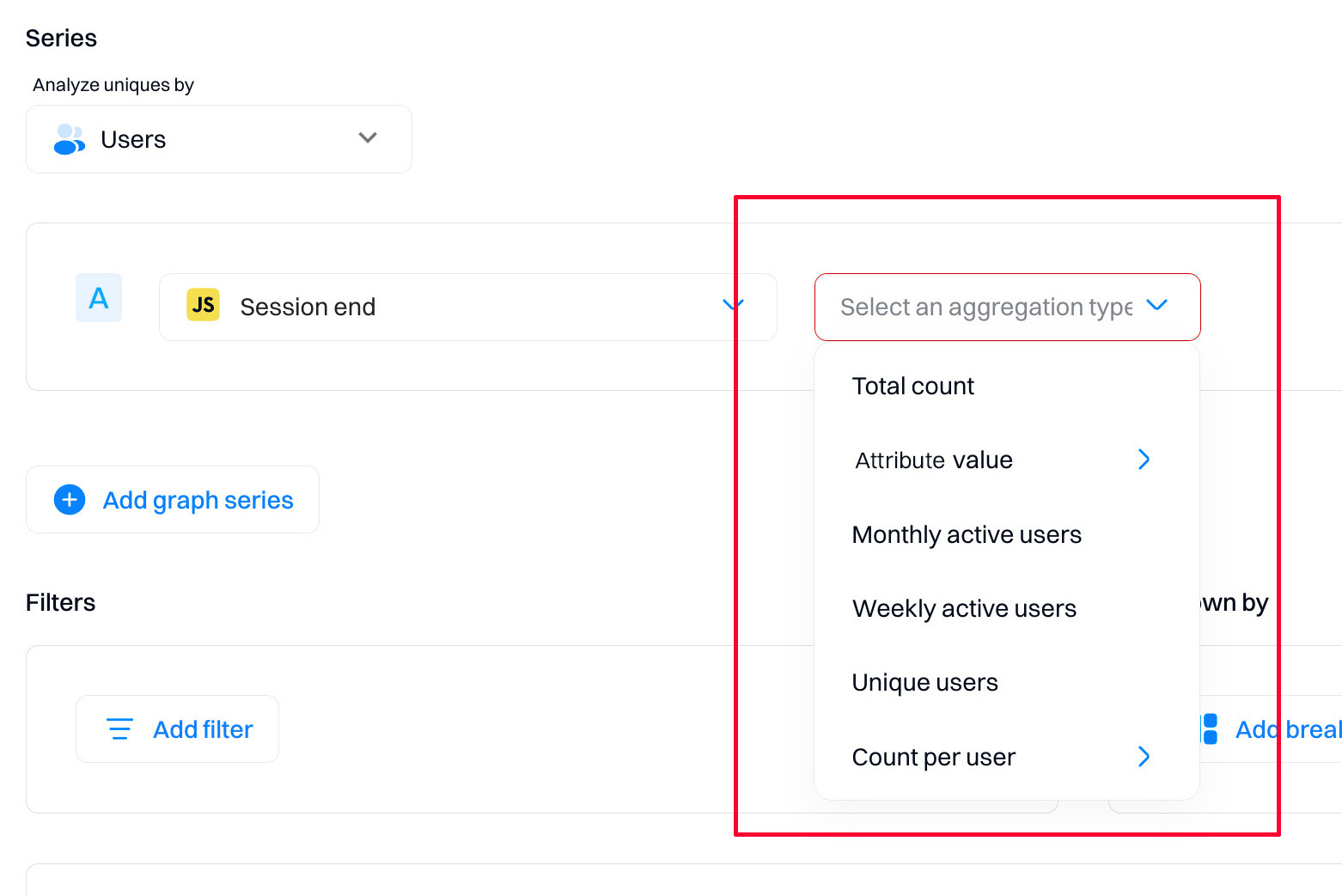
Choose aggregation type
Event aggregation determines the number of events within a certain period.
| Event aggregation | Description |
|---|---|
| Total count | The total number of times this event was performed in a given period |
| Attribute value | Plots an aggregation for a selected event attribute (all users) |
| Unique users | The total number of unique users who have performed this event in a given period. Example: If the same user performs an event twice, this will only count as 1 |
| Monthly active users (MAU) | The total number of unique users who have performed this event within the last 30 days. This is a rolling count for each period, counting the previous 30 days |
| Weekly active users (WAU) | The total number of unique users who have performed this event within the last 7 days. This is a rolling count for each period, counting the previous 7 days |
| Unique accounts | The total number of unique accounts that performed these events within a period. |
| Count per users | The number of events performed per user. Plots an average aggregation for a selected event attribute per user |
Good to know
Aggregations are only supported when selecting events as graph series. They are not supported for segments and journeys objects.
Attribute value aggregation
Attribute aggregation allows you to combine and plot the values of an event attribute.
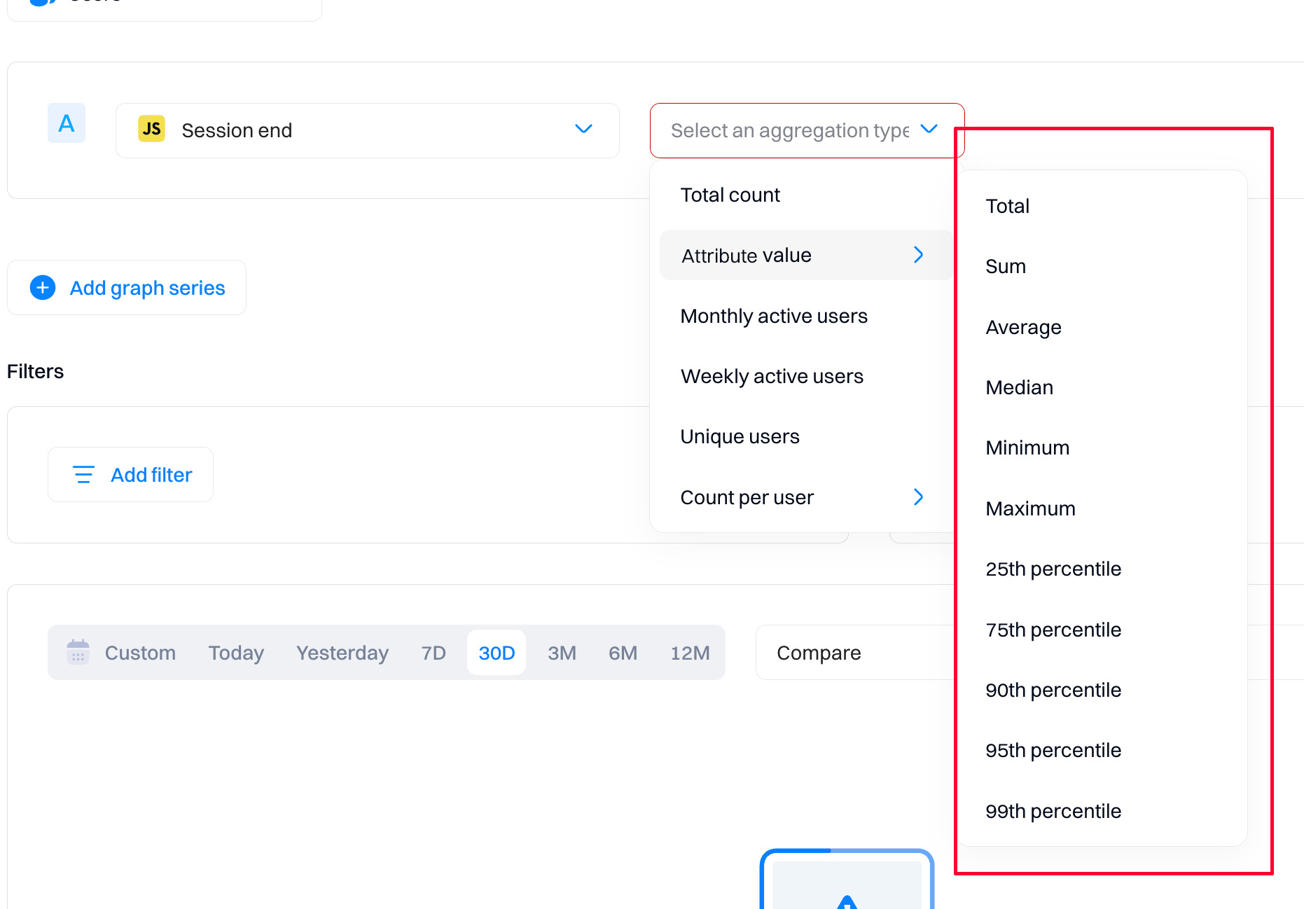
| Function | Events calculation | |
|---|---|---|
| Total | The total count of all instances of the attribute value. Example: What's the total number of times the user started a session? | |
| Sum | The total of a numeric attribute value across all instances of [event]. Example: What's the total number of minutes of videos watched? | |
| Average | Average of a numeric attribute value across all instances of [event]. Example: What's the average number of minutes per video watched? | |
| Median | The median of a numeric attribute value across all instances of [event]. Example: What's the median number of minutes per video watched? | |
| Minimum | Minimum of a numeric attribute value across all instances of [event]. Example: What's the minimum number of minutes per video watched? | |
| Maximum | Maximum of a numeric attribute value across all instances of [event]. Example: What's the maximum number of minutes per video watched? | |
| Percentiles (25/75/90/99) | The 25/75/90/99th percentile of a numeric attribute value across all instances of [event]. Example: What's the 25th percentile number of minutes |
Good to know
Currently, attribute aggregation only works on attributes with numerical (integer) values.
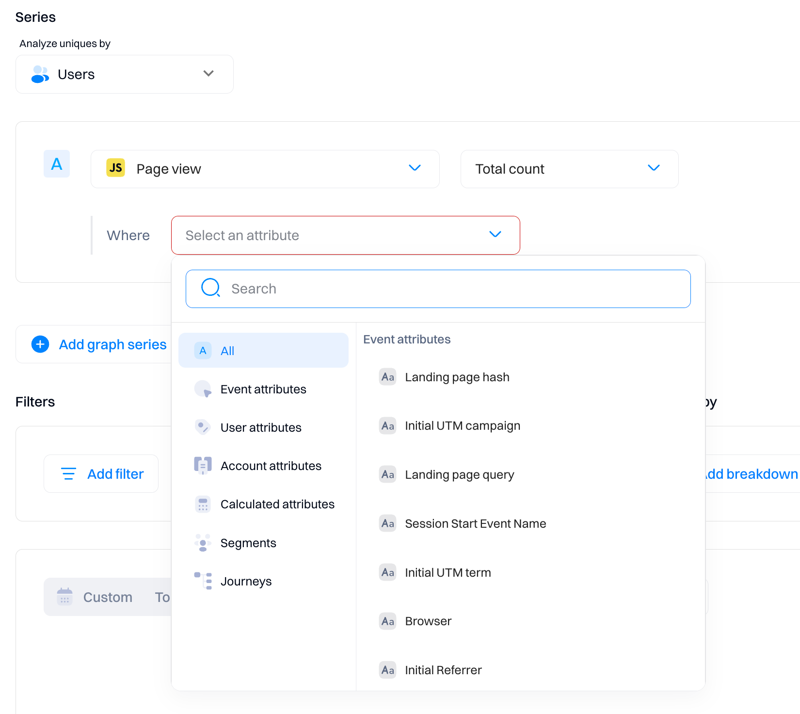
Choose an inline filter
Inline filters allow you to plot data for only a subset of events based on their attributes. For example, you might only want to see pageview events for a specific URL or only view events from users within specific countries, which can all be done using filters.
Click the icon next to the event name to add a filter to an event series.
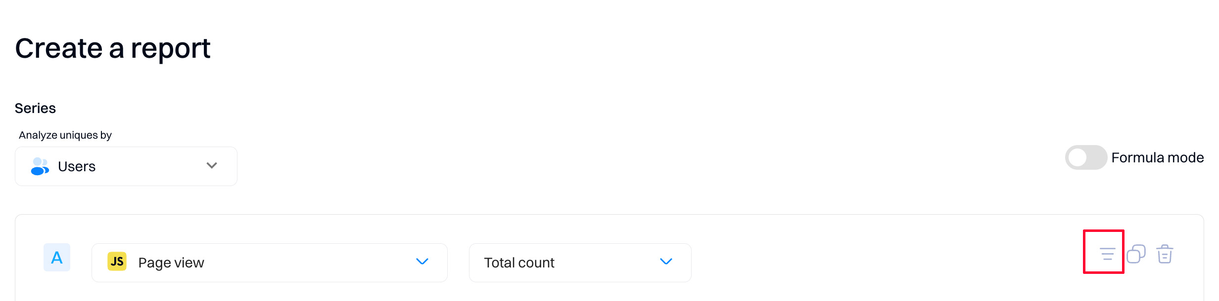
This will bring up a dropdown where you can search through all events and user attributes and choose the one you want to filter based on.
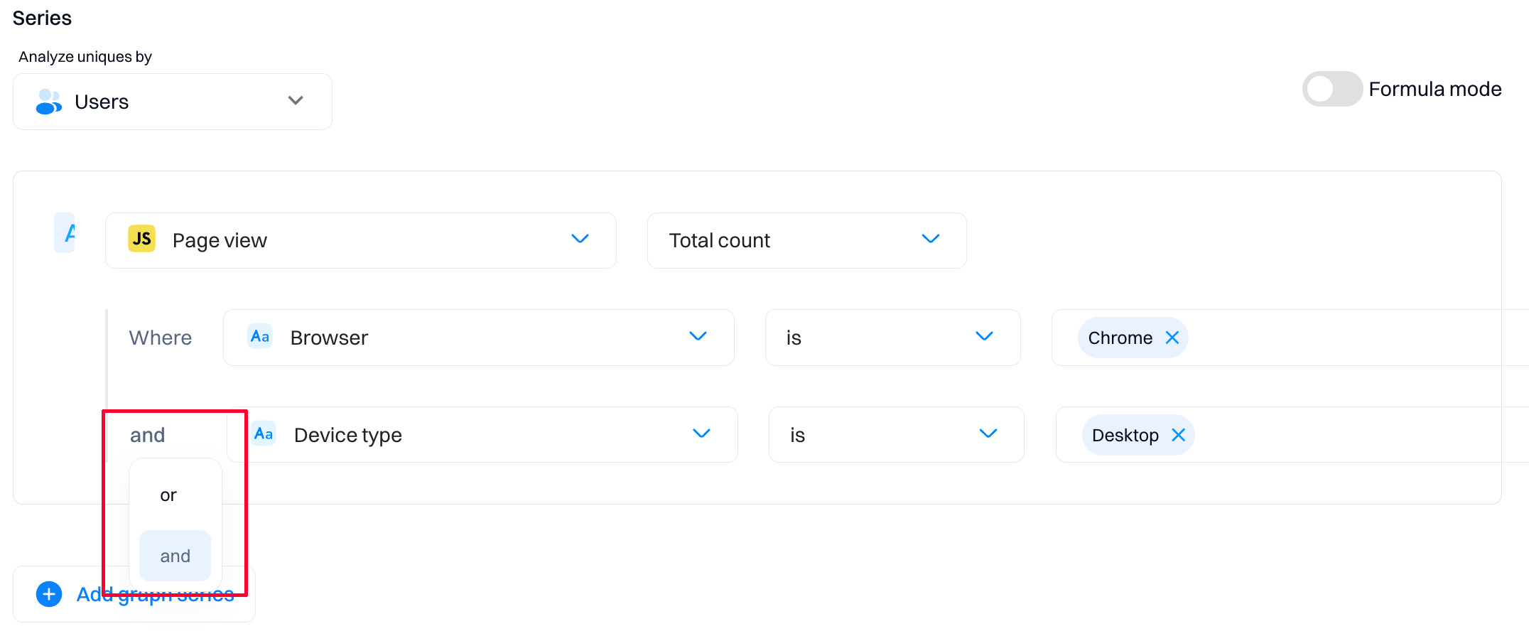
By clicking on and/or beside the filters, you can select whether you would like your query to match any or all of them.
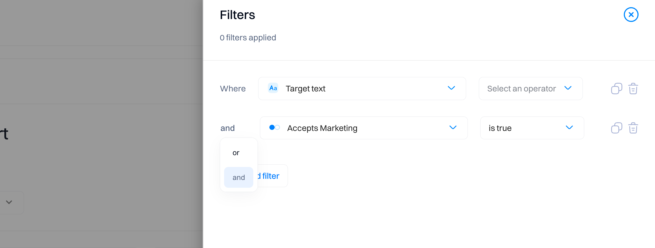
Choose a global filter
Global filters allow you to apply filters to all series within a report. The main difference between the inline filters is that global filters work not for a specific event but all events within the report.
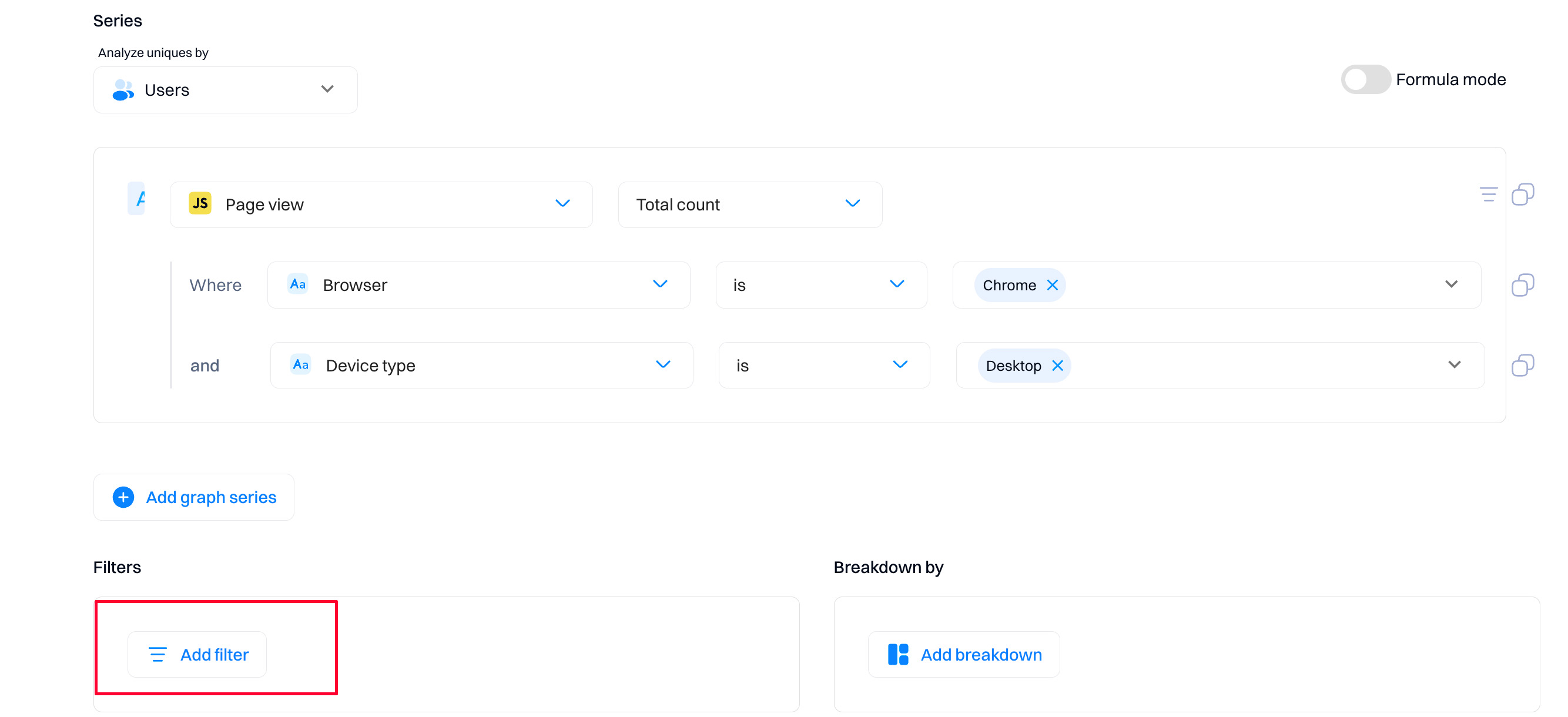
Global filters can be combined in the following two ways:
AND - Events have to match every filter within the group
OR - Events only have to match a single filter within the group
Good to know
One thing to note about global filters: since they apply to all events within an report, and these events may not share all their attributes, global filters allow you to use any attribute that has been seen in at least one of your events. If you happen to create a filter that references a attribute that not all events have, events that do not contain this attribute will automatically fail the check and will be excluded by the filter.
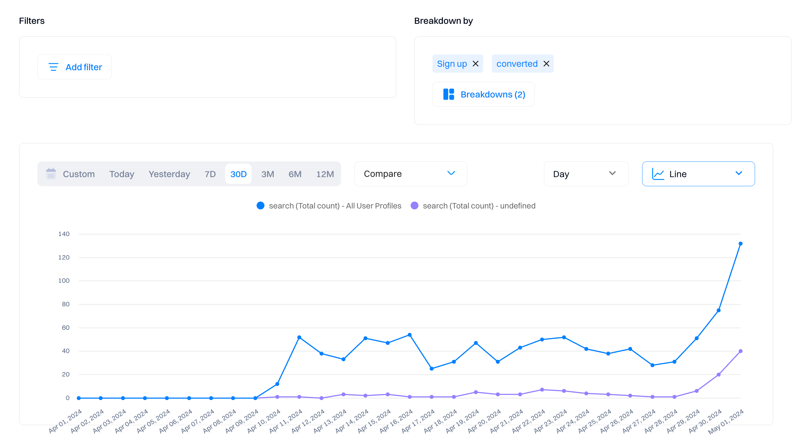
Choose a breakdown
Breakdowns allow you to split up your report's graph by the values of a certain attribute or segment. This is very useful when analyzing a trend and determining the cause of a change in one of your metrics.
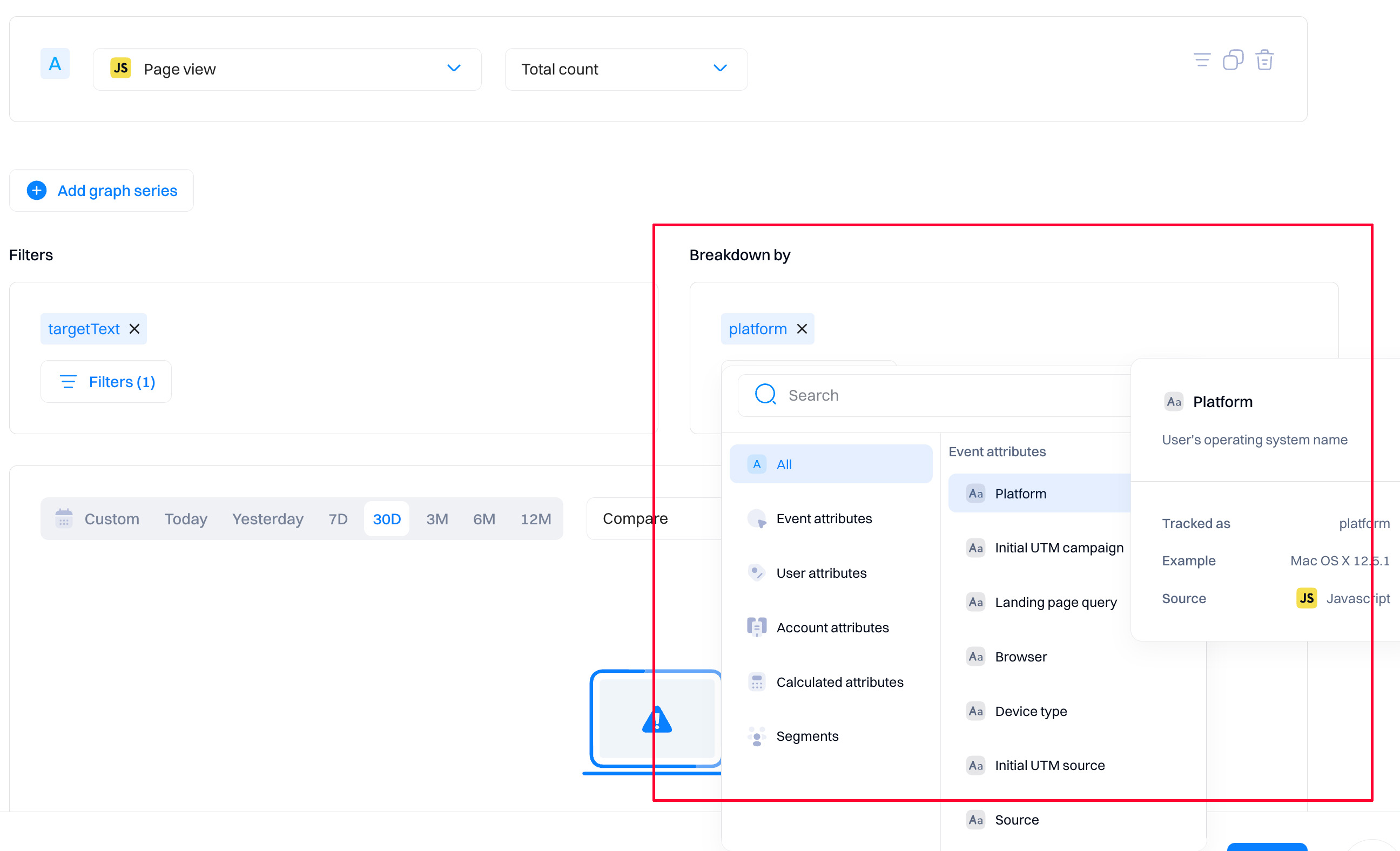
Once you've selected an attribute to break down, your graph should be split into multiple lines, each corresponding to a distinct attribute value.
Good to know
Currently, you're only able to breakdown an report by a single attribute.
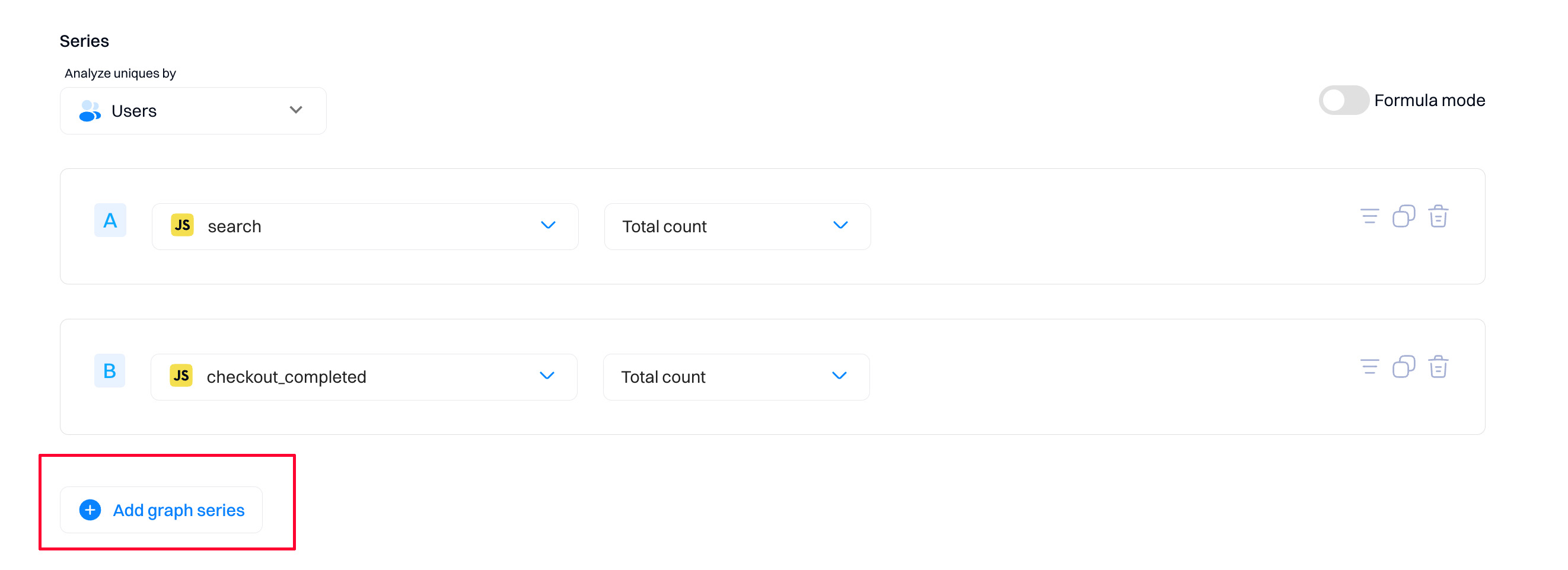
Add multiple series
Reports support adding multiple series onto the same insight, each tracking a separate event. This is useful when comparing the usages of different events across the same period.
To add a second series to a trend, click the 'Add graph series' button and select the event you would like to plot from the dropdown.
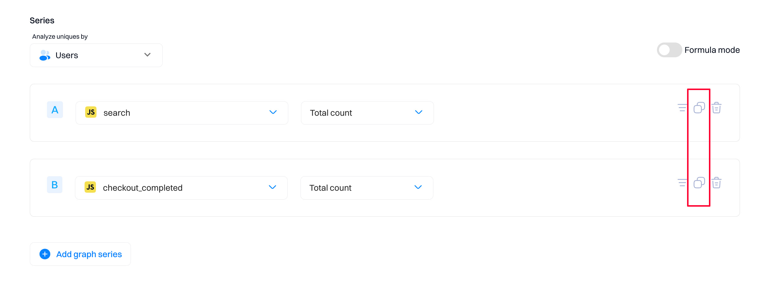
Another option is clicking the duplicate icon, which duplicates that series and its inline filters. This is helpful when comparing the same event with slightly different filters.
Formulas
Formulas are custom mathematical expressions that you can use to compare and combine the values of multiple series.
To add a formula, enable toggle "Formula mode," and within the input box, type out the expression you want to evaluate.
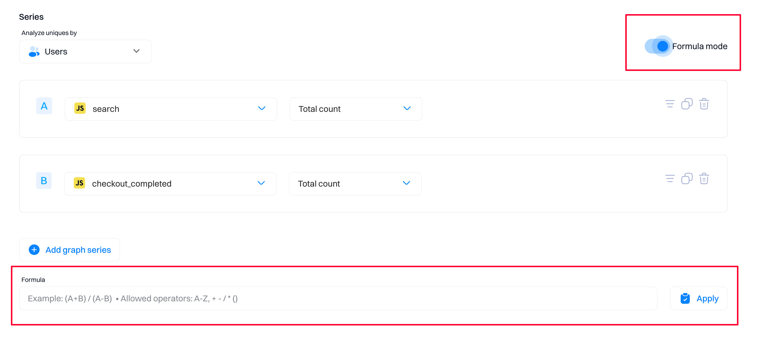
This expression can contain any number of basic mathematical operators (+, -, *, /) along with variables (A, B, C, ...) corresponding to the series with that letter.
For example, if you have two series A and B, then the formula A / B will plot the value of series A divided by the value of series B at each point in time.
You can also use numbers as constants in a formula. Multiply a ratio by 100 to display as a percentage, for example. Divide an attribute value tracked in seconds by 3,600 to display the value in hours. You can rename a formula by selecting Rename in the formula overflow menu.
Good to know
When using a formula, only one series will be displayed on the chart, which will show the output of the formula at each point in time.
Analyzing graphs
Go to Data visualization for a complete guide on understanding the charts and tables.
Updated 9 months ago