
Data visualization
The report visualization options allow you to choose how the data is displayed.
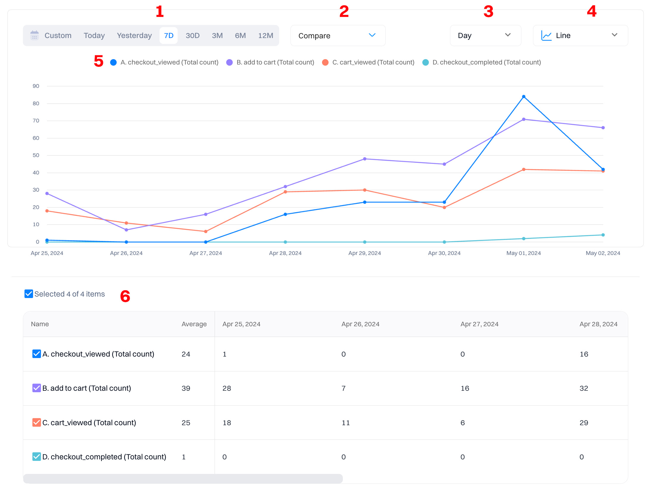
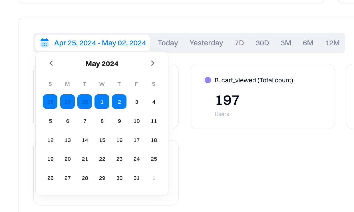
1. Date range
The date range within a report determines the absolute bounds for which events you want to include in your graph.
All dates and times in Intempt reflect the project timezone. The default on most reports is “Last 30 days” (displayed as "30D"), but there are a variety of pre-set options and the option to select a custom date range.
| Tab value | Meaning | Description |
|---|---|---|
| Custom | Custom | You can select a specific date range, e.g., May 1 - May 31 |
| Today | Today | Includes the current incomplete day up to the current second. |
| Yesterday | Yesterday | Includes the whole of the previous day from midnight to midnight. |
| 7D | Last 7 days | Last 7 days and the query count from the current incomplete day up to the current second. |
| 30D | Last 30 days | Last 30 days and the query count from the current incomplete day up to the current second. |
| 3M | Last 3 months | Last 3 months and the query count from the current incomplete day up to the current second. |
| 6M | Last 6 months | Last 6 months and the query count from the current incomplete day up to the current second. |
| 12M | Last 12 months | Last 12 months and the query count from the current incomplete day up to the current second. |
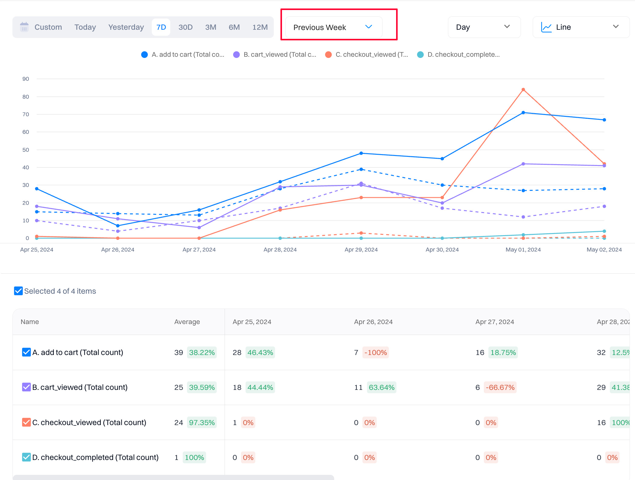
2. Compare
The "Compare" to the previous period option allows you to overlay data from a previous period onto the current period.
You can compare it against the previous day, week, month, quarter, and year. You can also choose a custom time comparison window.
The green/red chips in the chart table show the change in % from the original to the comparison period.
Good to know
With "Compare" you can also compare traffic from a specific campaign period or event from one year to the next or compare the success of that campaign to your normal traffic.
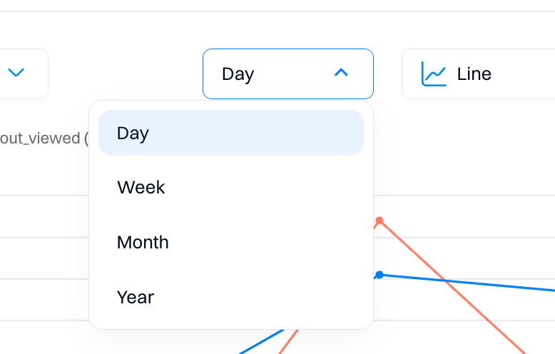
3. Group by
Changing the grouping will alter what Intempt considers a single 'Data point.' For example, when the grouping is set to 'Week,' then each data point on the graph will be one week of events, aggregated using whichever aggregation method you've chosen.
Select a day, week, month, or year as a grouping point.
4. Chart types
Reports have multiple visualizations to help you view the query results in the clearest chart type. By default, reports display the results on the line chart, which helps you understand how data trends over time. However, another chart type might clarify the results - you can get data calculated across the entire period selected in the date picker or on a time-segmented view of the metric (e.g., daily breakdown).
How data is displayed across different charts
| Across the entire time period | Time-segmented |
|---|---|
| Bar chart | Line chart |
| Pie chart | Stacked line chart |
| Doughnut | |
| Metric |
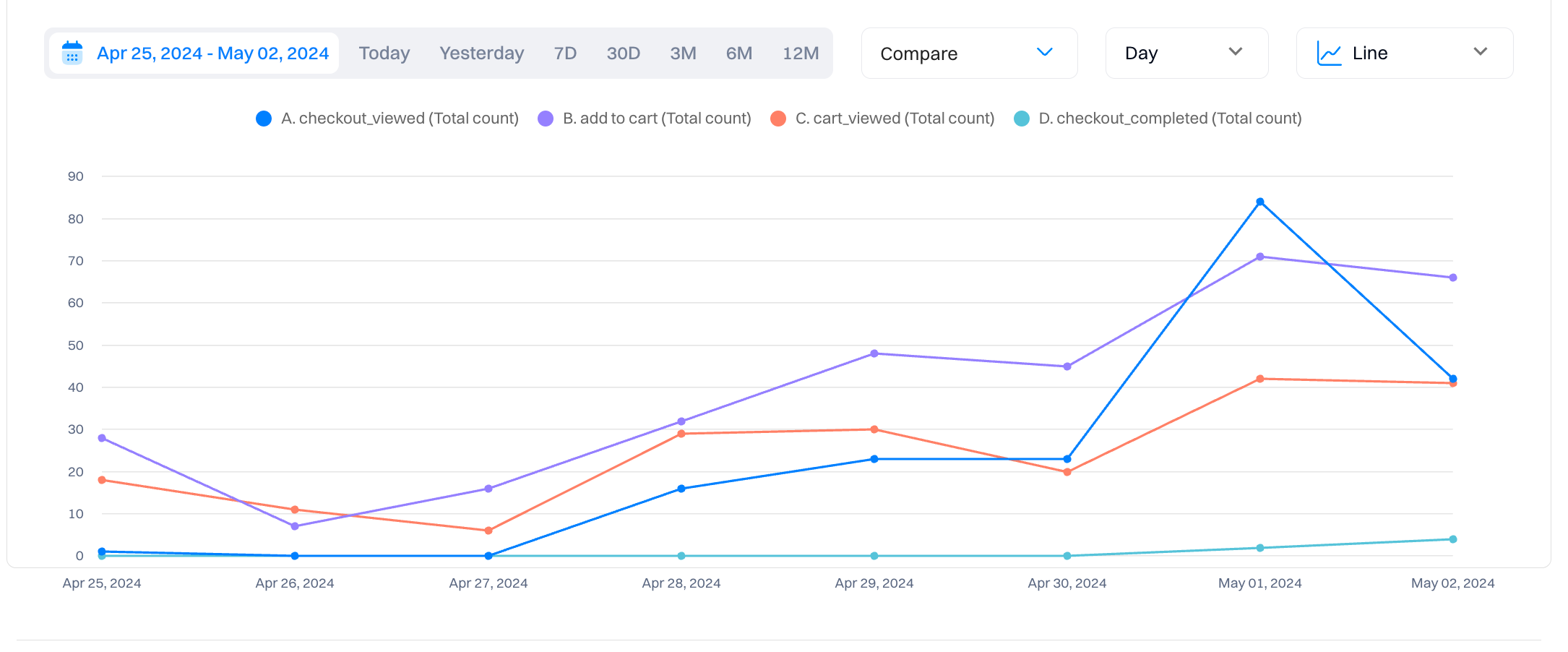
Line
The Line chart plot is the most basic type of trend plot. It is a simple line chart with time on the X-axis and each data point corresponding to your chosen grouping value.
Use cases
- Tracking trends: Use line charts to visualize how data changes over time, making it easy to spot trends or patterns.
- Visualizing continuous data: Line charts display continuous data with time on the X-axis, such as stock prices or temperature readings.
- Comparing the performance of multiple variables: The same chart allows you to compare the performance of multiple variables over time, making it easy to compare.
- Identifying patterns or seasonality: Line charts help identify patterns or seasonality in data, such as recurring trends or cycles.
- Analyzing the relationship between variables: Line charts can show how different variables relate to each other over time, helping to identify correlations or dependencies.
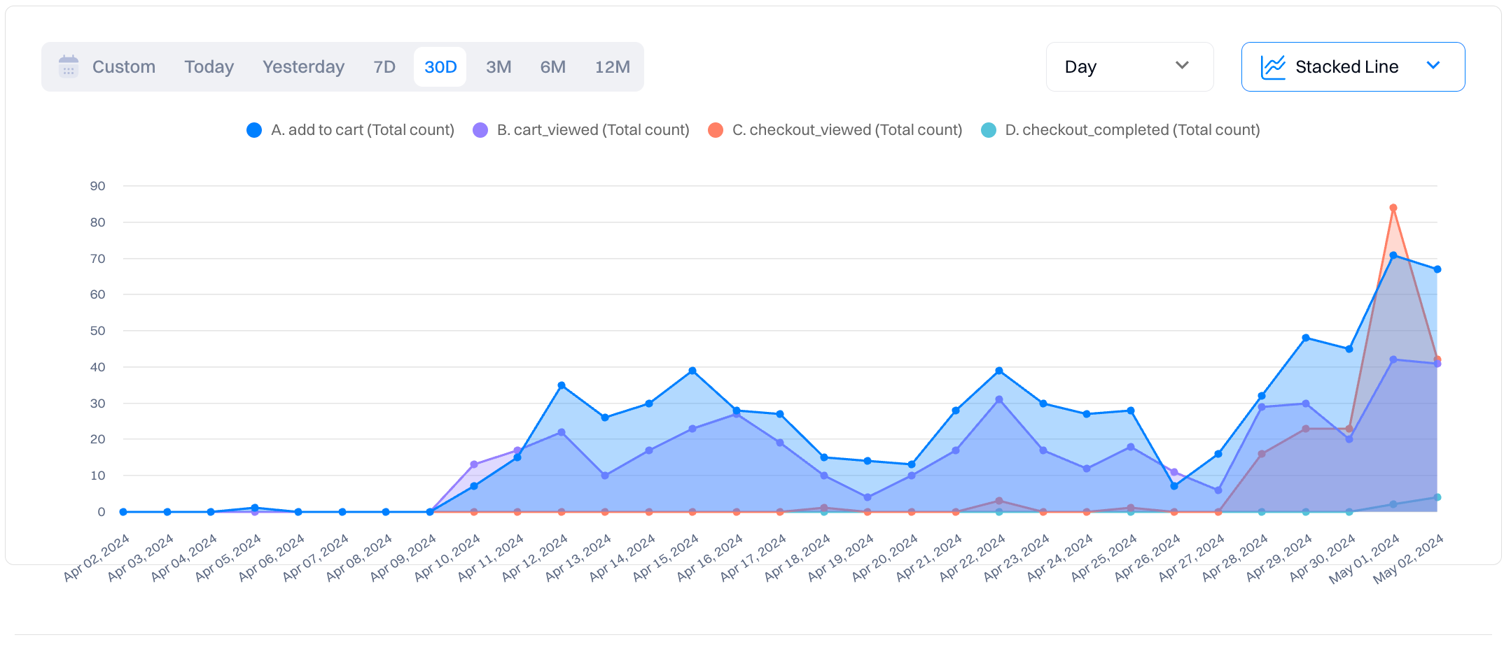
Stacked line
It is the same as a line chart but has a color overlay that indicates the difference between values.
Use cases
- Comparing trends across multiple categories or groups: Stacked line charts are useful for comparing trends across different categories or groups, showing how each contributes to the overall trend.
- Highlighting the composition of data points within each category or group: Stacked line charts visually represent the composition of data points within each category or group, illustrating the contribution of each component.
- Showing cumulative changes over time: Stacked line charts can display cumulative changes over time, demonstrating the overall trend while highlighting individual contributions.
- Visualizing the contribution of each category to the total: Stacked line charts make it easy to see how each category contributes to the total, allowing for quick comparisons and analysis.
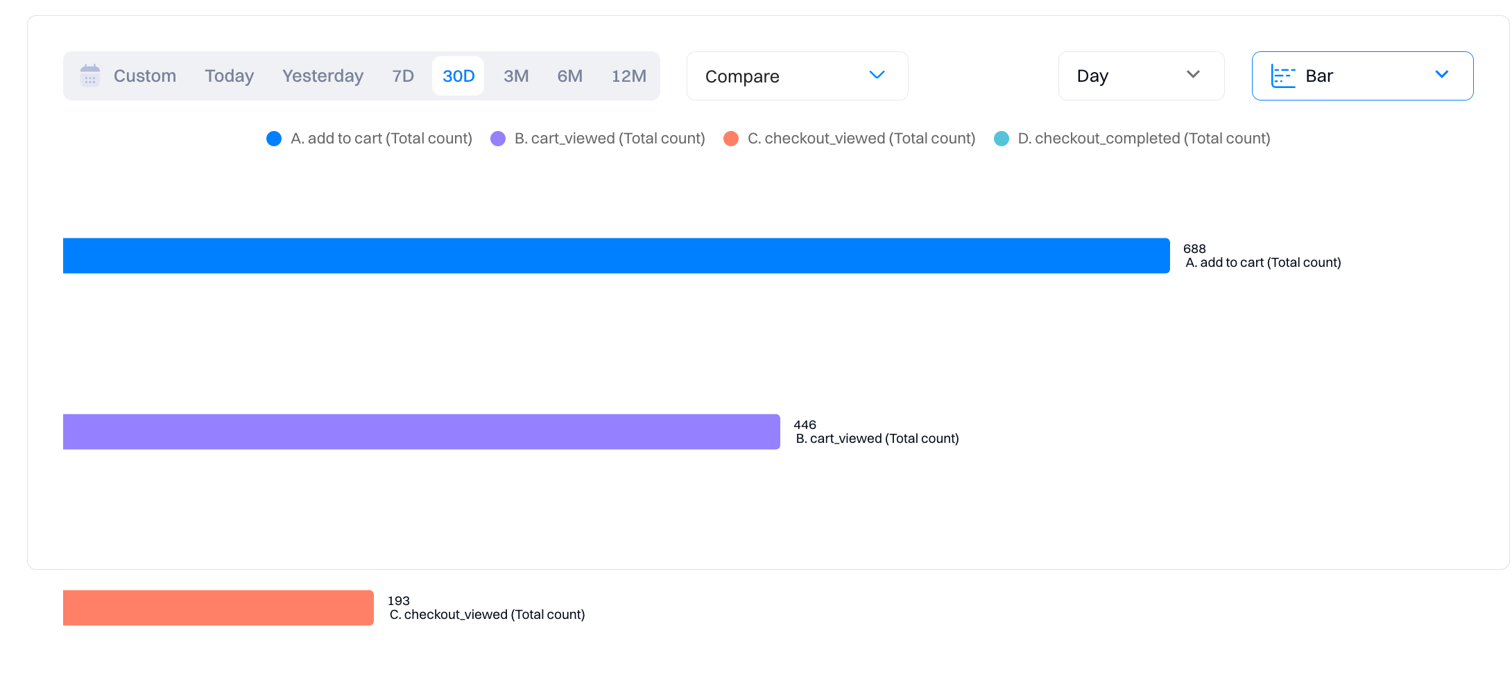
Bar
The bar chart displays a series's total value over the entire date range. This type of plot doesn't have an option for grouping, as it doesn't display data over time.
Use cases
- Comparing total values of different categories or groups: Bar charts effectively compare the total values of different categories or groups, providing a clear visual comparison.
- Visualizing changes in data over discrete intervals: Bar charts can show changes in data over discrete intervals, such as months or quarters, making them suitable for time-based comparisons.
- Ranking categories based on their values: Bar charts allow for easy ranking of categories based on their values, helping to identify the highest or lowest performing categories.
- Identifying outliers or anomalies in data: Bar charts make it easy to spot outliers or anomalies, as they stand out from the rest of the bars.
Good to know
Try using a breakdown in combination with this chart type to see a list of the top atribute values.
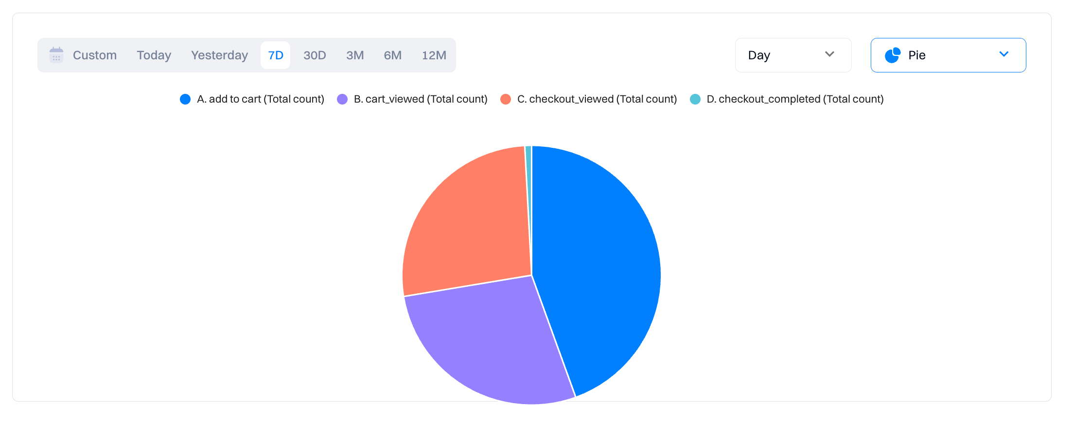
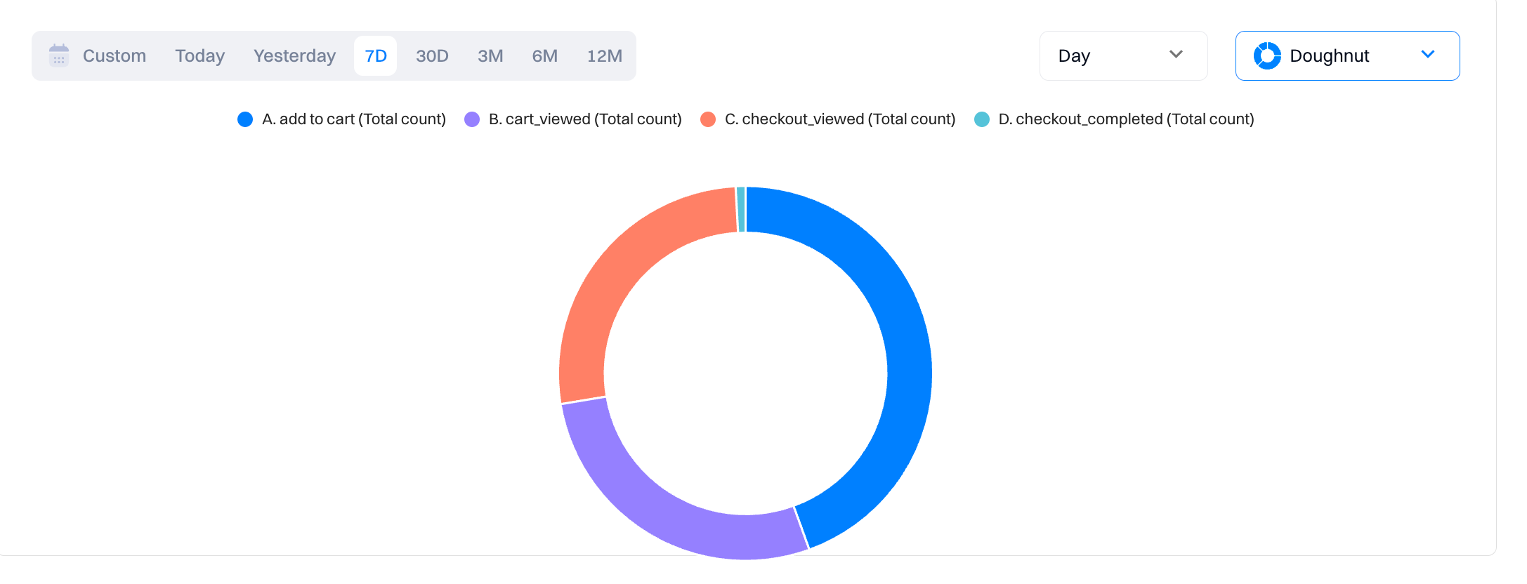
Pie & dougnut
The pie and doughnut charts display the relative distribution of the values of different series or breakdowns over the entire date range.
Use cases
- Illustrating the relative distribution of categories or groups: Pie and doughnut charts are useful for illustrating the relative distribution of categories or groups, showing the proportion of each category within the whole.
- Highlighting the proportion of each category within a whole: These charts highlight the proportion of each category within the entire dataset, making it easy to see the contribution of each category.
- Showing market share or percentage breakdowns: Pie and doughnut charts are commonly used to show market share or percentage breakdowns, providing insights into market trends or distribution.
- Comparing the distribution of data points across different categories: These charts allow for quick comparison of the distribution of data points across different categories, helping to identify trends or patterns.
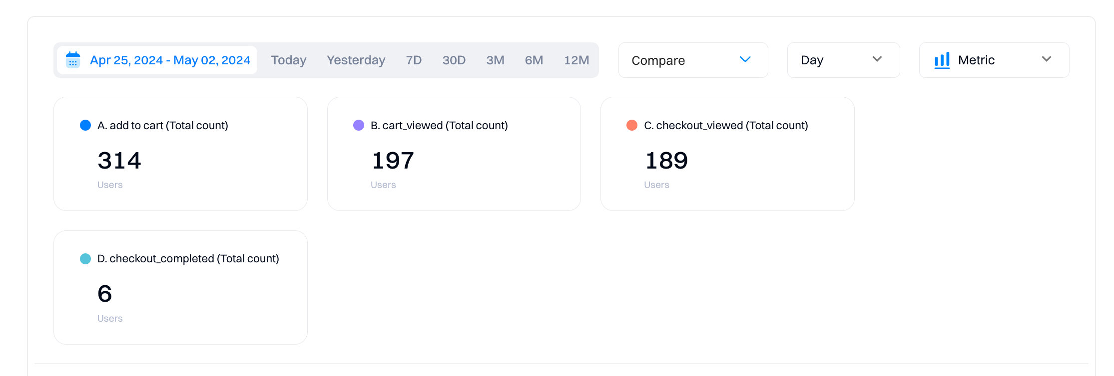
Metric
The metric chart displays an aggregated single numeric value for each metric.
Use cases
- Displaying a single aggregated value for a specific metric: Metric charts display a single aggregated value for a specific metric, providing a quick overview of key performance indicators (KPIs).
- Providing a quick overview of key performance indicators (KPIs): Metric charts are ideal for providing a snapshot of important metrics, allowing users to assess performance against targets or benchmarks quickly.
- Monitoring real-time changes in important metrics: Metric charts can be used to monitor real-time changes in important metrics, providing up-to-date information on performance.
- Comparing current performance against predefined targets or benchmarks: Metric charts make it easy to compare current performance against predefined targets or benchmarks, helping to identify areas for improvement.
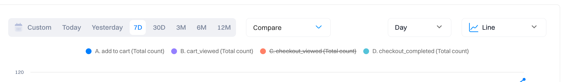
5. Legend
Legend helps users interpret the data presented in the visualization by explaining what each data series, category, or group represents. For example, in a bar chart comparing sales performance across regions, the legend might indicate that blue bars represent sales in North America, while red bars represent sales in Europe.
You can disable/enable the display of time series data by clicking on the legend.
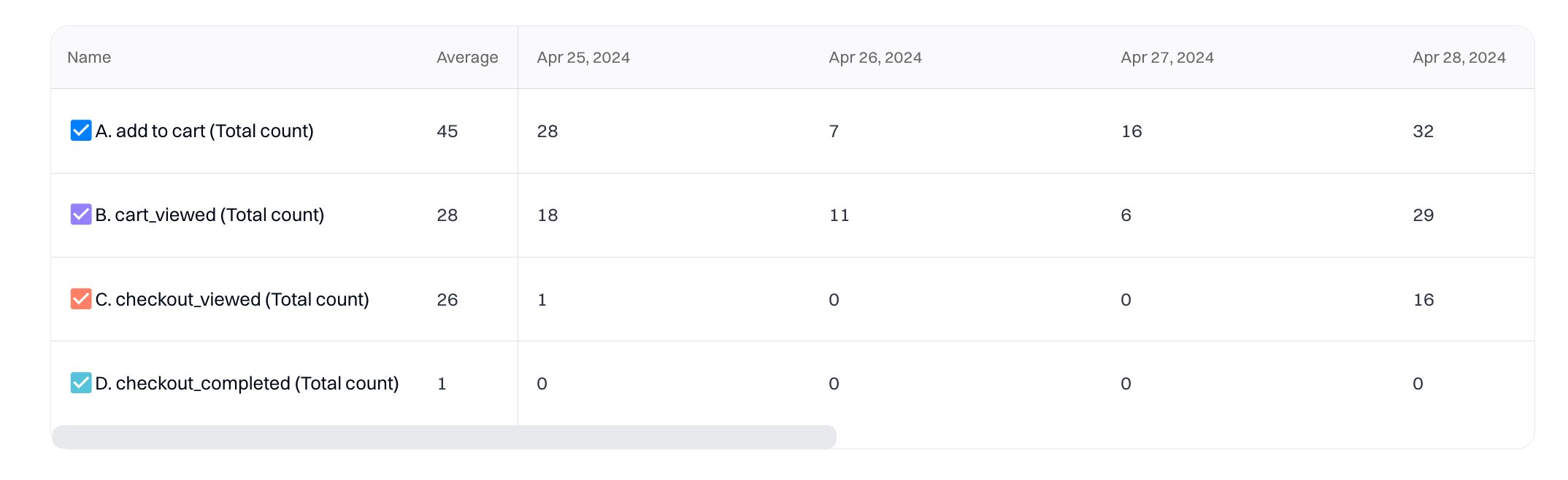
6. Table view
The table displays a series of raw numerical values over the entire date range. Each row represents the graph series metrics added to the report. "Average" shows the average across all values for a time-series metric.
Updated 9 months ago