
Creating emails with drag & drop editor
The drag & drop editor allows you to build responsive emails without coding quickly. You can quickly add content blocks and columns, easily add items like images, buttons, and social links, and set global styles.
It's best suited for these use cases:
-
Visual branding consistency. Drag & drop editor excels at ensuring visual consistency across marketing emails by allowing users to easily incorporate brand elements like logos, colors, and fonts, enhancing brand recognition and cohesion.
-
Interactive and multimedia content. Utilize drag & drop editors to easily embed multimedia content such as images, videos, and interactive elements, which can increase engagement and click-through rates by capturing the audience's attention more effectively.
-
Complex layouts and designs. Create sophisticated email layouts that include multiple columns, background images, and advanced design elements without needing deep knowledge of HTML or CSS, making your emails stand out.
-
Template utilization and customization. Access templates that can be quickly adapted to fit different campaigns or messages, speeding up the creation process and ensuring professional-looking emails.
-
Promotional campaigns. Ideal for creating visually appealing promotional emails highlighting offers, discounts, or sales, where attractive design and clear call-to-action buttons are crucial for success.
-
Newsletter formatting. Assemble complex newsletters that incorporate various types of content, including text, images, and links, organized in a visually appealing and easy-to-navigate layout.
-
Real-time design adjustments. Quickly make design adjustments and see changes in real time, allowing for rapid iteration and improvement based on team feedback or testing results.
These use cases underscore the benefits of a drag & drop editor when visual impact, ease of use, and layout flexibility are paramount in creating effective marketing and sales emails.
Creating email
You can create the email directly from the journey action step "Send email."
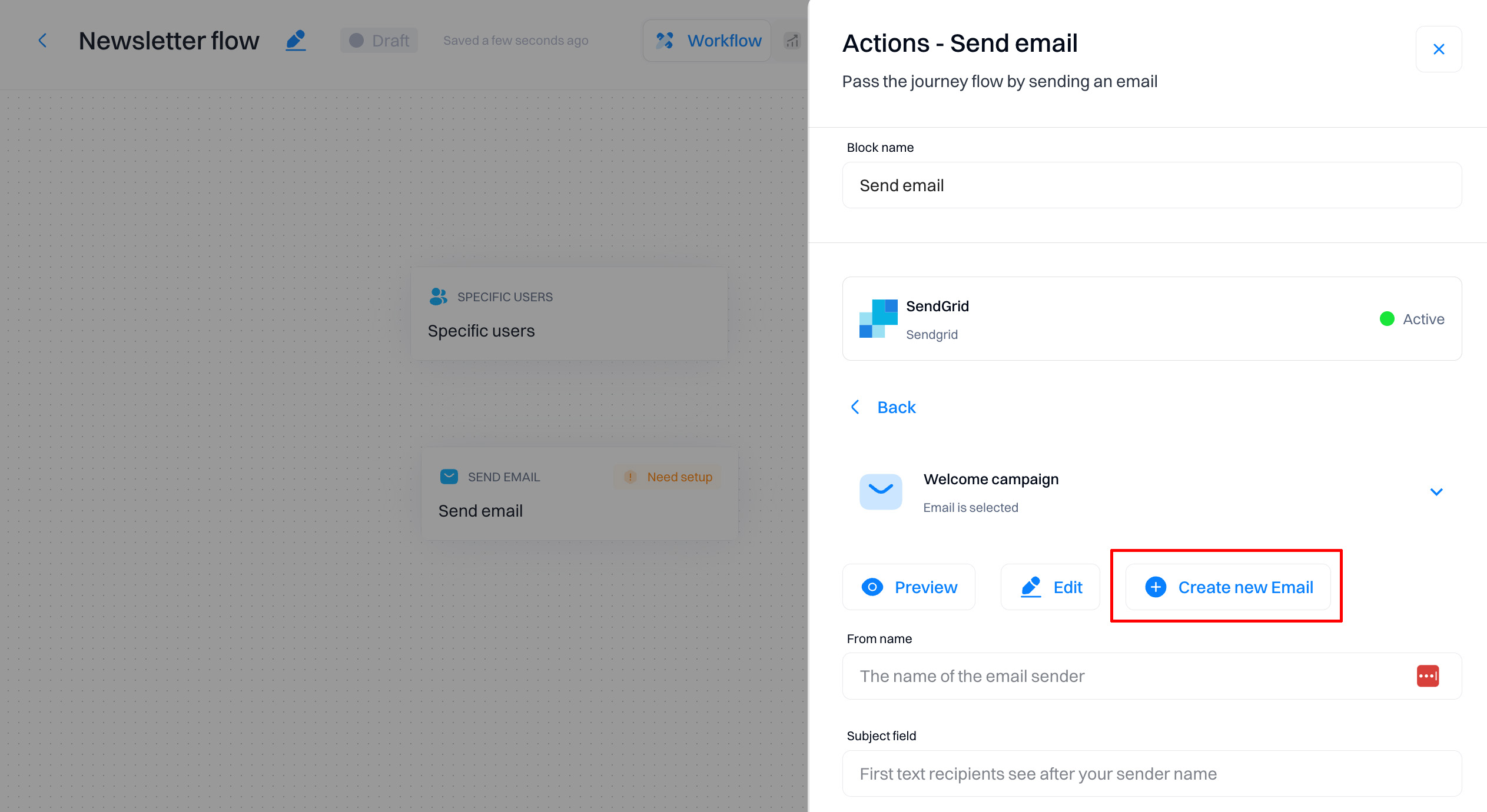
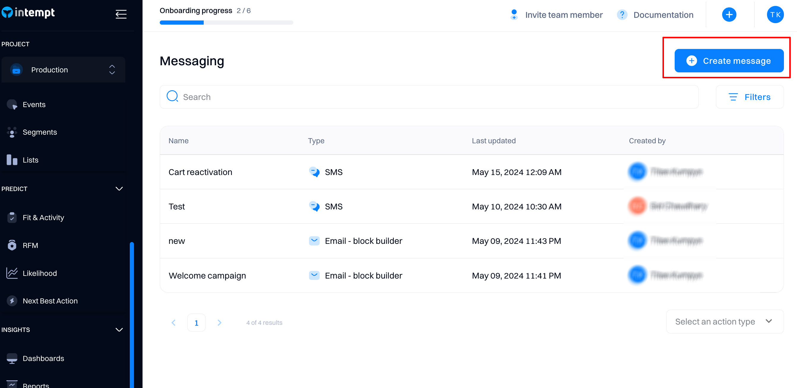
Alternatively, you can create the email from the Messages section.
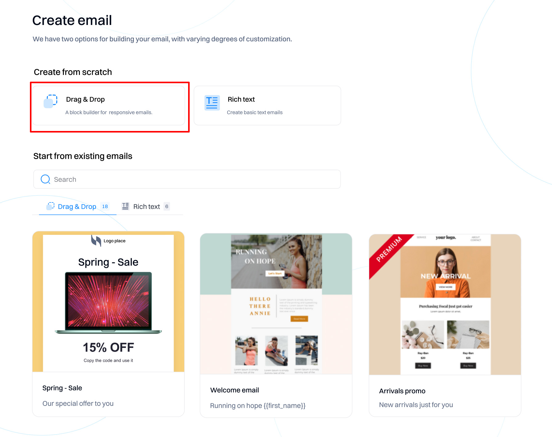
Next, select the "Drag & Drop" type of email editor. You can either start from scratch or reuse existing emails as a template.
Navigation bar overview
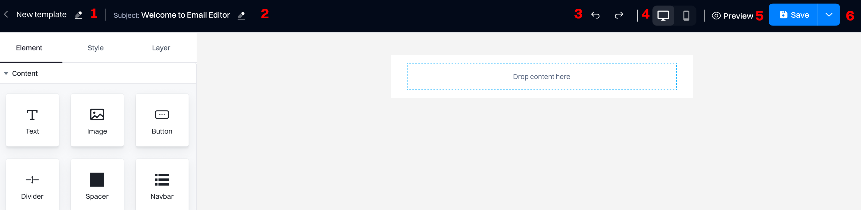
- Message title. This name will be displayed when selecting the message in the Message list and the "Send email" action.
- Subject. The message's subject will be the default subject when using the "Send email" action in journeys.
- Undo/redo. You can undo or redo changes you made while editing the email.
- Switch between views. You can view your email in desktop or mobile device view.
- Preview. Allows to see how the email will be rendered for the end user (with personalizations applied).
- Save dropdown.
- Send test email. Allows you to send email to a specified email address.
- Export to (HTML, MJML, JSON). Exports the email to the selected format. Automatically downloads the file.
Email editing - style
The style tab provides detailed options for customizing the appearance of various elements within your email.
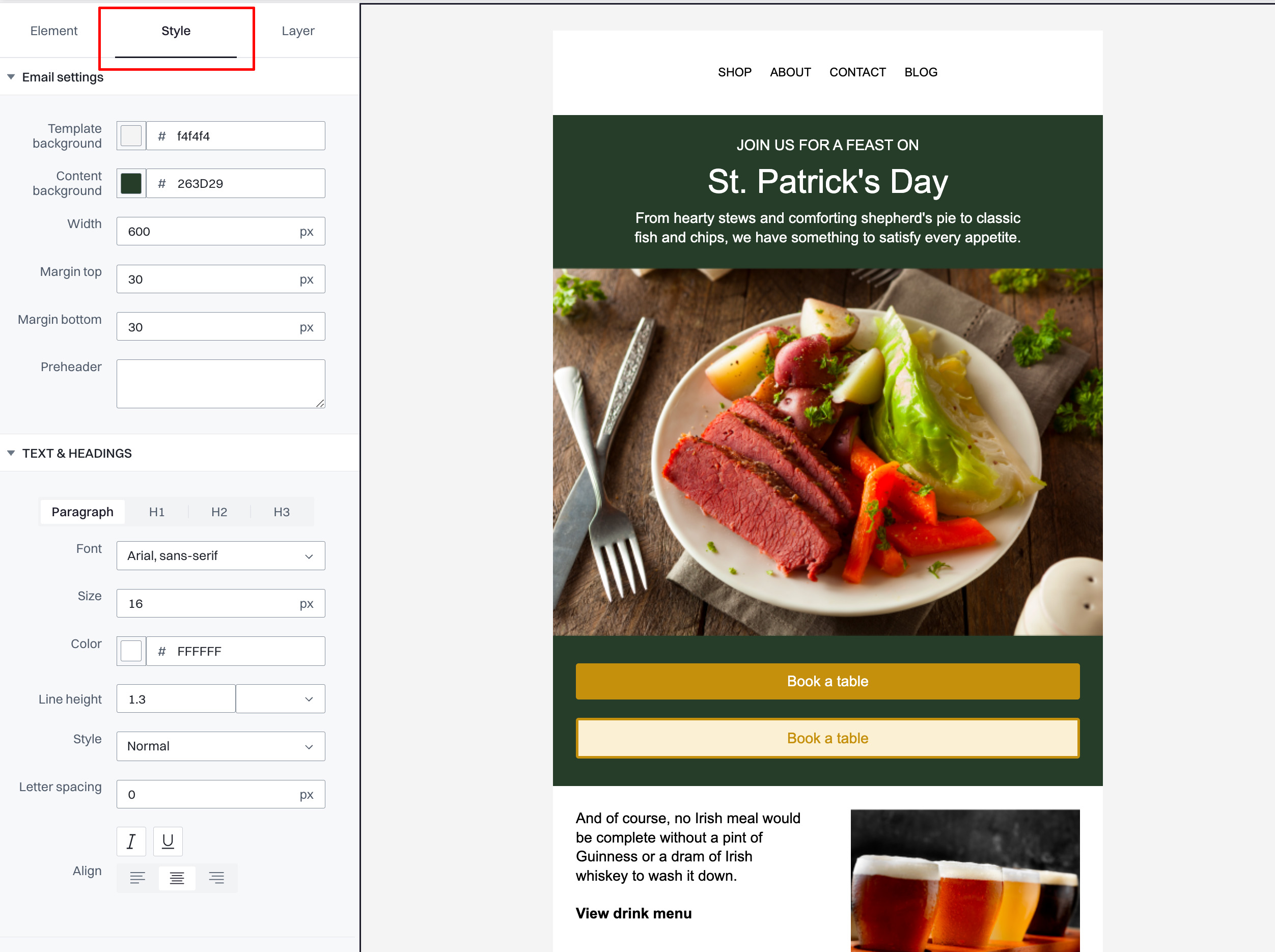
Style configuration
Email settings
- Template background. Set the overall background color of the email template. Example: #f4f4f4.
- Content background. Define the background color for the area where the content is placed. Example: #263d29.
- Width. Specify the width of the email in pixels. Default is 600px.
- Margin top. Set the top margin of the email content in pixels.
- Margin bottom. Set the bottom margin of the email content in pixels.
- Preheader. Add a short summary text that appears after the subject line when viewing the email in the inbox.
Text & headings
- Font. Choose the font family for your text elements. Example: Arial, sans-serif.
- Size. Set the font size in pixels. Example: 16px for paragraph text.
- Color. Choose a color for your text. Example: #ffffff.
- Line height. Adjust the space between lines of text.
- Style. Set the style of the text, such as normal, bold, or italic.
- Letter spacing. Adjust the spacing between characters in pixels.
- Align. Set text alignment to left, center, or right.
- Padding. Define the padding around text elements to adjust spacing within text blocks.
Buttons
- Font. Select the font family for buttons.
- Style. Choose the style for button text.
- Text color. Set the color of the text on the button.
- Button color. Define the background color of the button.
- Font size. Specify the size of the text on the button.
- Line height. Set the height of lines of text within the button.
- Letter spacing. Adjust the spacing between characters in the button text.
- Padding. Set padding around the button text to increase or decrease the clickable area.
Links
- Color. Choose a color for hyperlink text.
- Style. Set the style for hyperlinks, such as underline or no decoration.
Web fonts
- Add web fonts. Enhance your email's typography by adding custom web fonts.
Email editing - layers
The Layer tab provides a hierarchical view of all the elements within your email, helping you to manage the layout effectively. Each element can be selected to further customize or rearrange within the email template.
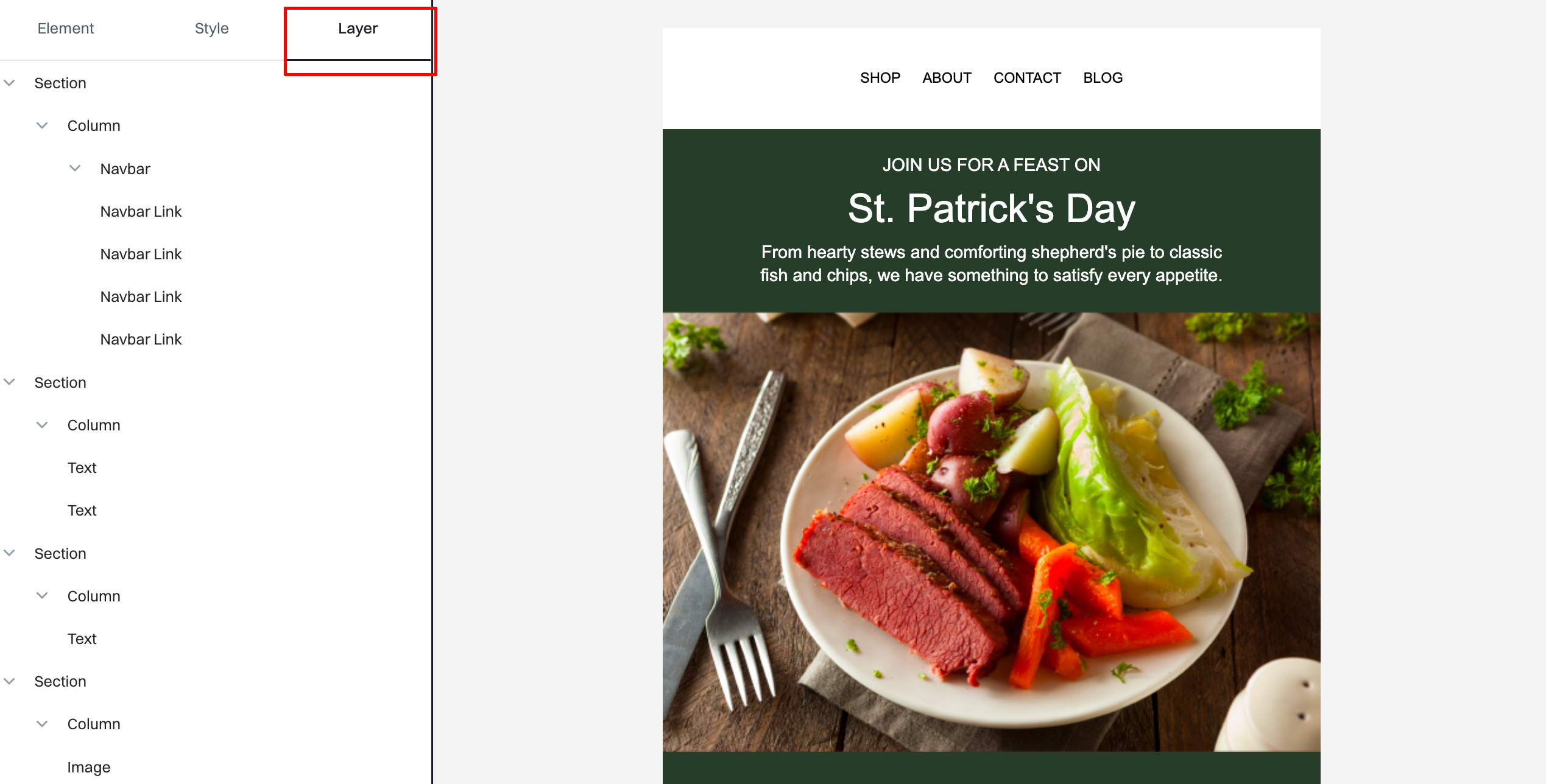
Layer configuration
Here's how the elements are typically organized:
-
Section. Represents a distinct block or section within the email. Sections are used to group different types of content and control the layout on a larger scale.
-
Column. Within each section, columns are used to structure the content horizontally. You can add multiple columns under a single section to create complex layouts.
-
Navbar. This is a special type of element that typically contains navigational links or menus. It's usually placed at the top of the email to provide easy access to different parts of your website.
- Navbar link. Individual links within the navbar. You can have multiple navbar links, each pointing to different destinations, such as 'Shop', 'About', 'Contact', and 'Blog'.
-
Text. Represents text blocks within columns. These can be used for headings, subheadings, body text, or any other textual content that needs to be included in the section.
-
Image. This is used to insert images into your email. Images can be used within any section or column to enhance the visual appeal of your email.
Managing layers
-
Reordering. Layers can be dragged and dropped to rearrange the order of sections, columns, and content within the email. This feature allows for flexible design adjustments as you build your email.
-
Editing. Clicking on any layer will bring up its specific settings in the sidebar, allowing you to modify attributes such as background color, padding, alignment, and more, depending on the type of layer.
-
Adding or removing layers. You can add new layers by selecting the appropriate element from the 'Element' menu. Similarly, you can remove any layer by selecting it and using the delete option.
Email editing - elements
You can drag & drop the elements to the message canvas to create the email.
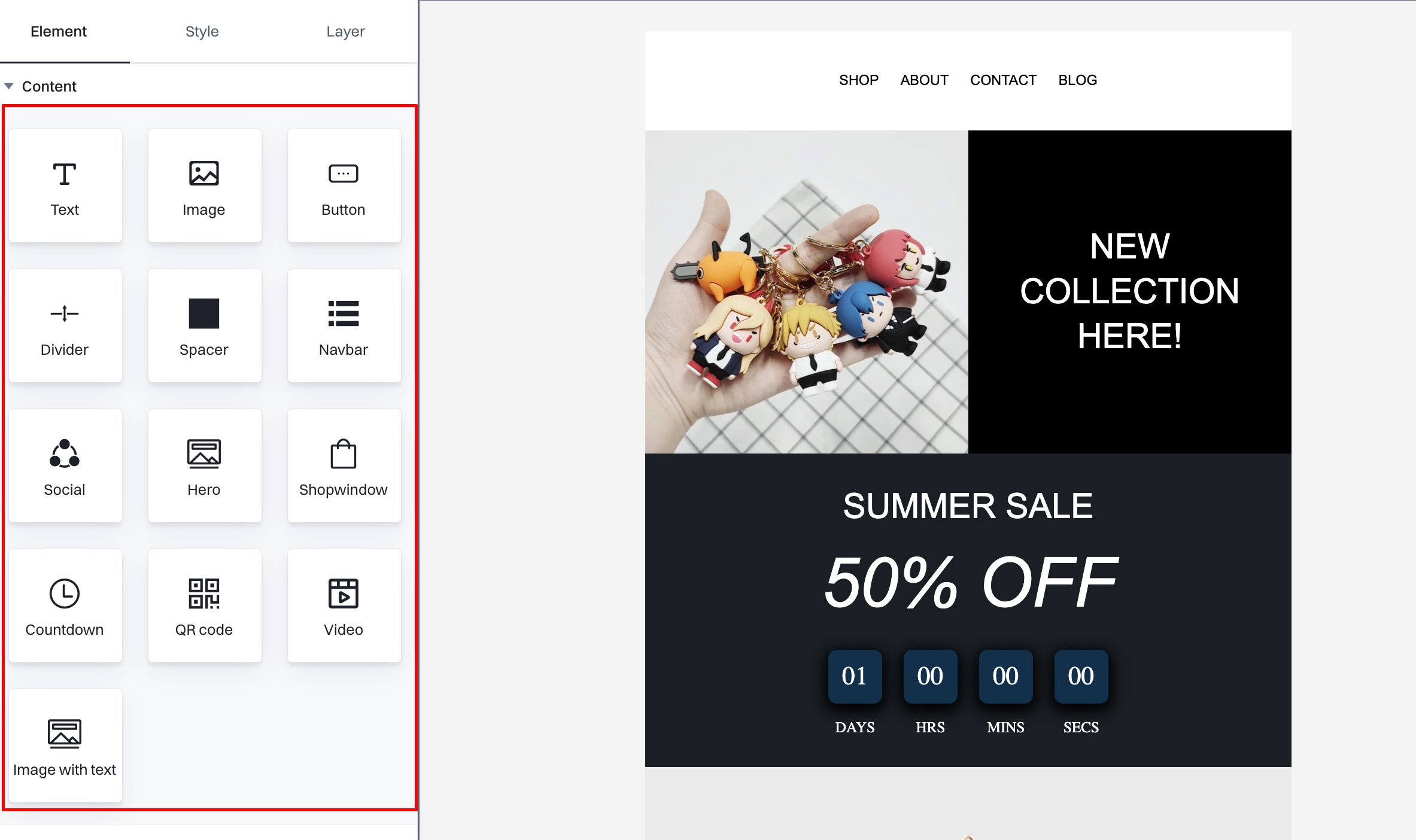
Text
This element allows you to add customizable text blocks to your email. It is useful for body text, headings, and other textual content that requires basic formatting, such as font style, size, and color.
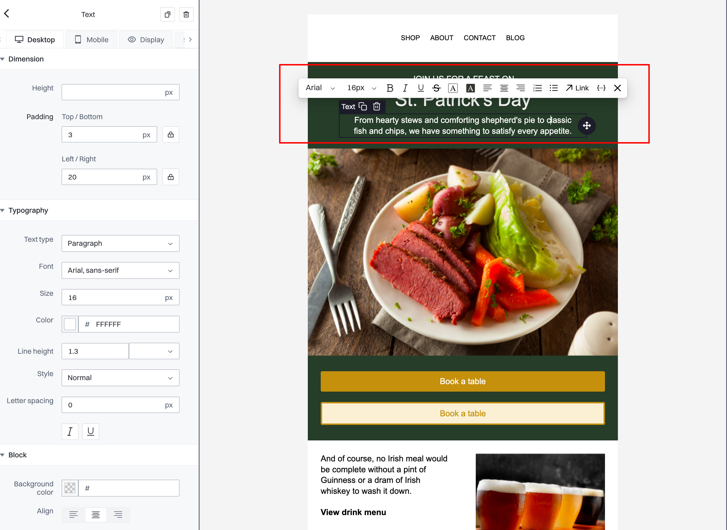
Dimension settings
- Height. Adjust the height of the text block in pixels.
- Padding Top/Bottom. Set the space above and below the text content.
- Padding Left/Right. Set the space on the sides of the text content.
Typography settings
- Text Type. Choose the type of text (e.g., paragraph, heading), which affects the default styling.
- Font. Select from a list of available fonts to apply to the text.
- Size. Specify the font size in pixels.
- Color. Choose the color of the text using a color picker or hex code.
- Line Height. Adjust the space between lines of text.
- Style. Select text styles like normal, bold, or italic.
- Letter Spacing. Adjust the spacing between characters.
Block settings
- Background Color. Set the background color of the text block.
- Align. Align the text within the block (left, center, right).
On-canvas text editing toolbar
- Font Size Adjustment. Increase or decrease the text size.
- Bold, Italic, Underline, and Strike-through. Apply emphasis styles to the text.
- List Formatting. Create bullet points or numbered lists.
- Hyperlink Insertion. Make text clickable by adding hyperlinks.
- Text Alignment Controls. Adjust the alignment of the text.
- Indentation Tools. Indent or outdent text blocks.
Rich text editing
After clicking on the text element, you can edit its style directly.
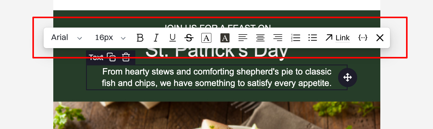
Available formatting options:
-
Font family: Allows you to select from a variety of fonts to apply to your text, affecting readability and style. Example: Arial.
-
Font size. Adjust the size of your text using predefined pixel sizes. Example: 16px.
-
Bold (B). Emphasize text by making it bold. Useful for highlighting important information or headings.
-
Italic (I). Italicize your text to emphasize key words or for stylistic purposes.
-
Underline (U). Underline text to emphasize or distinguish content, often used for links or important names.
-
Strikethrough (S). Strike through text to indicate removal or irrelevance without deleting it from the content.
-
Text color (A with color dropdown). Change the color of the text to enhance visibility or to align with branding colors.
-
Background color (A with background). Set a background color for text, improving contrast or highlighting specific sections of text.
-
Align text (three lines aligning left, center, right). Align your text left, center, or right within the content block to improve the layout and readability.
-
List (unordered and ordered). Create bulleted or numbered lists to organize information clearly and logically.
-
Indentation (left and right arrows). Adjust the indentation of paragraphs to structure your content more effectively.
-
Link (chain icon). Insert hyperlinks in your text, essential for linking to external resources, other pages, or email addresses.
-
Variables. Insert variables (user attributes) into the email body. Useful for personalizing the content.
-
Clear formatting (Tx). Remove all existing formatting from the selected text, reverting it to the default style settings.
Image
Enables the insertion of images into your email. This is essential for adding visual elements like logos, product photos, or any other graphical content that enhances the visual appeal of your email.
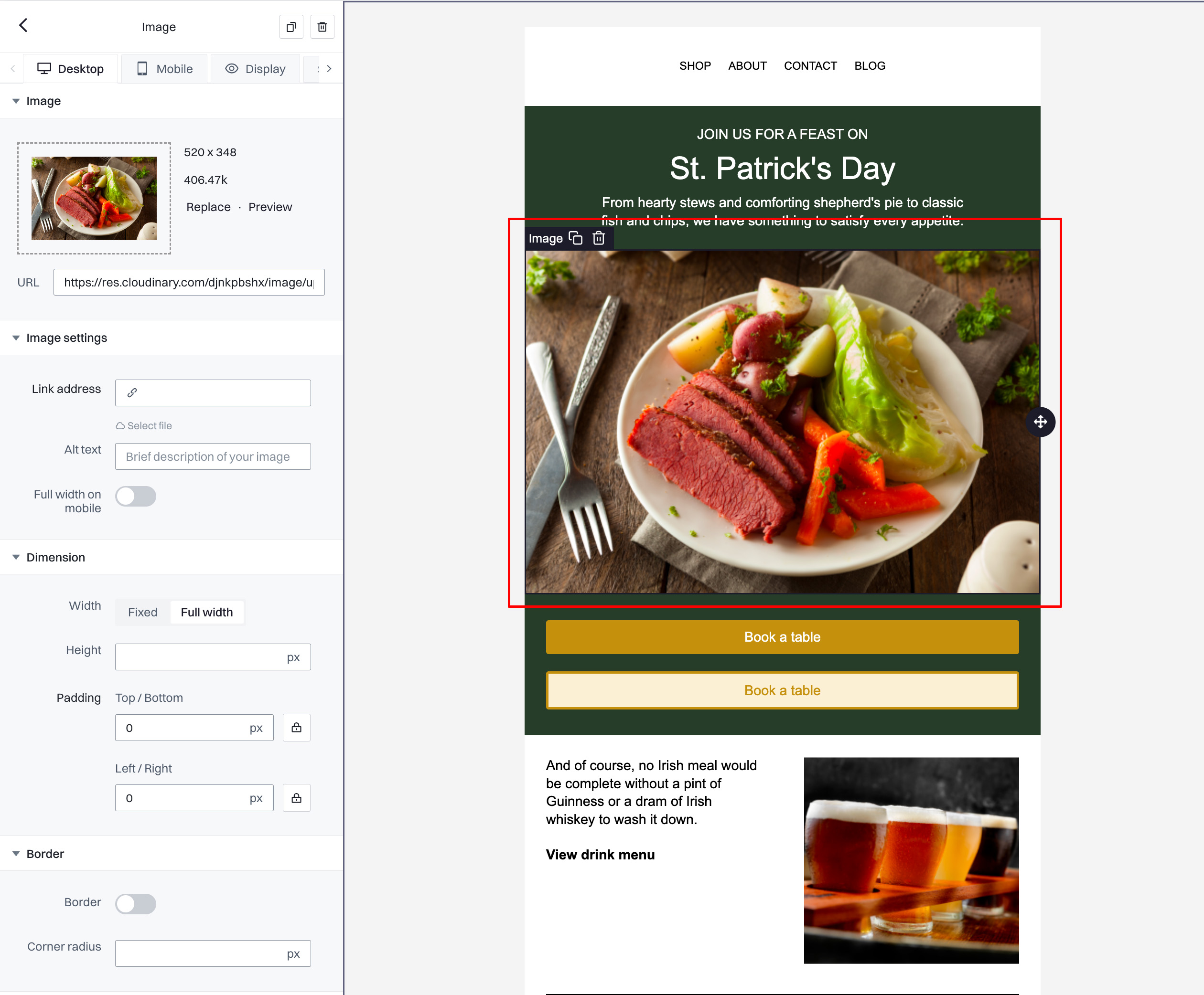
General settings
- URL. The direct link to where your image is hosted. You can replace or preview the image directly from this field to ensure it's the correct one being used in your email.
- Link address. Optionally, you can make the image a clickable link by entering a URL here. This is useful for directing users to a specific webpage when they click on the image.
Image settings
- Alt text. Provide alternative text for the image, which describes the image if it cannot be displayed or if the reader uses assistive technologies. This is important for accessibility and SEO.
- Full width on mobile. Toggle this option to allow the image to expand to the full width of the mobile screen, improving visibility and impact on smaller devices.
Dimension settings
- Width. Choose between a fixed width or full-width. Fixed width allows you to specify the exact width in pixels, while full width will ensure the image stretches to the edges of the email container.
- Height. Manually set the height of your image in pixels. Adjusting the height can help maintain aspect ratio or fit the design layout.
- Padding Top/Bottom. Set the vertical padding around the image to increase or decrease spacing between the image and other elements.
- Padding Left/Right. Adjust the horizontal padding to align the image more precisely within the content area.
Border settings
- Border. Toggle to enable or disable a border around the image. If enabled, you can define the color and thickness of the border.
- Corner radius. Adjust this to round the corners of your image's border, which can soften the design and integrate the image more smoothly into your email layout.
Block settings
- Background color. Set a background color for the area behind the image, useful for making the image stand out or match your brand's color scheme.
- Align. Align the image within its content block—left, center, or right. This alignment can help balance the design or adhere to the overall visual flow of the email.
Button
Inserts clickable buttons into your email. Ideal for calls-to-action such as "Buy Now," "Register," or "Learn More." Buttons can be styled in terms of color, text, and size to stand out in the email layout.
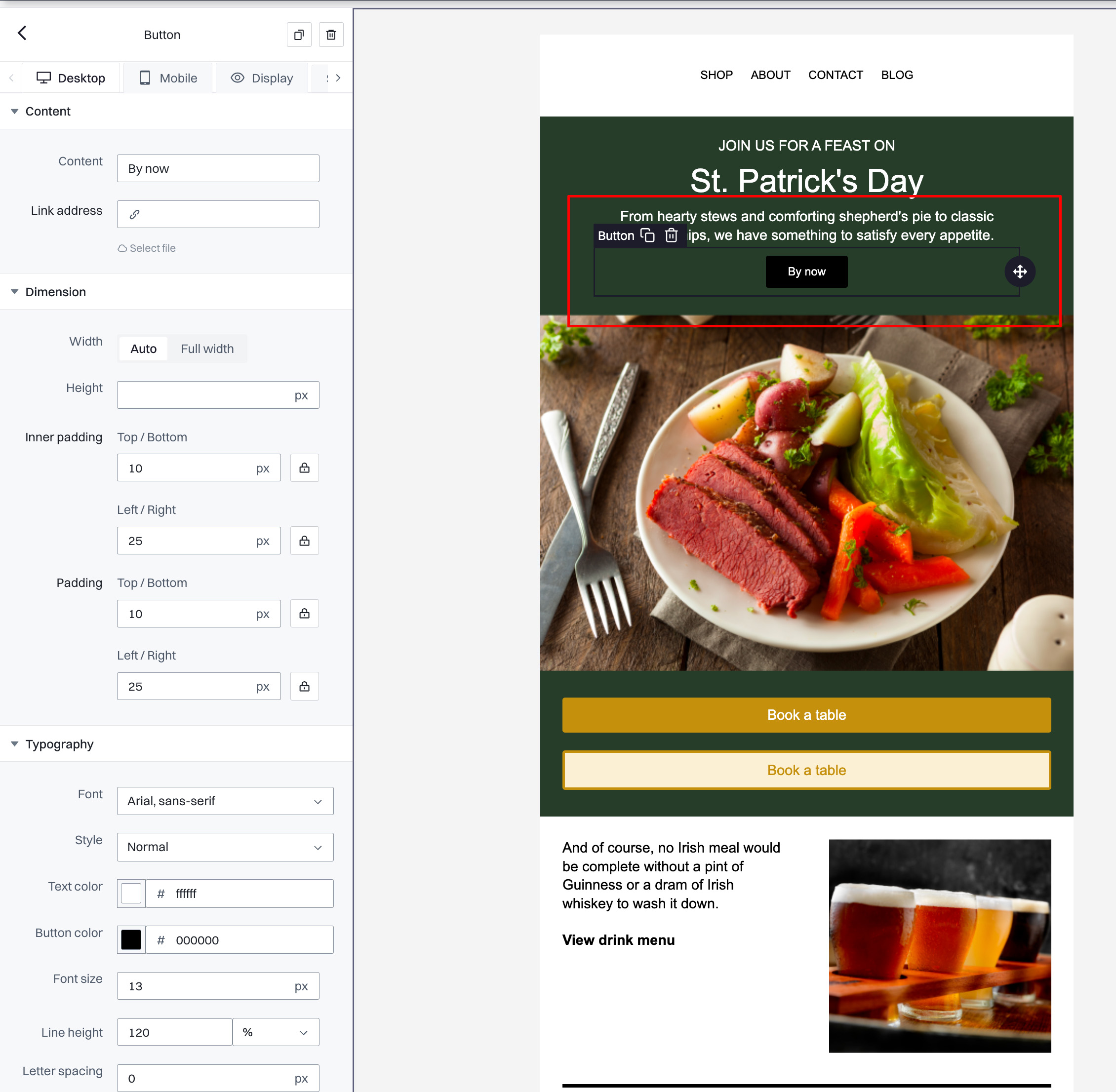
Content settings
- Content. Enter the text that will appear on the button. This is typically a call-to-action such as "Buy now" or "Book a table."
- Link address. Provide the URL where users will be directed when they click on the button. You can type the URL directly or select a file if the link is to a downloadable resource.
Dimension settings
- Width. Choose between "Auto" where the button width adjusts to the text length, or "Full width" to extend the button across the entire width of the email container.
- Height. Set a specific height for the button in pixels, influencing the button's size vertically.
- Inner padding Top/Bottom. Adjust the vertical padding inside the button to increase or decrease the space between the text and the button's top and bottom edges.
- Inner padding Left/Right. Adjust the horizontal padding to increase or decrease the space between the text and the button's left and right edges.
Typography settings
- Font. Select the font family for the text on the button from a dropdown menu of available fonts.
- Style. Choose the font style such as normal, bold, or italic to make the button text stand out.
- Text color. Pick a color for the button text, ensuring it contrasts well with the button background for clear visibility.
- Button color. Choose a color for the button's background, which should align with your brand colors or the design theme of your email.
- Font size. Set the size of the text on the button, making it large enough to be easily readable.
- Line height. Adjust the line height as a percentage to control the spacing of text lines within the button.
- Letter spacing. Modify the spacing between characters in the button text to enhance readability or fit the design style.
Divider
This element adds a horizontal line or divider between sections of the email. It visually separates different topics or sections within the email, making the content easier to navigate.
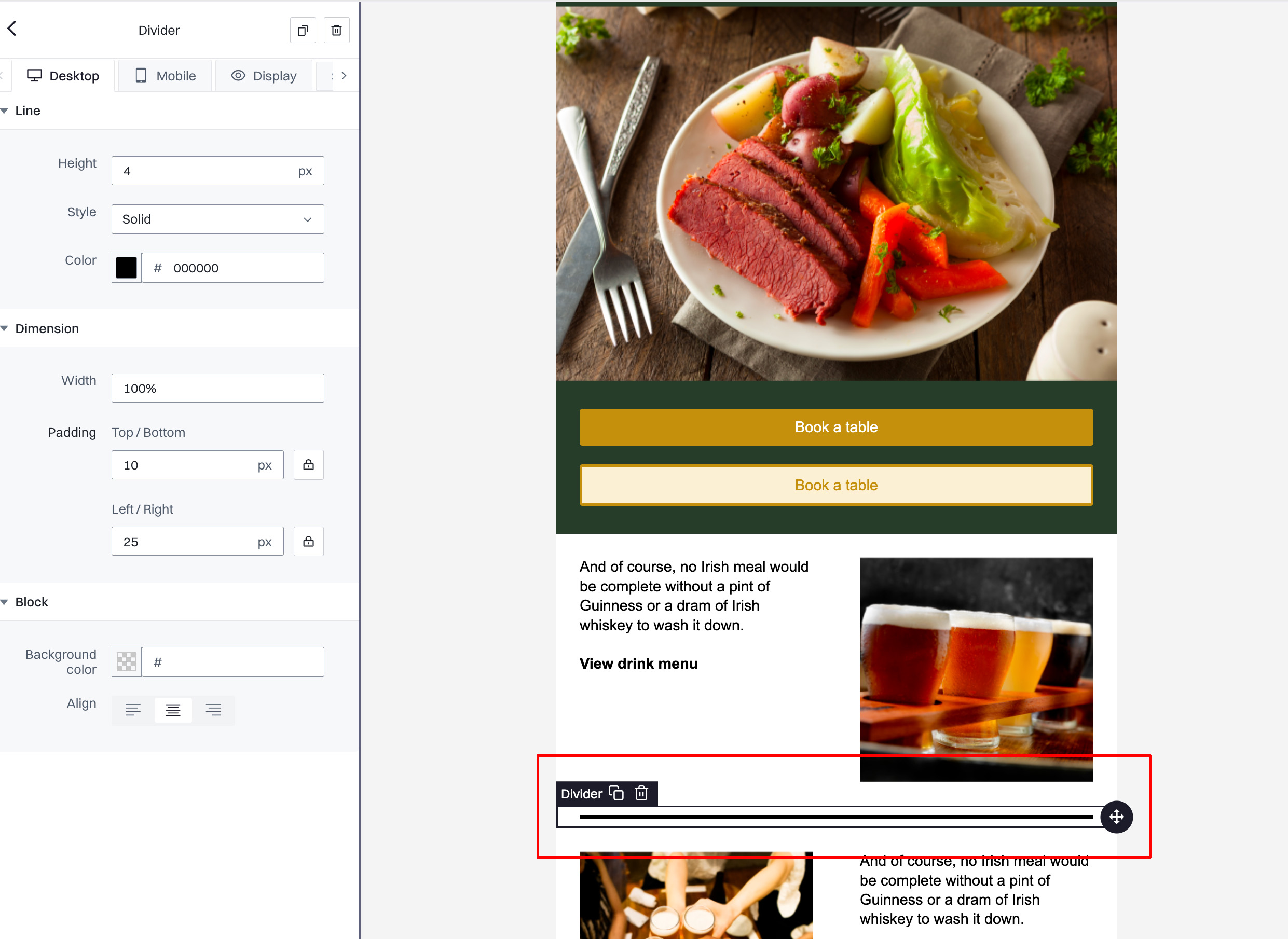
Line settings
- Height. Set the thickness of the divider line in pixels. This determines how thick or subtle the line appears within the email layout.
- Style. Choose the style of the divider line. Options typically include solid, dotted, dashed, and others, allowing you to match the line style with the design aesthetic of your email.
- Color. Select the color of the divider line using a color picker or hex code. This allows the divider to either stand out or blend in with the rest of the email design, depending on your needs.
Dimension settings
- Width. Adjust the width of the divider, with options typically ranging from a percentage of the container width to full width. This controls how long the line stretches across the email.
- Padding Top/Bottom. Set the amount of space above and below the divider line to control vertical spacing within your layout. This helps to ensure that the divider does not crowd the content it separates.
- Padding Left/Right. Adjust the horizontal padding to control the indentation of the divider from the left and right edges of the container, helping to align it perfectly within your design.
Block settings
- Background color. Choose a background color for the area surrounding the divider, which can be used to further distinguish the sectioned areas or to maintain a fluid design aesthetic across the email.
- Align. Set the alignment of the divider within its block. Alignment options such as center, left, or right allow you to place the divider precisely according to the layout requirements.
Spacer
Provides vertical spacing between elements in your email. Spacers help adjust the layout to ensure the content is spaced out evenly, improving readability.
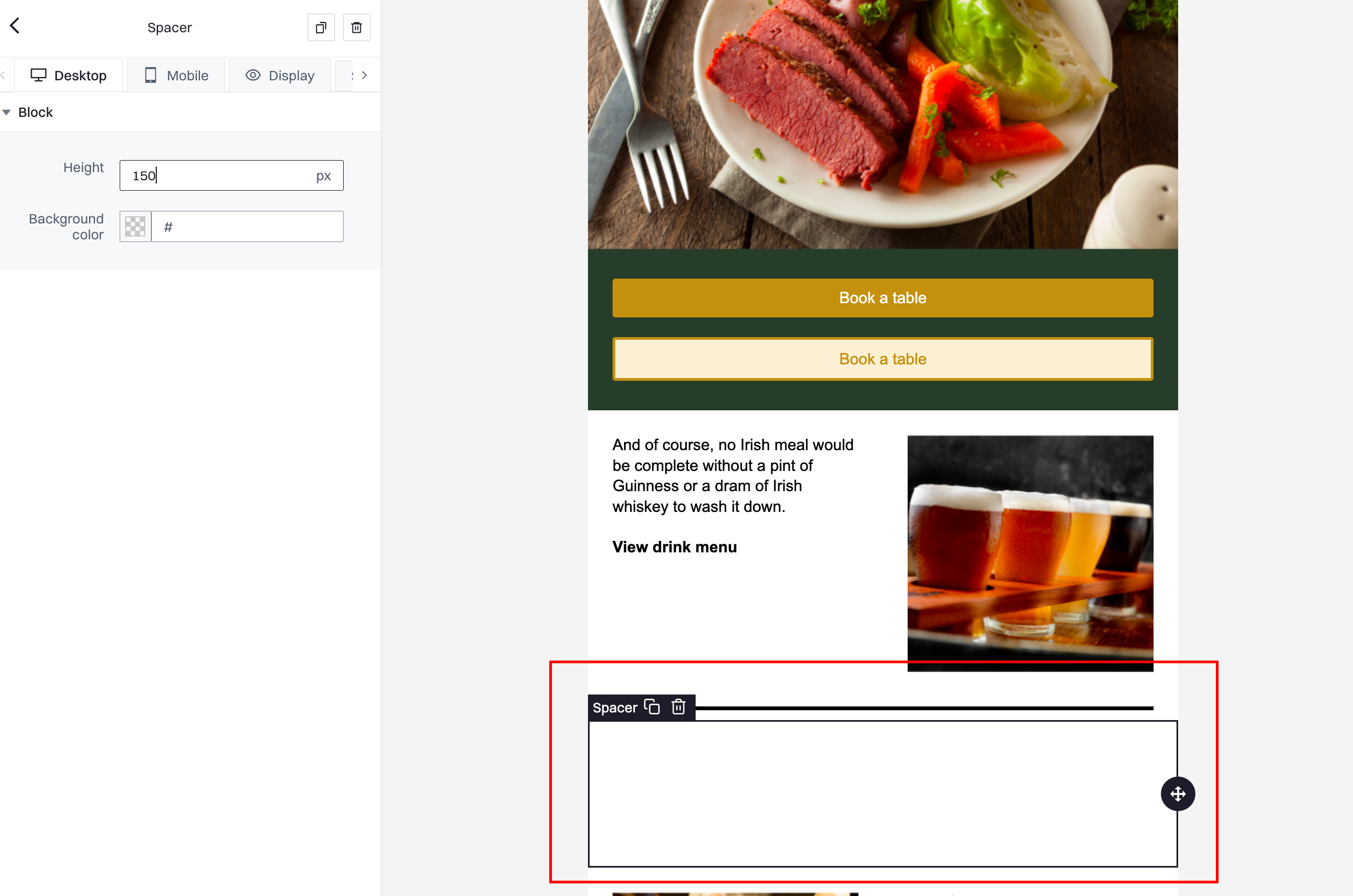
Block settings
- Height. Adjusts the height of the spacer in pixels. This determines the amount of vertical space added between elements. For example, setting it to
150pxas shown in the screenshot will insert a space of 150 pixels high. - Background color. Sets the background color of the spacer. While spacers typically might not need a background color since they are used to create empty space, this option can be used for creative purposes, such as creating a visual division with color if desired.
Navbar
Inserts a navigation bar at the top of the email. This is useful for including links to different sections of your website, such as the Home, About Us, or Contact pages, allowing recipients to navigate easily.
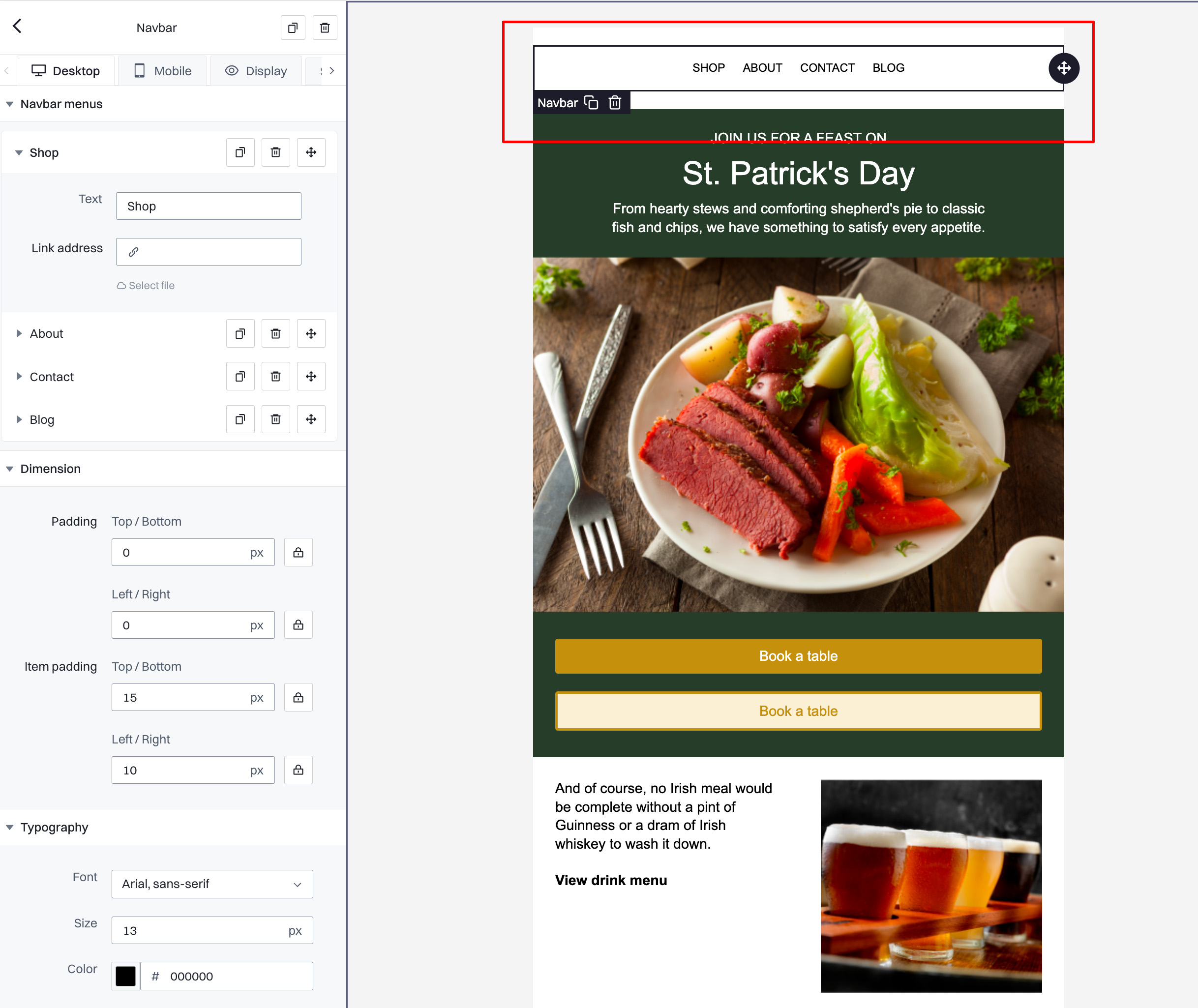
Navbar menus
- Menus. Add menu items by defining the text and linking each to a relevant URL. For example, in the screenshot, menu items like 'Shop', 'About', 'Contact', and 'Blog' are included. Each menu item can be linked to a different destination to facilitate easy navigation for the recipients.
Dimension settings
- Padding Top/Bottom. Adjusts the vertical padding of the navbar to increase or decrease the space above and below the menu items.
- Padding Left/Right. Adjusts the horizontal padding to control the space on the sides within the navbar.
- Item padding Top/Bottom. Controls the padding above and below each item within the navbar, useful for creating more space between the navbar border and the text.
- Item padding Left/Right. Adjusts the padding on the sides of each navbar item, influencing how closely the items are grouped together.
Typography settings
- Font. Selects the typeface used for the text within the navbar. This example uses Arial, sans-serif for a clean and modern look.
- Size. Sets the size of the text within the navbar in pixels.
- Color. Chooses the color of the navbar text. In the example, the text is set to black (#000000).
- Line height. Determines the space between lines of text, which can affect the height of the navbar if the text wraps.
- Style. Changes the font style (e.g., normal, bold, italic) to highlight the navbar items or match them with the email's aesthetic.
- Letter spacing. Adjusts the space between characters, helping to make the navbar text more readable or stylish.
Block settings
- Align. Controls the alignment of the navbar within its container. You can align it left, center, or right depending on your layout needs and design preferences.
Social
This element adds social media icons linked to your profiles. Encourage recipients to follow your social media channels directly from the email.
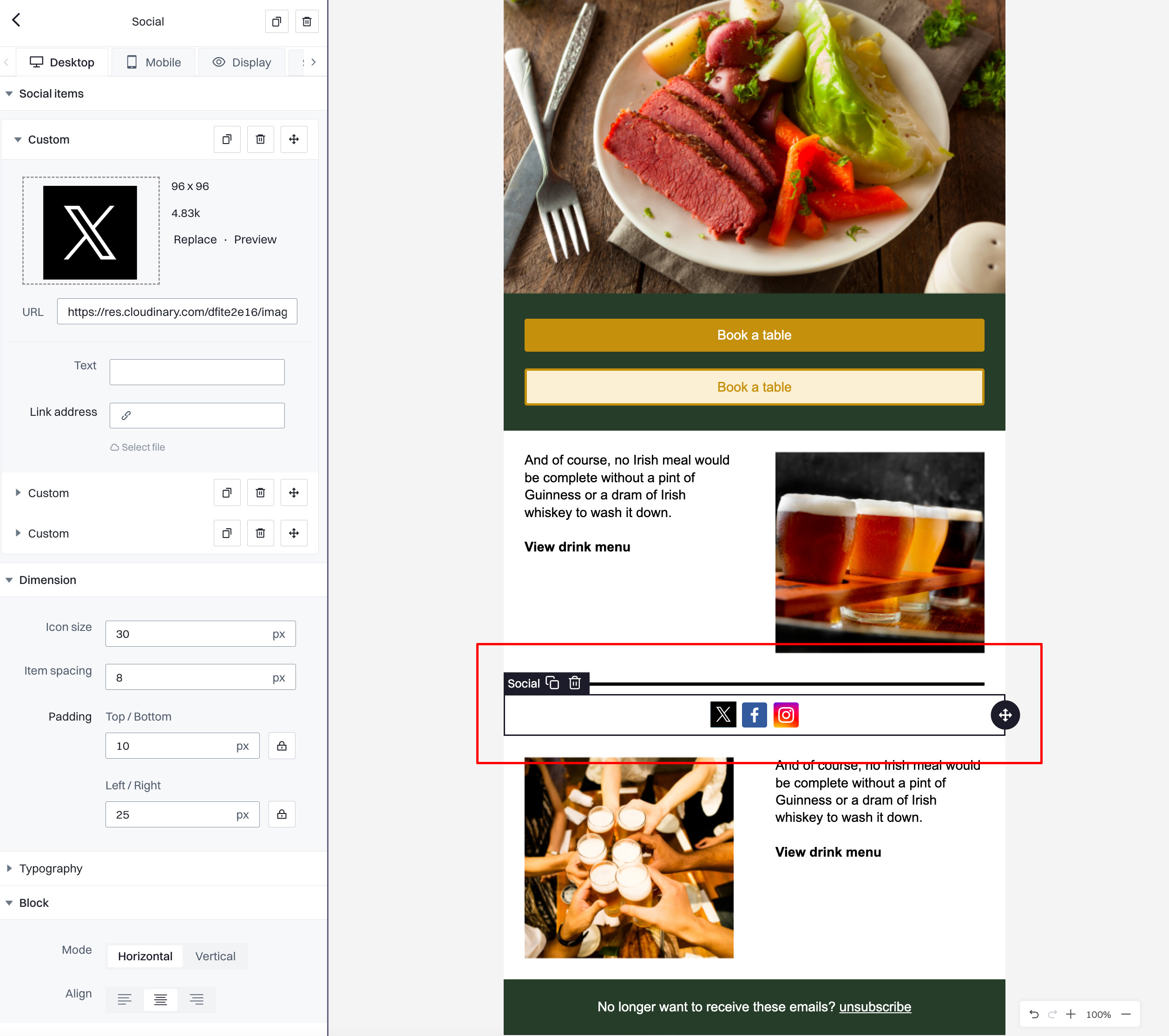
Social items
- Custom. Add and customize social media icons. For each icon:
- URL. Enter the URL to your social media profile to link the icon accordingly.
- Text. Optionally add text next to the icon (e.g., Follow us).
- Link address. Provide a direct link where the icon or text will redirect upon clicking.
Dimension settings
- Icon size. Set the size of the icons in pixels. Adjusting this value changes how prominent the icons are within the email layout.
- Item spacing. Control the spacing between individual social media icons to manage how closely they are grouped.
- Padding Top/Bottom. Adjust the vertical padding around the icons to increase or decrease the space above and below the social media icons.
- Padding Left/Right. Adjust the horizontal padding to control the space on the sides of the icons.
Typography settings
- (No typography settings shown in the screenshot, but typically here you could adjust the font, size, and color of any text accompanying the icons.)
Block settings
- Mode. Select the orientation of the social media icons; options are typically 'Horizontal' or 'Vertical', depending on how you want to display the icons in your email.
- Align. Choose the alignment of the entire block within its container — left, center, or right — to integrate the social icons harmoniously into the overall design of the email.
Hero
Allows you to combine a large, attention-grabbing image with overlay text and a button, often used at the top of the email to make a strong visual impact right when the recipient opens the email.
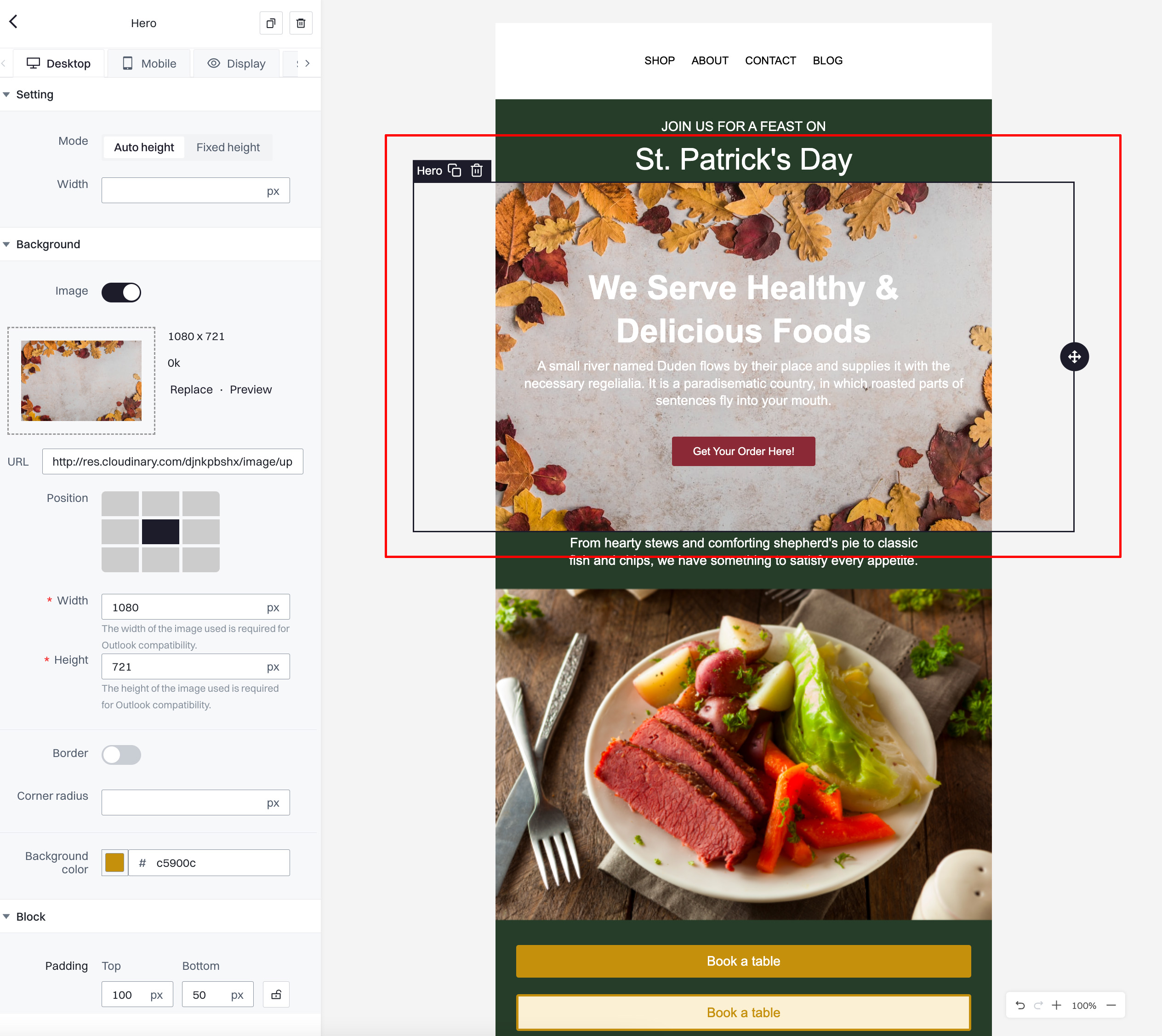
Setting
- Mode. Choose between 'Auto height' or 'Fixed height' for the hero section. 'Auto height' adjusts based on the content and image size, while 'Fixed height' allows you to specify the exact height.
- Width. Set the width of the hero image or section. This can be adjusted to span the full width of the email or fit within specific dimensions.
Background
- Image. Enable to use a background image. You can upload or link to an image and set it as the background of the hero section.
- URL. Provide the URL of the image you wish to use as the background.
- Position. Adjust the positioning of the background image to best fit the hero section, with options like center, top, bottom, etc.
- Width and Height. Specify the dimensions of the image for compatibility with different email clients, especially for ensuring the display looks consistent across platforms.
Border
- Corner radius. Adjust the radius of the corners of the hero section to create rounded edges. This can soften the overall appearance and integrate the hero more smoothly into your email design.
Block
- Padding Top/Bottom. Adjust the space above and below the content within the hero section. Increasing padding can help to ensure that text does not overlap with any crucial parts of the background image.
- Padding Left/Right. Control the spacing on the sides within the hero block, which can help with the overall balance and proportion of text and images within the section.
- Background color. Set a background color for the hero section, which can appear as a fallback if the background image fails to load or as an overlay to enhance text visibility.
- Align. Align the content within the hero block to the left, center, or right. This alignment impacts how the text and any additional elements within the hero section are displayed relative to the background image.
Shopwindow
This element is specifically designed for showcasing products. It can display a slideshow of multiple products, each with an image, description, and a link to the purchase page, useful for e-commerce promotions.
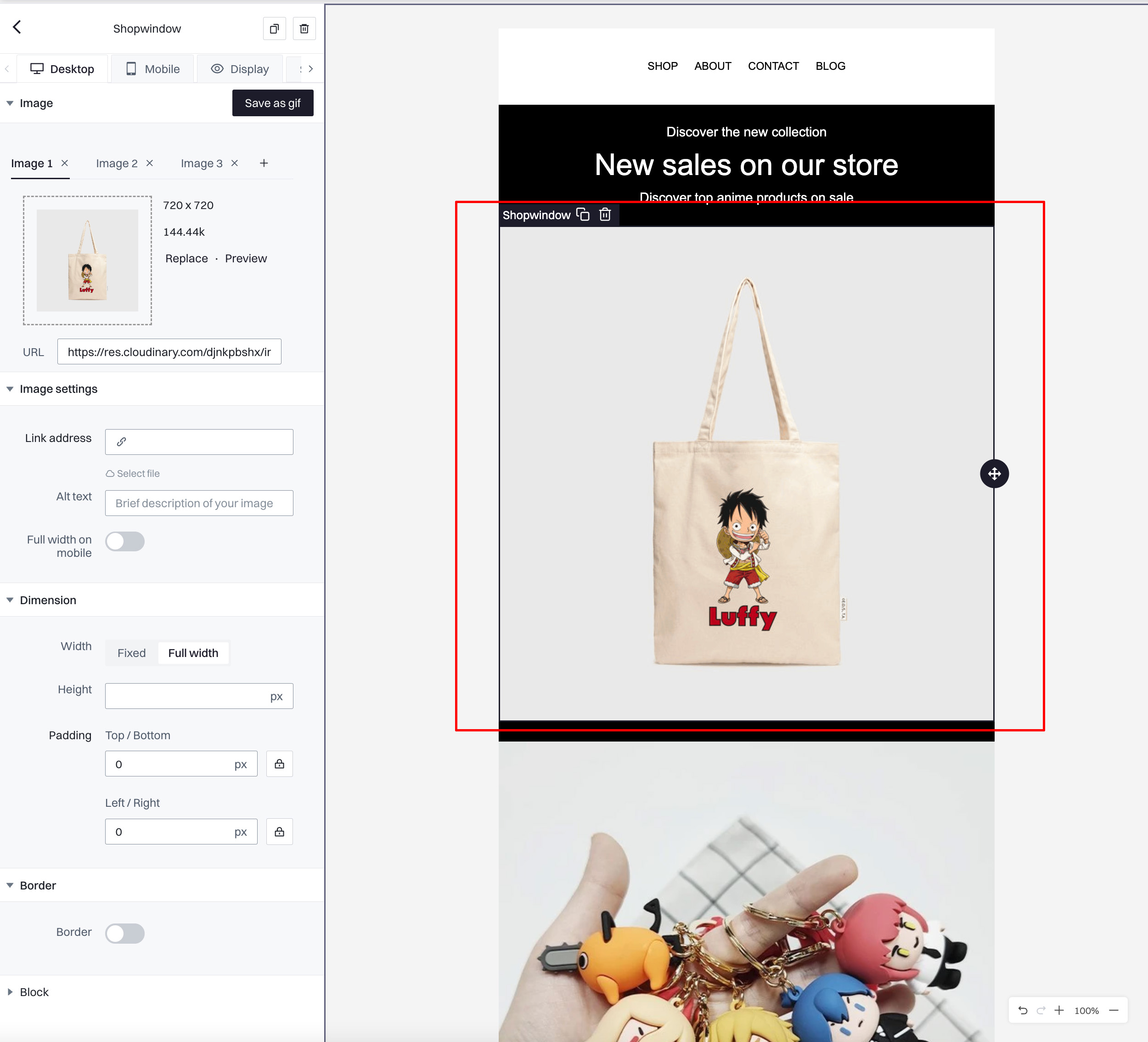
Image settings
- Plus icon. Add a new image to the slideshow.
- URL. Enter the URL for each product image you want to display. This allows you to link directly to the image file hosted online.
- Link address. Optionally, you can provide a URL that users will be redirected to when they click on the image. This should link directly to the product page where users can learn more or make a purchase.
- Alt text. Provide a brief description of the image for accessibility and SEO. This text will be displayed if the image fails to load and is also used by screen readers.
- Full width on mobile. Toggle this option to allow the image to expand to the full width of the screen on mobile devices, ensuring optimal visibility and impact.
Dimension settings
- Width. Choose between a fixed width or full width for the images. Full width will allow the images to stretch across the entire container, making them more prominent.
- Height. Optionally set a specific height for the images to maintain consistency in size across different images.
- Padding Top/Bottom. Adjust the vertical padding around the images to increase or decrease the space above and below each image.
- Padding Left/Right. Adjust the horizontal padding to control the spacing on the sides of the images.
Border settings
- Border. Toggle to add or remove a border around the images. If enabled, you can further customize the color and thickness of the border to match your email’s design.
Block settings
- Background color. Choose a background color for the shopwindow block to enhance the visual layout and make the images stand out.
- Align. Set the alignment of the entire block within its container to left, center, or right to best fit the overall design of the email.
Countdown
This element inserts a countdown timer into your email, creating urgency for a sale or event deadline. This tool is effective in marketing campaigns where time-sensitive offers are presented.
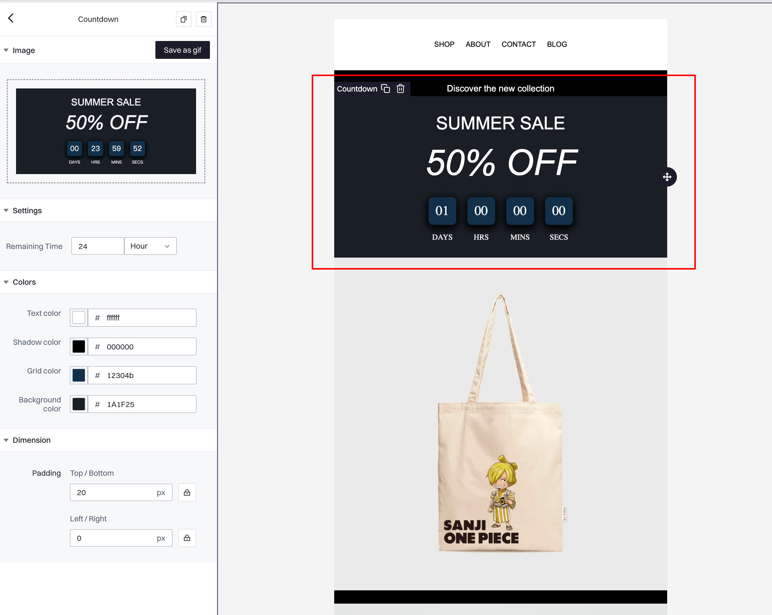
Image
- Save as gif. This option allows you to save the countdown timer as an animated GIF, making it compatible across various email clients that might not support dynamic HTML countdowns.
Settings
- Remaining Time. Set the duration for the countdown timer. You can specify the time in days, hours, or minutes depending on the urgency and the timing of the event or promotion.
Colors
- Text color. Choose the color of the numbers in the countdown timer. This should be selected to ensure good visibility against the background.
- Shadow color. Set the color for any shadows on the countdown text. This can help make the text more legible against complex backgrounds.
- Grid color. Adjust the color of the grid or dividers between the countdown elements (days, hours, minutes, seconds), which can help to visually separate the units for clarity.
- Background color. Select a background color for the countdown timer itself. This color should contrast with the text and shadow colors for readability.
Dimension
- Padding Top/Bottom. Adjust the vertical padding around the countdown timer to increase or decrease the space above and below the timer within its container.
- Padding Left/Right. Control the horizontal padding to align the countdown timer properly within the layout of your email.
QR Code
Generates a QR code within the email that recipients can scan with a mobile device. This can be linked to a website, event registration, or special offers, providing a quick way for users to access through their phones.
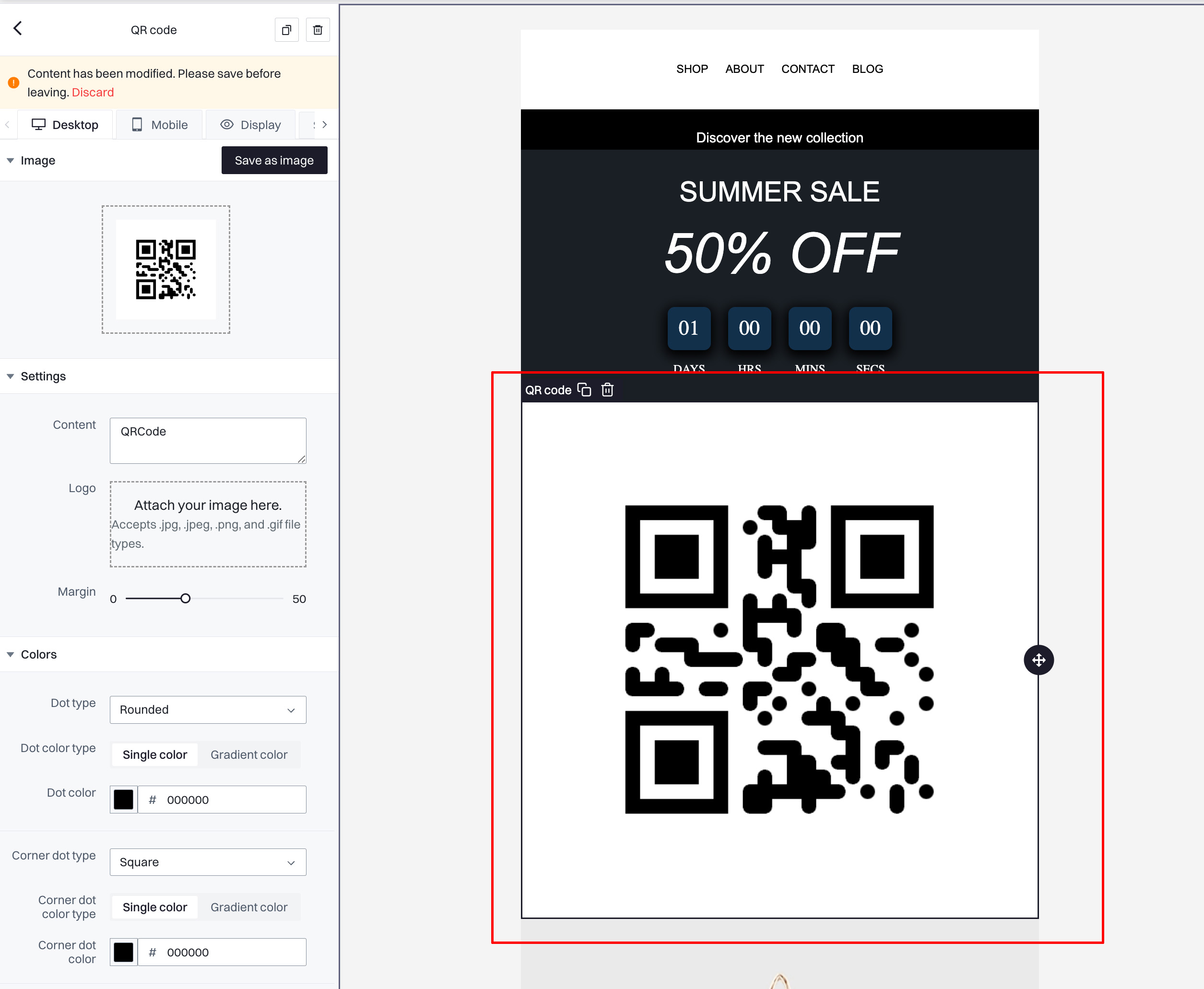
Image
- Save as image. This option allows you to save the QR code as an image file, ensuring it can be displayed correctly across all email clients.
Settings
- Content. Enter the URL or the text that the QR code will encode. This is the destination or message users will access when they scan the QR code.
- Logo. Optionally attach an image (e.g., your brand logo) that will appear in the center of the QR code. This can help with branding and makes the QR code more visually distinctive.
- Margin. Set the width of the margin around the QR code. This is the white space that surrounds the QR code, which helps to separate it visually from other elements in the email.
Colors
- Dot type. Choose the shape of the dots in the QR code; options include squared, rounded, and more, allowing for a customized look.
- Dot color type. Select whether the dots of the QR code should be a single color or a gradient. The gradient can make the QR code more visually engaging.
- Dot color. Choose the color of the dots in the QR code. A contrasting color to the background ensures the QR code remains scannable.
- Corner dot type. Select the style for the dots in the corners of the QR code, which can be different from the main grid to emphasize the scanning points.
- Corner dot color. Set a color for the corner dots, typically the same as the main dots for consistency or a contrasting one for emphasis.
- Corner square type. Define the shape of the decoration squares around the corner dots.
- Corner square color. Select a color for the squares surrounding the corner dots of the QR code.
- Background color. Choose a background color for the QR code area, which can enhance readability and aesthetic integration into the email design.
Dimension
- Padding Top/Bottom. Adjust the vertical padding around the QR code to ensure it is spaced appropriately from other content.
- Padding Left/Right. Control the horizontal padding to maintain balance in the QR code's placement within the email layout.
Video
This element embeds a video directly into the email. It can significantly enhance engagement by providing interactive or explanatory content that recipients can watch without leaving the email.
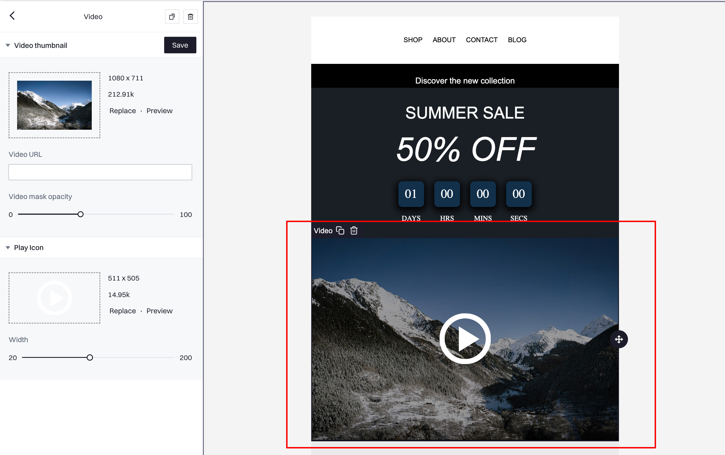
Video thumbnail
- Video URL. Enter the URL of the video you wish to embed. This link should direct to a video hosted on a platform like YouTube, Vimeo, or a similar service that supports embedding.
- Thumbnail. Upload or specify the URL for a thumbnail image that will appear before the video is played. This image is crucial as it serves as a visual prompt for the video content.
- Replace. Change the current thumbnail image by replacing it with a new one.
- Preview. View the thumbnail to ensure it accurately represents the video or is visually appealing.
Settings
- Video mask opacity. Adjust the opacity of an overlay that can be applied to the thumbnail image, which can enhance visibility of the play icon or create a desired visual effect. Set this between 0 (fully transparent) and 100 (fully opaque).
Play icon
- Icon. Choose an icon that will appear on the thumbnail to indicate that the image is playable. This is often a play button.
- Replace. Change the play icon with a different design if needed.
- Preview. View the play icon on the thumbnail to ensure it is visually intuitive and clearly indicates the action expected from the user.
- Width. Adjust the width of the play icon. This determines how prominent the play button is on the thumbnail, which can affect click-through rates.
Dimensions
- Padding Top/Bottom. Adjust the vertical padding around the video within its block. This spacing is important to ensure the video does not clash with other elements in the email.
- Padding Left/Right. Control the horizontal padding to maintain a balanced layout in the email's overall design.
Image with Text
This element combines an image with adjacent text in one block, which is useful for creating visually balanced sections in your email that pair graphical content with descriptive text.
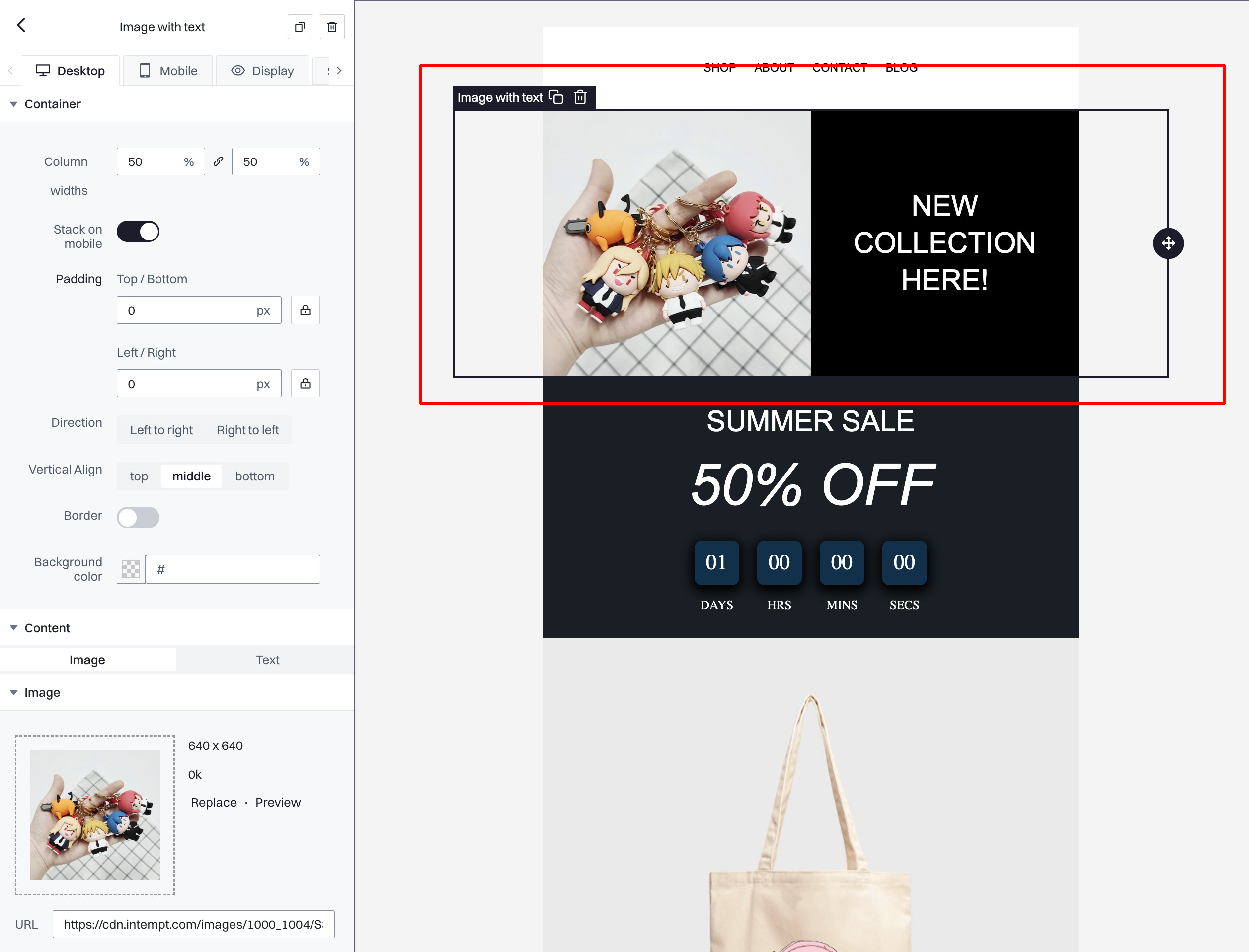
Container
- Column widths. Adjust the percentage of space that each side of the element (image and text) will occupy within the container. This allows for flexible design arrangements depending on the focus you want to give to either the image or the text.
- Stack on mobile. Enable this option to stack the image and text vertically on mobile devices for better responsiveness.
- Padding Top/Bottom. Set the vertical padding inside the container to create spacing above and below the content.
- Padding Left/Right. Adjust the horizontal padding to control the spacing on the sides of the content within the container.
- Direction. Choose the layout direction, such as left to right or right to left, to determine how the image and text are aligned horizontally.
- Vertical Align. Set the vertical alignment of the content within the container to top, middle, or bottom, which helps in aligning the text properly with the image.
- Border. Optionally add a border around the container for aesthetic emphasis or to define the block more clearly within the email layout.
- Background color. Select a background color for the entire block, which can be used to enhance the contrast between the email background and the content of this element.
Content
- Image.
- URL. Provide the URL of the image you want to include. This should be a direct link to where the image is hosted online.
- Image settings.
- Link address. Optionally, add a URL that the image will link to when clicked, directing users to a webpage or a larger version of the image.
- Alt text. Write a brief description of the image for accessibility purposes and SEO.
- Full width on mobile. Enable this option to allow the image to occupy the full width of the screen on mobile devices, ensuring it is easily viewable on smaller screens.
- Text.
- The text portion can be edited directly in the adjacent editor in the builder, where you can input and format the text to accompany the image.
Dimension
- Width. Choose between fixed or full width for the image, which determines how the image fits within the column it occupies.
- Height. Optionally set a fixed height for the image to maintain uniformity in size, particularly useful when images need to align neatly in a row.
- Padding.
- Top/Bottom. Adjust vertical padding around the image to increase or decrease spacing relative to the text.
- Left/Right. Adjust horizontal padding to ensure the image has adequate spacing from the text or the edge of the email container.
Updated 8 months ago