
Using the visual editor
Overview
Visual editor (VE) allows you to create multiple variants per experiment via an intuitive web page editor.
Important to know
VE loads the page based on the URL you enter before creating the experiment.
Toolbar overview
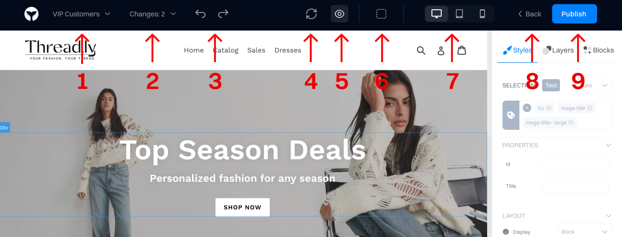
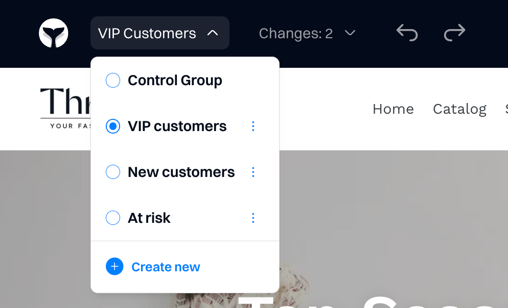
1. Variant creation
You can create variants directly within the visual editor (VE) without being required to return to the admin console. If you are on the control variant, any change you make on VE will automatically create a variant for you.
When you switch between variants, you will see only changes that apply to the experiment selected.
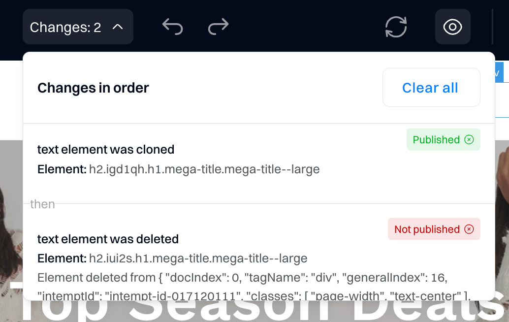
2. Change list
The change list shows all changes you apply on the page, sorted by recency. Each change list item contains the type of change and the element that was changed.
"Published" means the change is already live and running on your website.
"Not published" means that the change is only saved in VE and not live. To publish the changes, you need to click the "Publish" button at the top right corner.
3. Undo/redo manger
You can undo and redo the changes you made on the page. The VE and changes list will be updated accordingly to reflect the changes.
4. Sync page
This functionality refreshes the page template used in the VE. This is useful if you updated your original website design (e.g., added a new section, banner, etc.) and want the VE to reflect the changes.
Important to know
For each URL Intempt creates a page template file that is reused until you select sync. If you make a change on you website and you have a an variant that is using this element, you may have issues in rendering it. To prevent this, always double check the variants that have elements affected by changes on your website and re-sync the page template.
6. Preview
This allows you to preview the website with variant changes applied. The configuration sidebar and top toolbar are hidden. Click on the eye icon to return to the configuration page.

6. Show outline
Once enabled, it starts showing a dotted outline for each page element. This is useful when you need to see the hierarchy and layout of the elements.
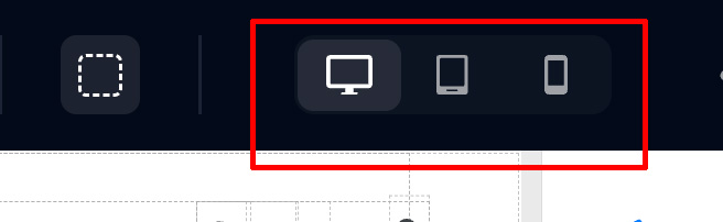
7. View options
You can view the variant using different layouts based on the device type: desktop, tablet, or mobile.
8. Back
It returns you to the experiment configuration page.
9. Publish
This publishes changes that you made in the variant.
Important to know
All changes you make within VE are auto-saved but not automatically published. To prevent accidental updates, changes to the variant will not go live until you explicitly publish them.
Sidebar overview
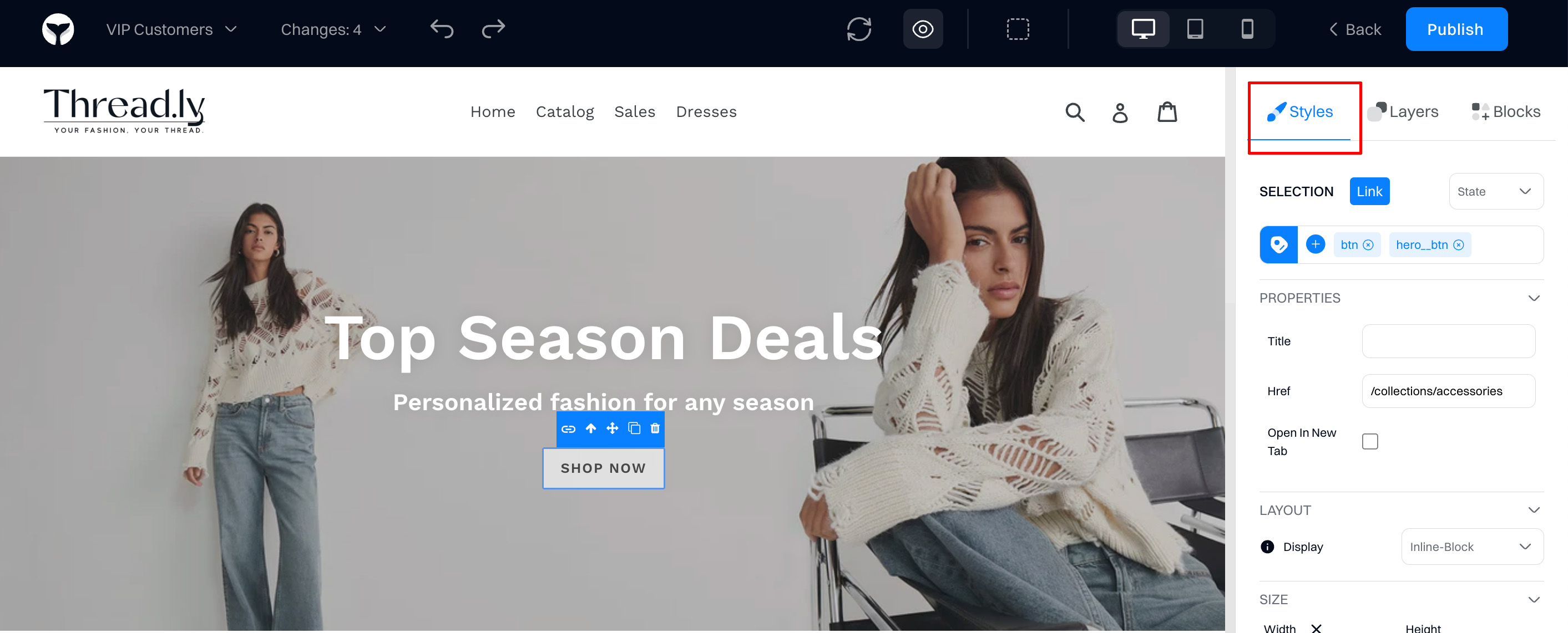
1. Styles
Styles allow you to configure every page's element properties, such as color, font, borders, layout, etc. The section below provides a full reference for each change.
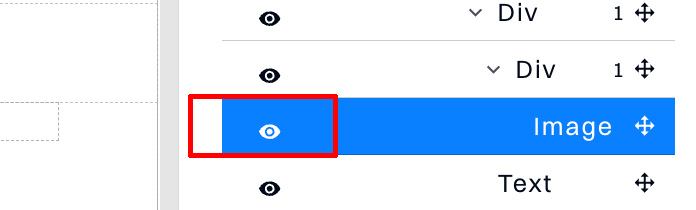
2.Layers
It allows you to view the page hierarchy and change the positioning of the elements within the page. You can drag the element you want to move and drop it in the desired position.
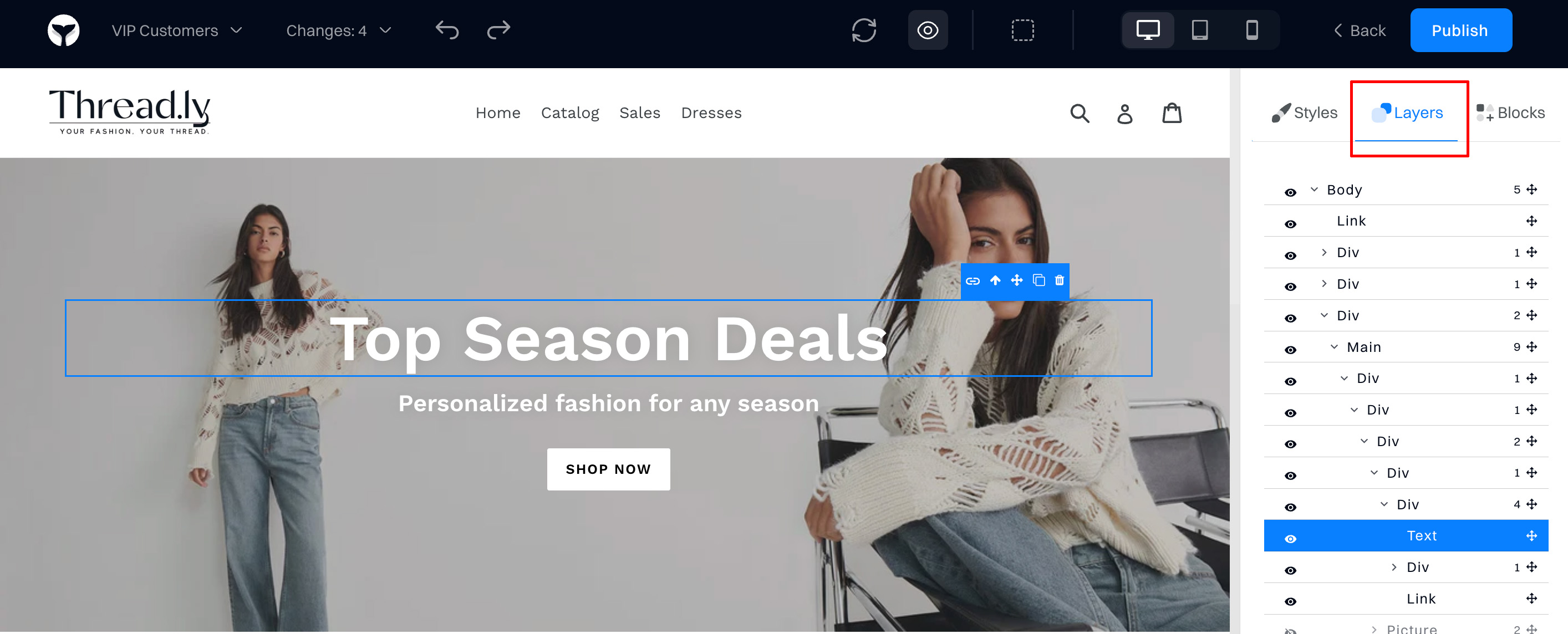
You can also hide/unhide the element on the page using the eye icon.
3. Blocks
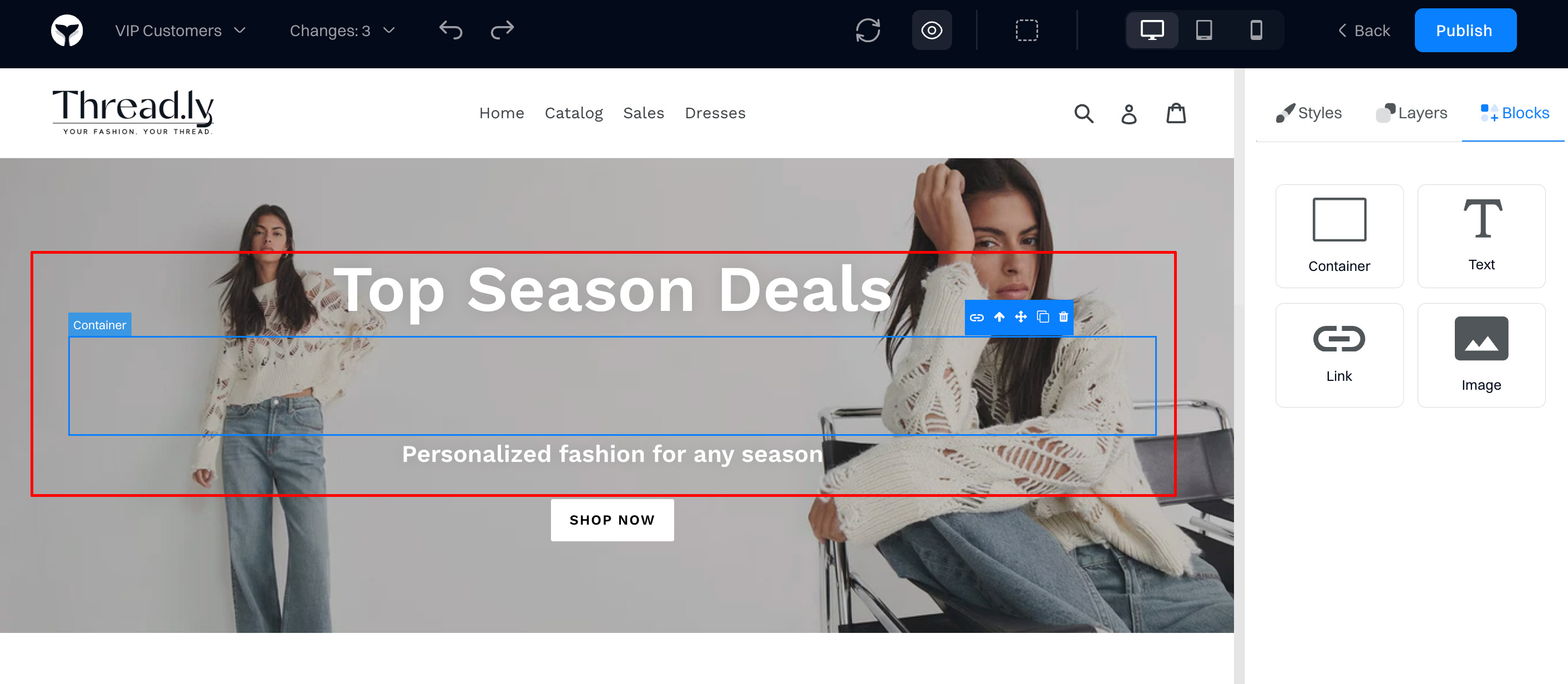
Allows you to add new content to the variant. To use it, drag the container and drop it on the desired position on the page.
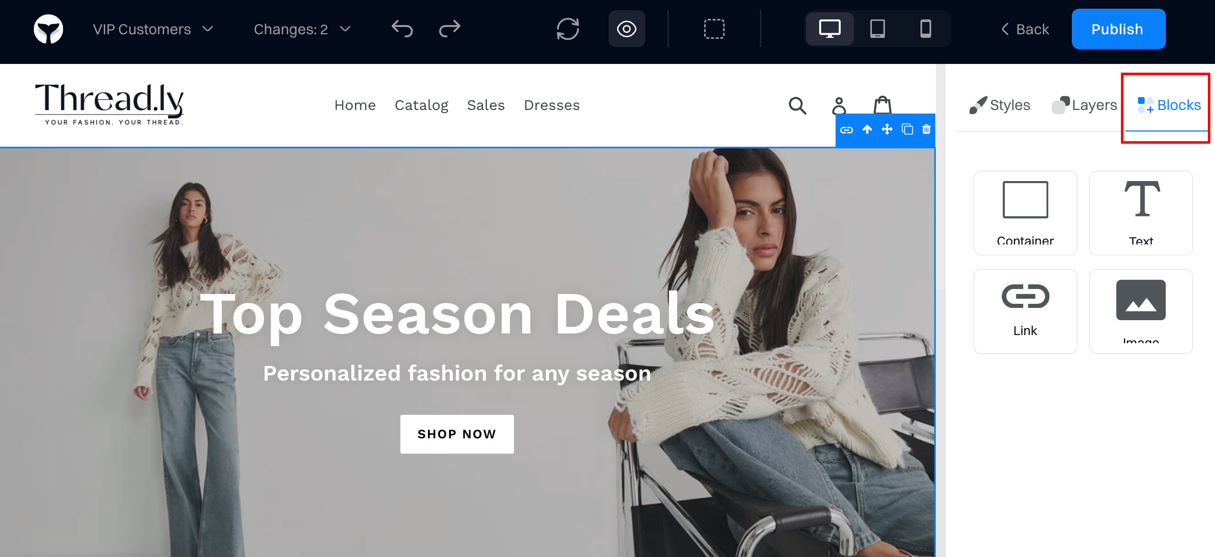
Container. The container element is used to keep your content organized. You can add multiple elements to a container and keep them organized based on a layout specified.
Important to know
Conainer is a div block with predefined styles. You can adjust the max width of a container so it will still respond to the size of your viewport but only extend to the maximum width you set.
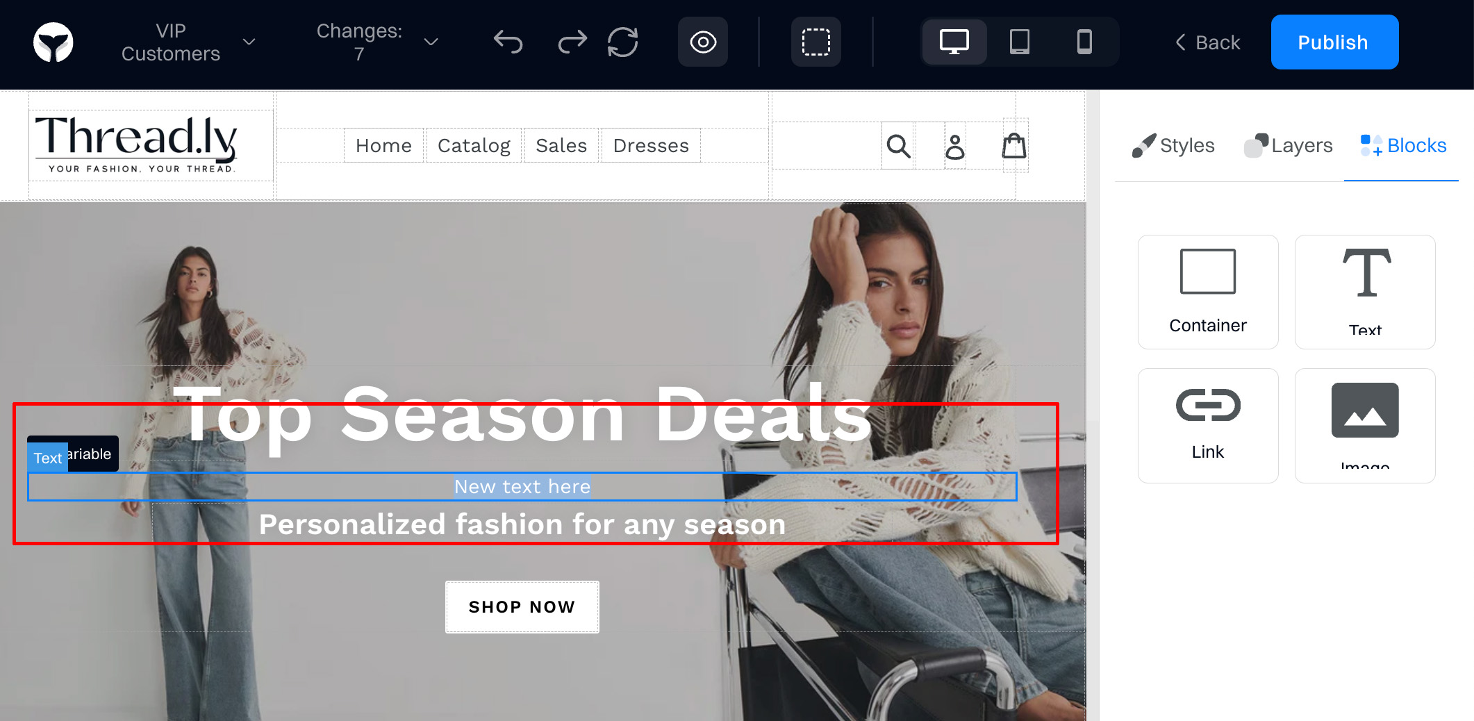
Text. A text block is a generic text element that you can easily edit and format.
To edit the text, double-click the element or select it and press enter. Then, select the placeholder text and replace it with your own content.
Link. Link blocks can turn any element, like an image, or any layout, like a banner, into a link.
To add a Link block to your variant, drag a Link block element onto your page.
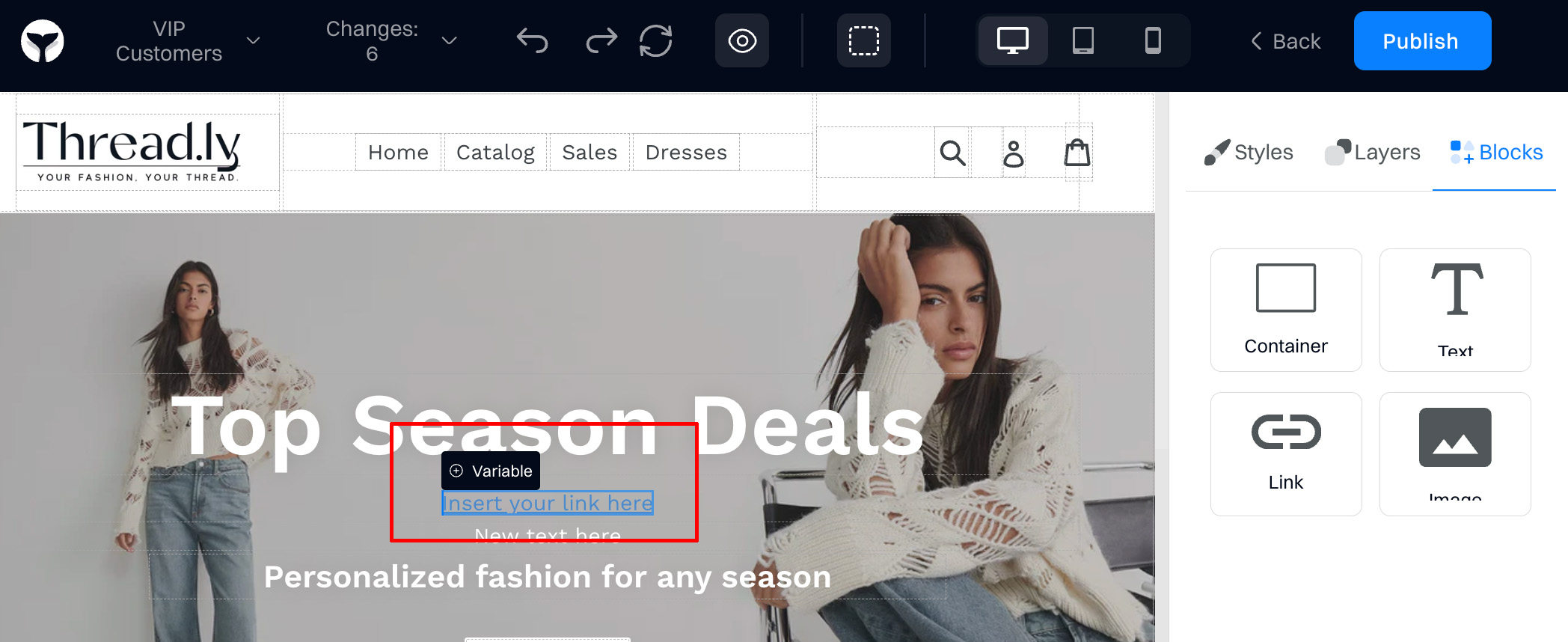
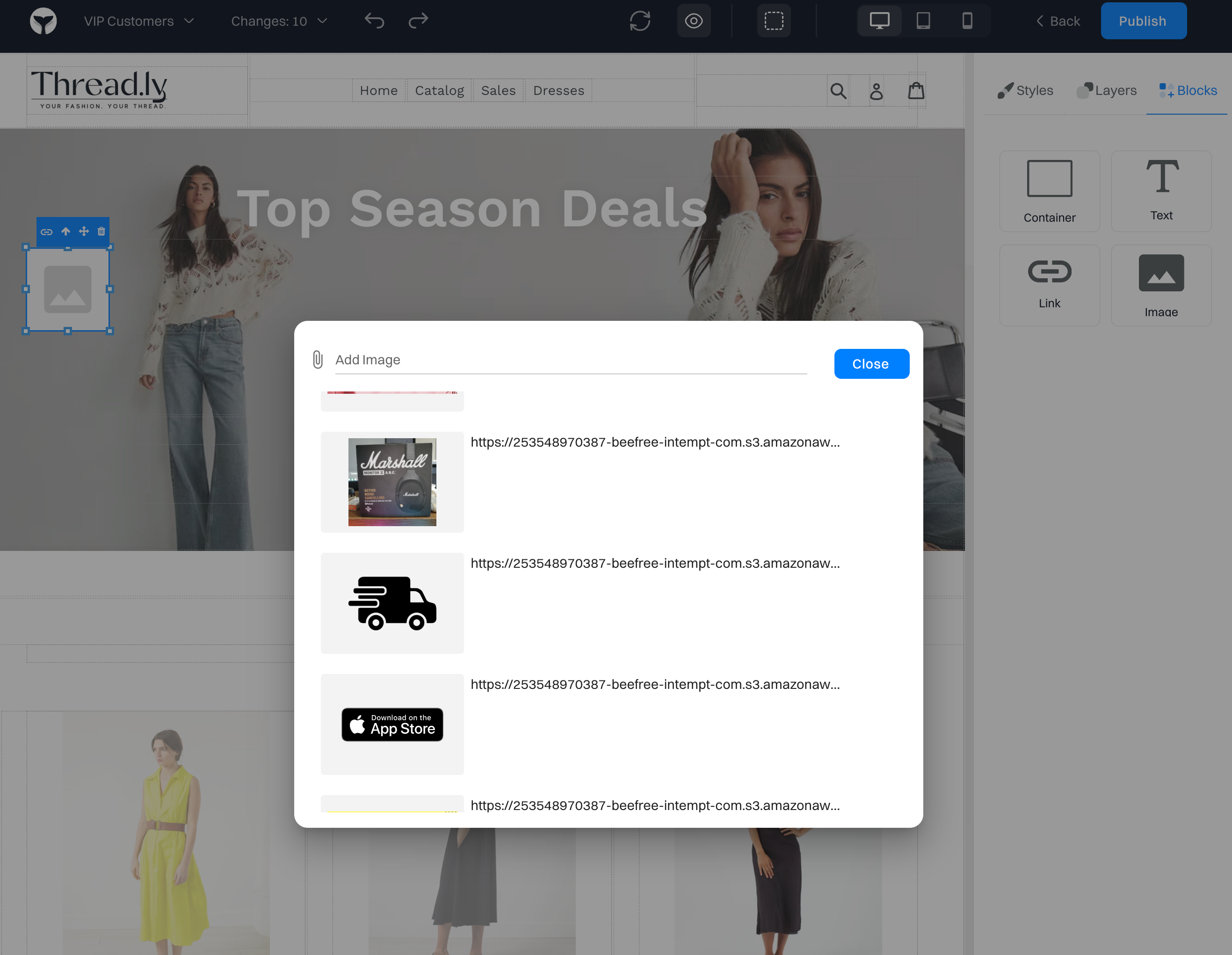
Image. Allows you to upload and display an image for the variant. After you drag the element on the page, double-click on the placeholder to upload or select the image.
Element editing
After selecting a certain element, it can be edited with these changes.
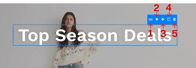
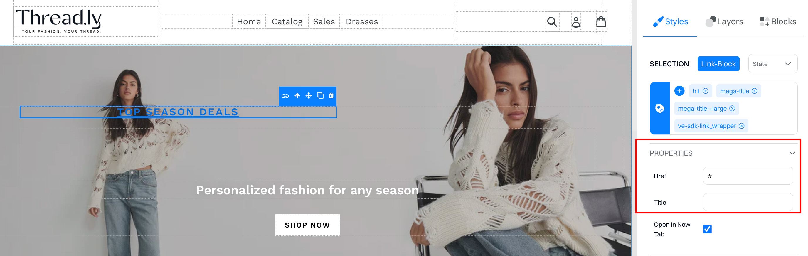
1. Add link
Adds a link to the element. You can change the link href on the right sidebar.
2. Move element up
Moves an element within the DOM tree by one position.
3. Move element
Allows to move elements anywhere within the page. To adjust, drag the element to the desired position.
4. Duplicate
Create a duplicate version for an element. Not accessible for image elements.
5. Delete
Deletes the element from the variant.
Important to know
Deleting an element does not actually remove it from your page. The deletion is only reflected within the experiment, it does not make any changes on your actual website code.
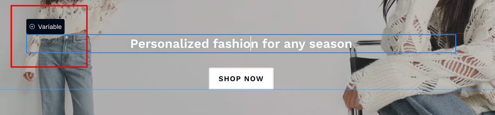
Adding variables
You can add variables (like name, email, etc.) after selecting a text element and clicking the "Add variable" option.
Styles configuration
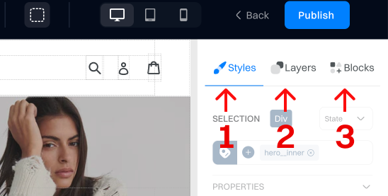
Selection
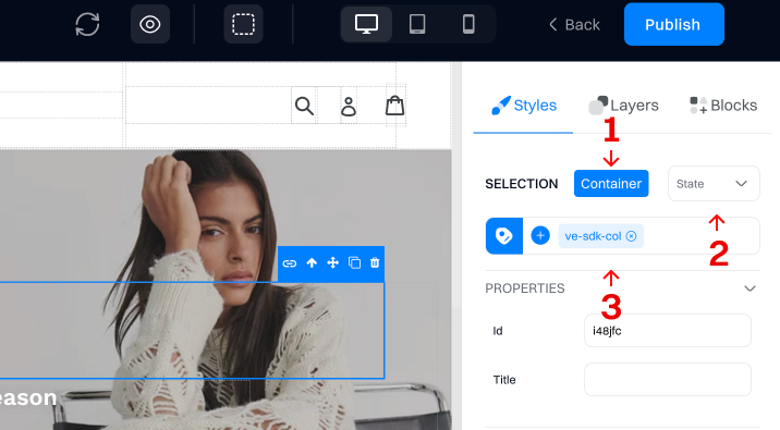
1. Element type
Shows the type of the selected element (like text, container, image etc.)
2. Element state
You can edit elements in different states. Each state will be saved individually within the variant.
- Hover - activated when you hover over the element.
- Active - has been activated by the user and is in the process of being activated or is being activated and has not been deactivated yet. For example, when a link is clicked.
- Focus - activated when the element on a screen is selected.
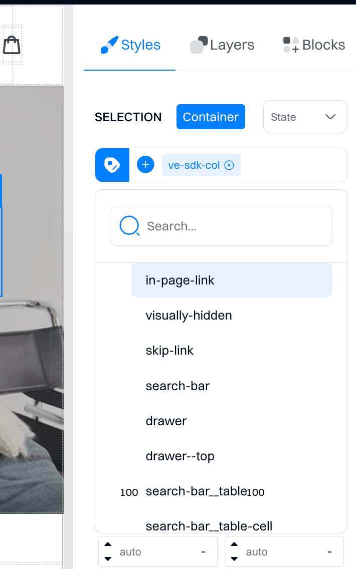
3. CSS selector
This shows the class of the selected element. You can change the class or create a new one by clicking on the class dropdown.
Layout

You can change the layout display based on these options:
- Inline. Elements flow within the text or other inline elements, like integrating a small tag within a paragraph, without starting on a new line.
- Block.Elements start on a new line and stretch out to fill the available width, creating a visible "block" on the page, like paragraphs or divs.
- Contents. It makes an element act as if it's not there, allowing its children to interact with the layout directly, removing the wrapper but keeping the content aligned.
- Flex. Displays elements in a flexible box layout, adjusting how children are laid out in a row or column, perfect for responsive layouts.
- Inline-Block. Combines traits of both inline and block, allowing elements to sit in the same line but also have block-like features, such as setting width and height.
- Inline-Flex. Elements behave like inline elements but have their content laid out using the flex model, useful for aligned items in a row without breaking the line.
- Inline Table. Displays an element as an inline-level table, integrating a small table within a line of text.
- List-Item. Displays elements as a list item, including a bullet point or numbering, organizing content in a structured manner.
- Run-In. Elements either run in as part of the previous block of content or become a block themselves, adapting based on context.
- Table. Mimics the structure of HTML tables, including rows, columns, and cells, ideal for data presentation.
- Table-Caption. Adds a caption to table elements, providing a label or description for the table.
- Table-Column-Group. Groups a set of table-column elements, making it easier to style and manage columns collectively.
- Table-Header-Group. Styles the header section of tables, grouping header rows for collective styling or structural changes.
- Table-Footer-Group. Styles the footer section of tables, allowing for collective styling and structuring of footer rows.
- Table-Row-Group. Groups multiple rows together in a table body, which can be styled or manipulated as a single unit.
- Table-Cell. Styles individual table cells, allowing for precise adjustments and styling of each cell.
- Table-Column. Defines and styles columns in a table, giving control over column presentation.
- Table-Row. It applies to rows in a table, enabling the styling and management of each row individually.
- None. Completely removes an element from the display, making it invisible and not part of the layout.
- Initial. Resets the display value to the default setting for that element, acting as an "undo" button.
- Inherit. Inherits the display setting from the parent element, maintaining a consistent style across elements.
Size
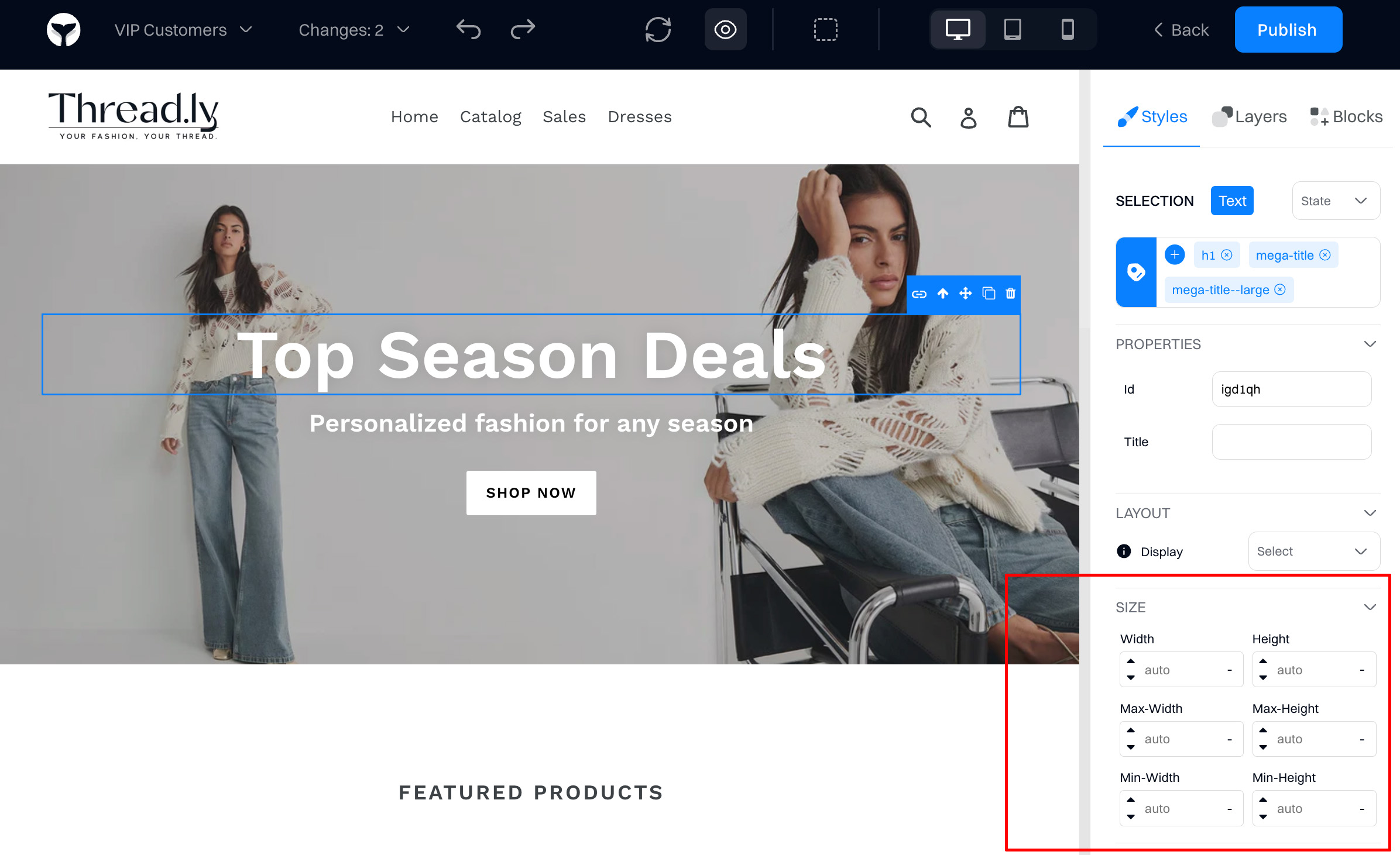
Resizes the element based on these options:
- Width. Sets the width of an element. This can be a specific measurement (like pixels or ems) or a percentage of its containing element, defining how wide the element will be.
- Height. Determines the height of an element. Similar to width, it can be set using various units of measurement or percentages, specifying how tall the element should be.
- Max-width. Establishes the maximum width an element can expand to. This is useful for ensuring that elements don't stretch too wide on larger screens, maintaining design integrity.
- Max-height. Sets the maximum height an element can reach. It prevents elements from becoming too tall, especially in situations where content size varies, ensuring a consistent appearance.
- Min-width. Defines the minimum width an element can shrink to. This ensures that elements do not become too narrow, preserving readability and functionality of the content.
- Min-height. Specifies the minimum height an element can reduce to. It helps in maintaining the element's visibility and ensures that content does not get cut off when there is less content.
Space
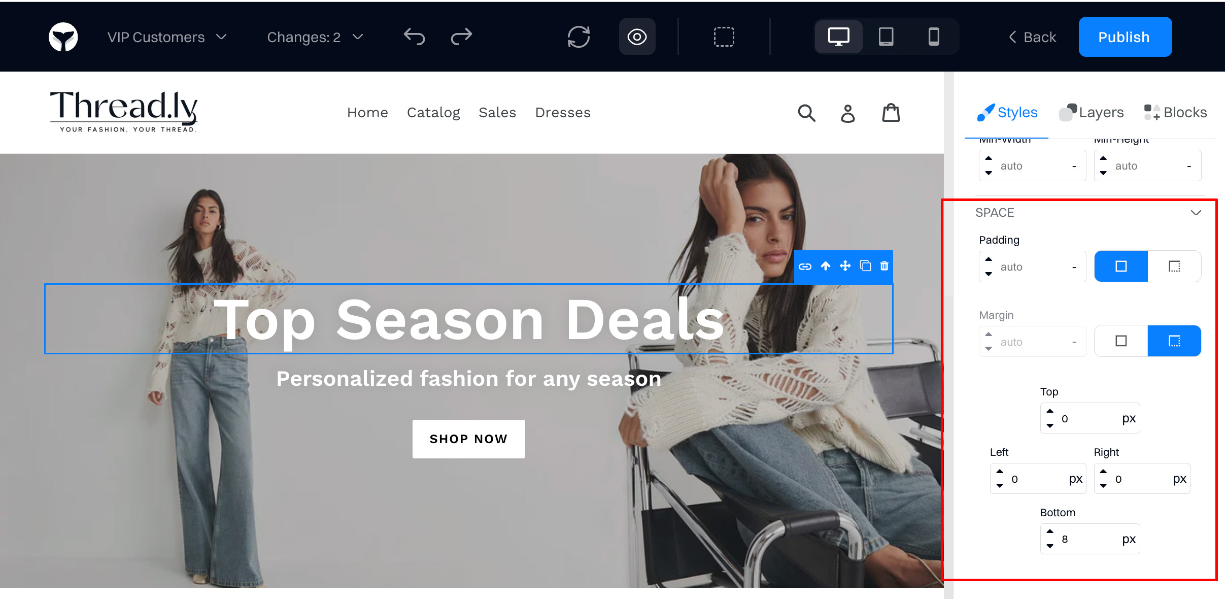
Adjust the space around the element:
-
Padding. Adds space inside an element, between the element's content and its border. It's like giving your content some breathing room inside the box it lives in. Padding increases the element's size since it adds to the overall dimensions of the content inside.
-
Margin. Creates space outside an element, between the element's border and surrounding elements. It's akin to creating a buffer zone around your box, ensuring it doesn't touch other elements directly. Margin does not affect the size of the element itself, but it influences how it's positioned relative to other elements in the layout.
Position
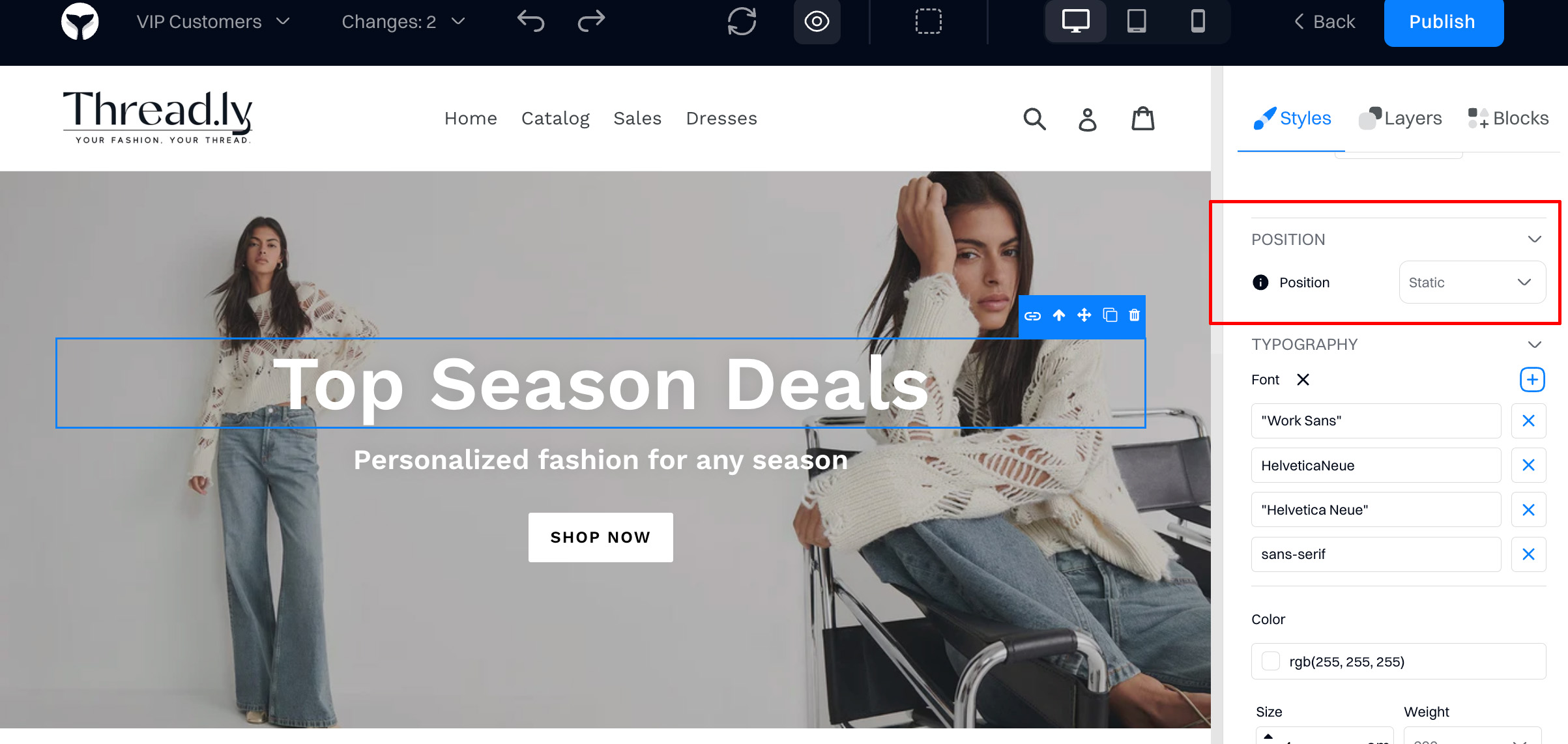
Modify how an element is positioned within the page:
-
Static. The default position for any element. Elements positioned as
staticare laid out in the normal page flow, meaning they don't react totop,right,bottom, orleftproperties. It's like letting the element just go with the flow of the page layout. -
Relative. Positions the element relative to its normal position without changing the layout around it. You can use
top,right,bottom, orleftto move it from where it would normally sit. It's as if you're nudging the element from its original spot, but the space it occupied remains reserved. -
Absolute. Removes the element from the normal page layout, positioning it absolutely in relation to its nearest positioned ancestor (not static). It can then be placed precisely using the
top,right,bottom, orleft. This is like lifting the element out of line and placing it exactly where you want it, without it taking up space. -
Fixed. Similar to
absolute, but the element is positioned relative to the viewport, meaning it stays in the same place even when the page is scrolled. It's great for elements you want to keep in view, like sticky headers or chat buttons. -
Sticky. A hybrid of
relativeandfixedpositioning. The element is treated asrelativeuntil the page is scrolled to a certain point, at which it becomesfixed, sticking in place as the user continues to scroll. It's useful for elements that you want to scroll away but then stay in place, like a sticky navbar.
Typography
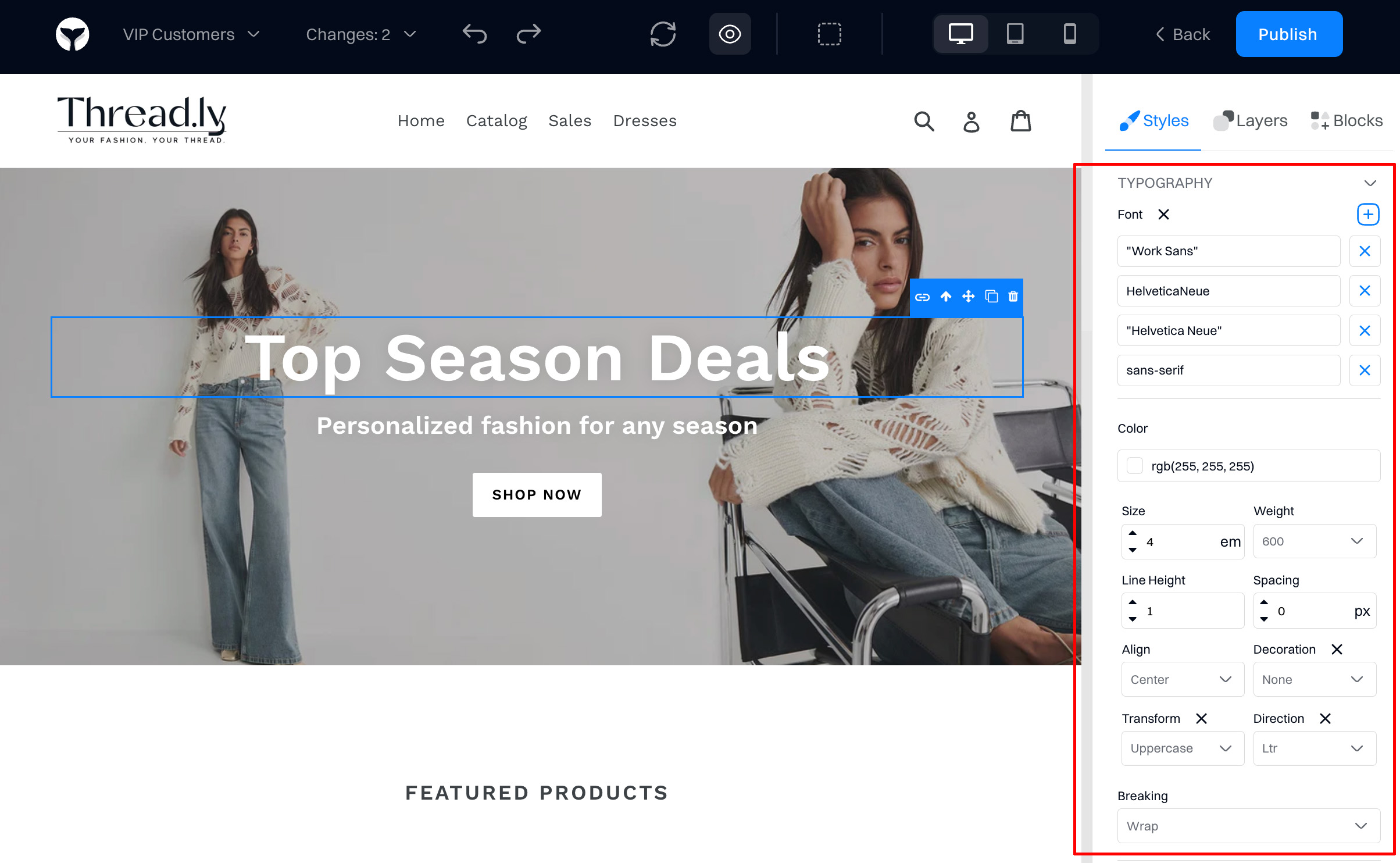
Adjust how text is displayed:
-
Font. Specifies the typeface used for text.
-
Color. Defines the color of your text. The right color can enhance readability, draw attention, or fit perfectly with your overall design palette, affecting how users perceive and interact with your content.
-
Size. Determines the size of your text. Larger sizes draw attention and are used for headings, while smaller sizes are typically used for body text. The size can affect how easily your content can be read and understood.
-
Weight. Controls the thickness of your text, from thin to bold. Weight can emphasize certain parts of your content or create a hierarchy of information, making your text more dynamic and engaging.
-
Line Height. Adjusts the space between lines of text. Proper line height improves readability by ensuring that text is neither too cramped nor too spread out, making content more comfortable to read.
-
Spacing. Refers to the space between characters (tracking) or the space between words. Adjusting spacing can make text more legible and aesthetically pleasing, especially in headlines or with certain fonts.
-
Align. Sets the alignment of your text, such as left, right, center, or justified. Alignment affects the readability and visual layout of your text, guiding the reader's eye through the content in a structured way.
-
Decoration. Adds stylistic features to your text, such as underlines, overlines, line-throughs, or no decoration. Decorations can highlight or distinguish specific parts of your text, like links or important terms.
-
Transform. Alters the case of your text, including uppercase, lowercase, or capitalized options. Transform can be used for stylistic effects or to denote specific sections of content, like headers or buttons.
-
Direction. Specifies the text direction, which can be left-to-right (LTR) or right-to-left (RTL). This is particularly important for languages that read differently, ensuring content is accessible and correctly oriented for all readers.
-
Breaking. Controls how text breaks across lines or at page breaks. Options like keeping words whole, allowing breaks within words, or preventing breaks altogether can influence the flow and readability of your text, especially in narrow containers or with long words.
Background
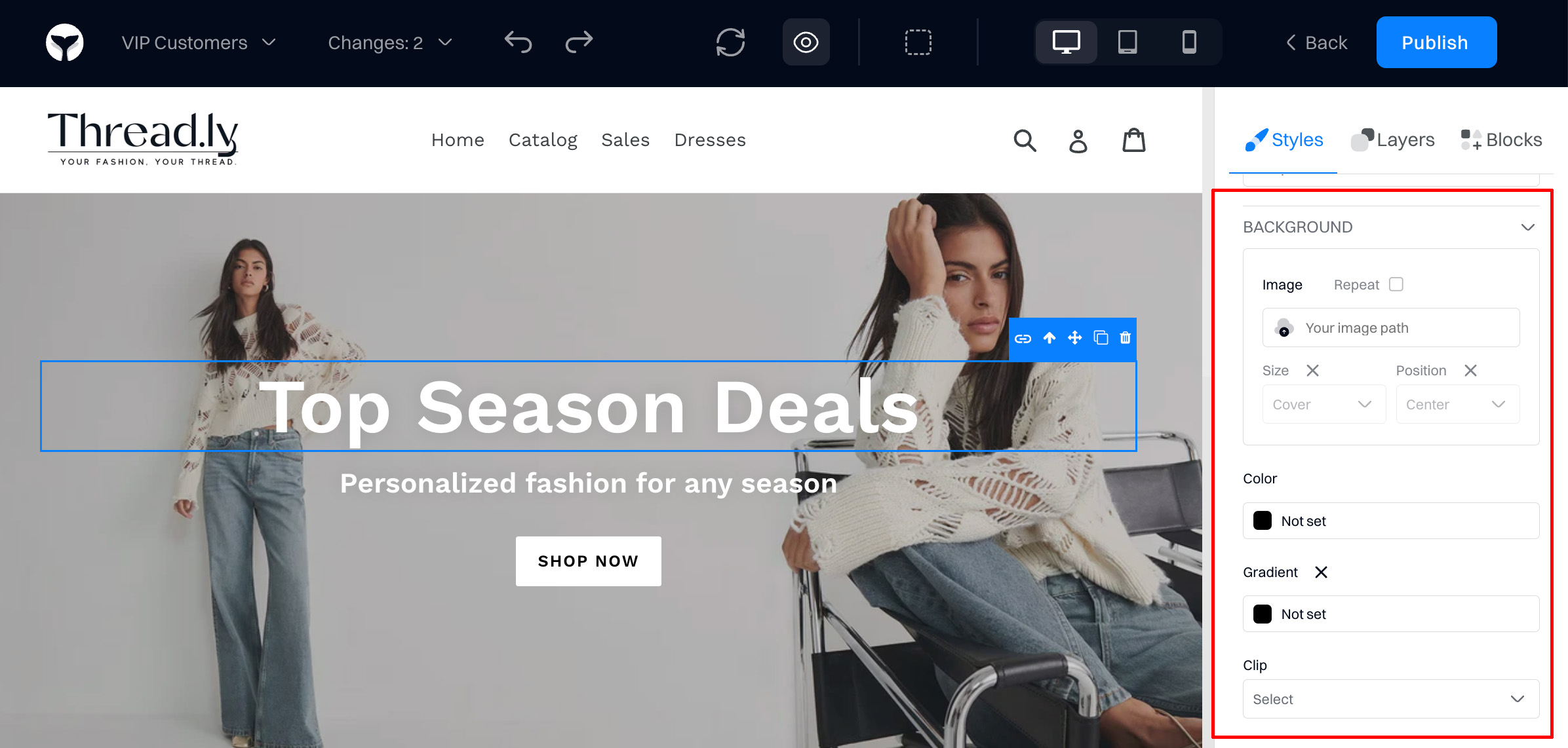
Each element can have an individual background defined:
-
Image. Sets an image as the background of an element.
-
Repeat. Controls whether and how the background image repeats.
-
Size. Adjusts the size of the background image. Whether you want the image to cover the entire background, fit within the space while maintaining its aspect ratio, or set it to a specific size, this property gives you control.
-
Position. Specifies the starting position of the background image. You can finely tune the placement of your background image, ensuring it perfectly aligns with your content for the desired visual impact.
-
Color. Sets the background color of an element.
-
Gradient. Creates a gradual blend between multiple colors as the background. Gradients can add depth, vibrant visuals, and a modern feel to your backgrounds, offering a dynamic alternative to solid colors.
-
Clip. Defines how far the background (color or image) extends within an element. You can have it fill the entire element, or just the content or padding areas, allowing for creative background styling tricks.
Borders
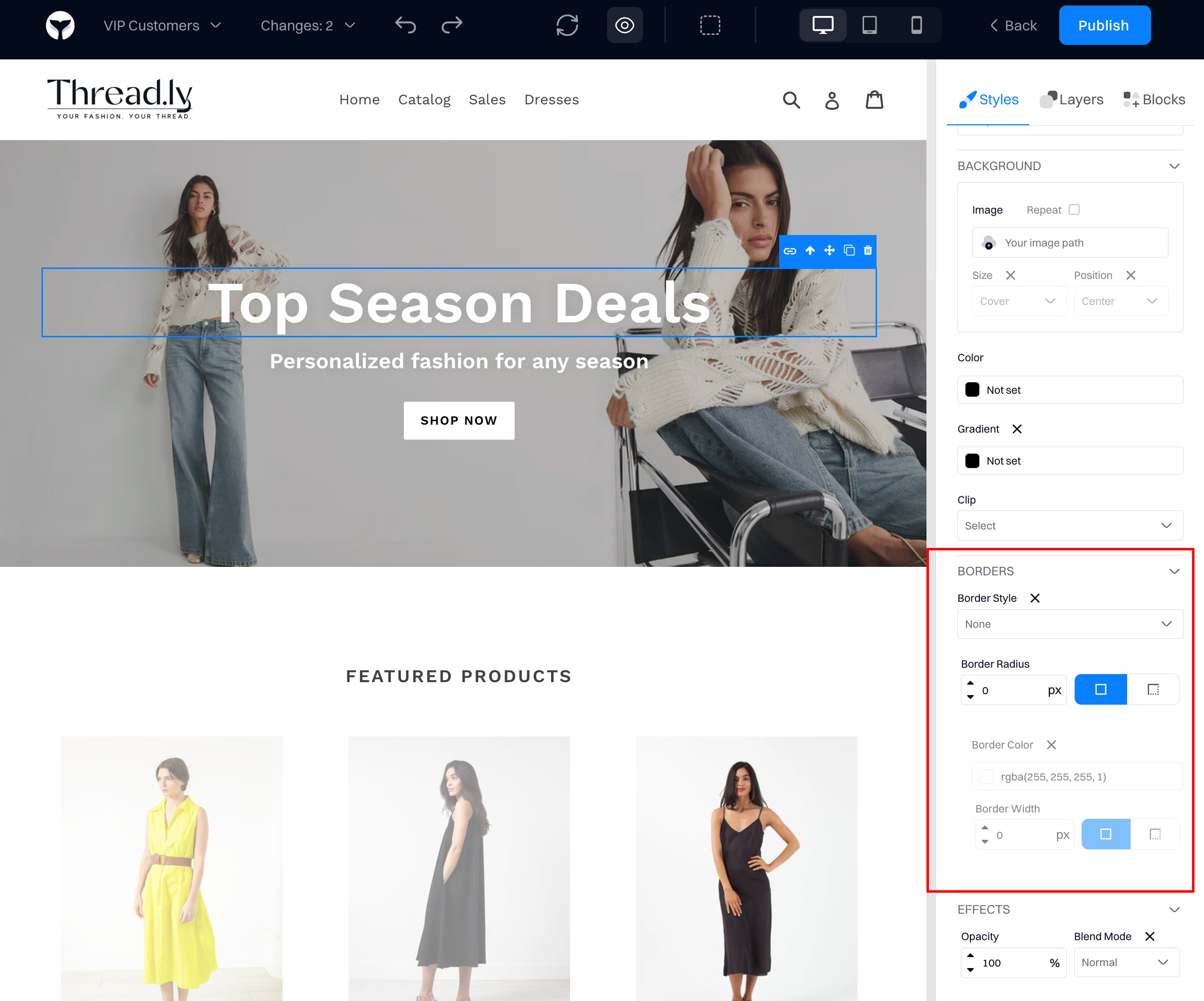
Change how element borders are displayed:
-
Border Style. Dictates the appearance of the border surrounding an element. Styles can range from solid, dashed, and dotted to double, groove, ridge, inset, and outset, providing a wide range of visual effects that outline or frame your element.
-
Border Radius. Determines the curvature of the border's corners. A higher value creates more rounded corners, allowing for circular shapes or softly rounded edges. This property can soften the overall look of an element and is key in designing modern, friendly user interfaces.
-
Border Color. Specifies the color of the border. By selecting the appropriate color, you can make the border subtle or striking, matching or contrasting with the element's background or the page's color scheme, enhancing the visual hierarchy and design coherence.
-
Border Width. Sets the thickness of the border. It can be uniform around the entire element or varied across different sides, controlling how pronounced the border appears. Thicker borders make a bold statement, while thinner borders are more subtle and refined.
Effects
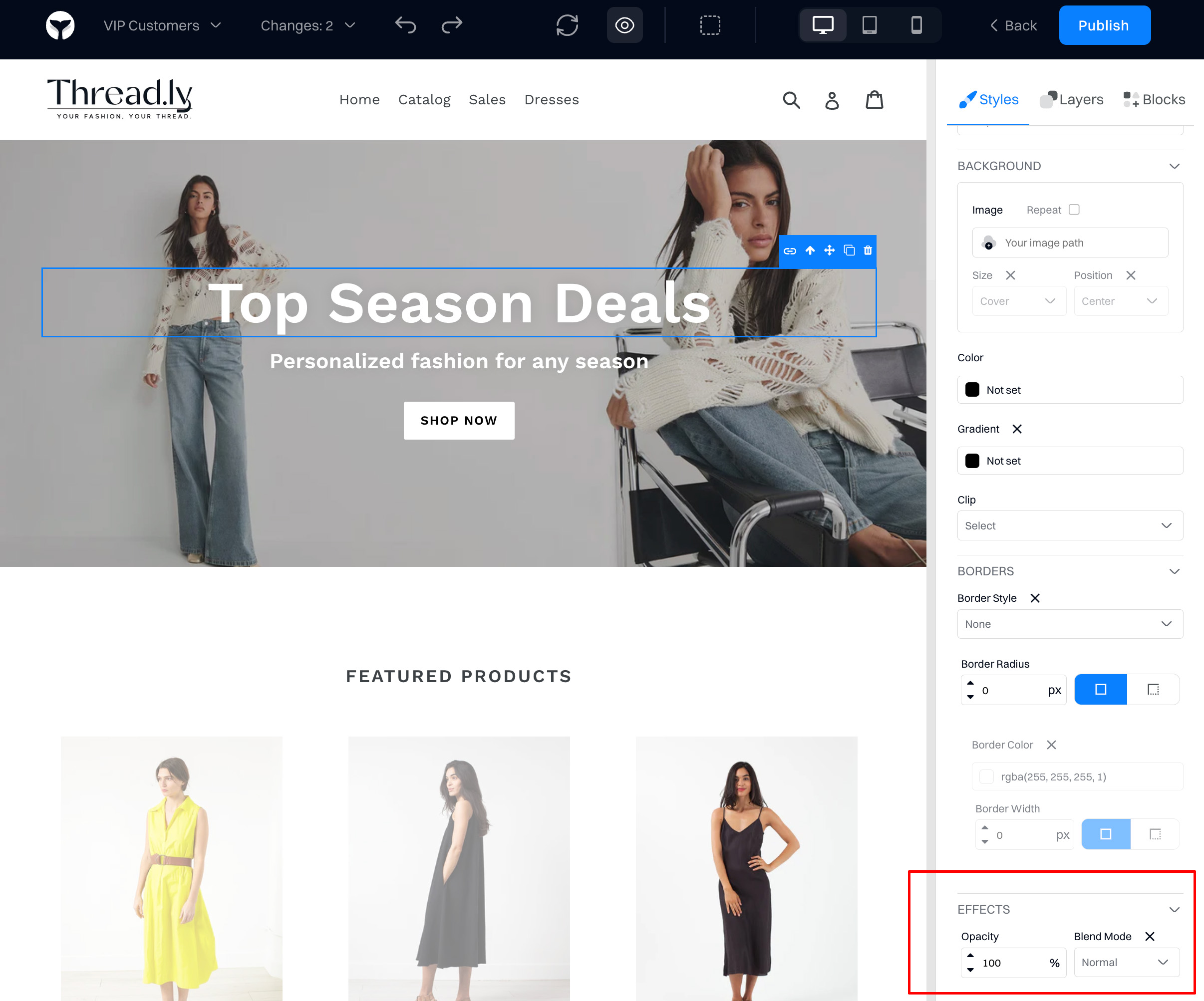
Advanced changes that you can apply to an element:
-
Opacity. Adjusts the transparency of an element, including its content. A lower opacity means the element is more transparent, allowing elements behind it to show through. This property is great for creating overlay effects, dimming content to draw attention elsewhere, or designing sleek, modern interfaces where layers and depth play a key role.
-
Blend Mode. Determines how an element's colors blend with the background or other elements beneath it. Different blend modes can create various visual effects, such as darkening, lightening, or adding complex color interactions. This is particularly useful in creative web design for achieving striking visual impacts, image treatments, or dynamic text effects against diverse backgrounds.
Updated 1 day ago