
Experiment analytics
Results
You can view your experiment performance via the “Results tab.”
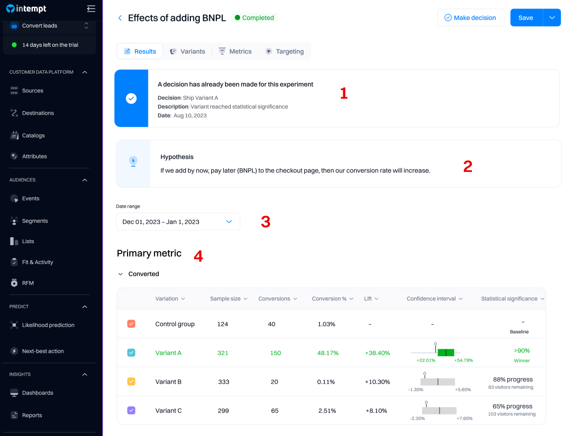
1. Decision
Making a decision for an experiment enables you to 'ship' the winning group to all your users. After you decide, the result will be accessible in the "Results" tab.
Good to know
The results of your experiment will still be accessible after you decide, but they will stop updating - the last day of metrics will be the day you "make a decision" on the experiment.
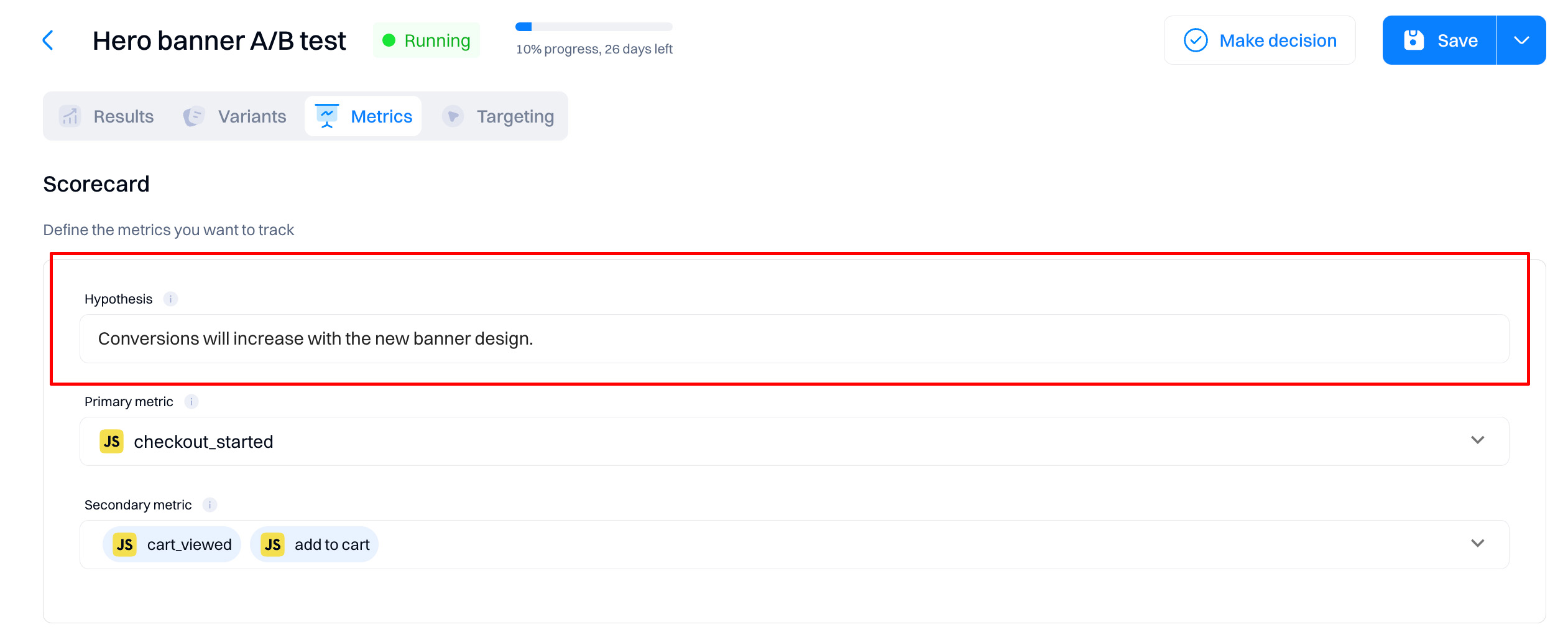
2. Hypothesis
The hypothesis you specified when creating the experiment will be listed under the "Results" page. You can change the hypothesis on the "Metrics" tab.
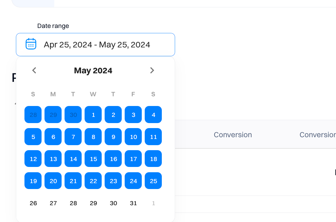
3. Date range
Use the Date range drop-down to select start and end dates for your results page view. The results generated are in your project's time zone.
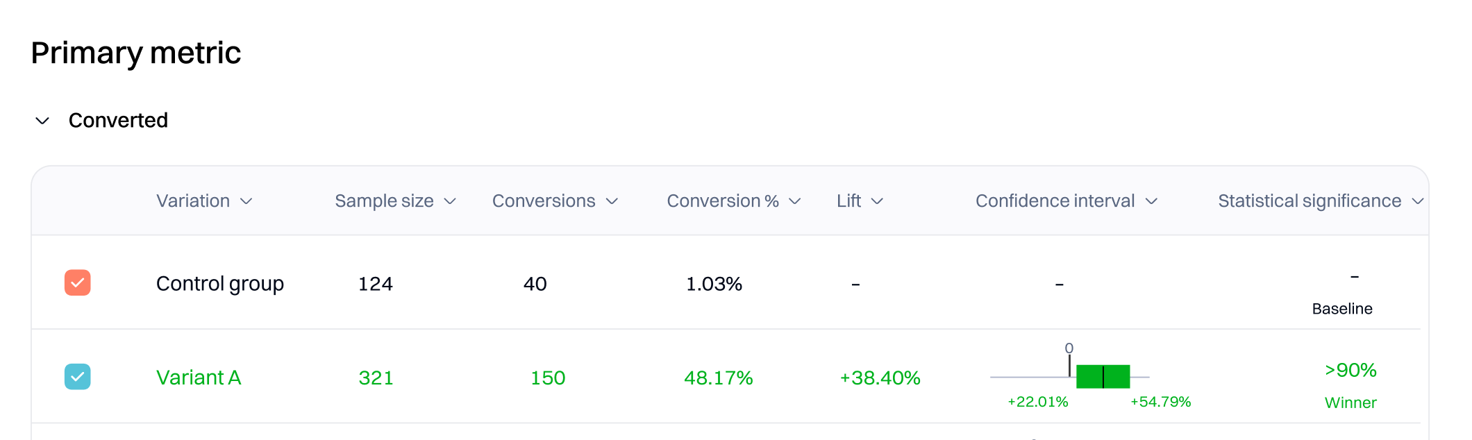
4. Metrics
Depending on how many experiences you have created within the personalization, each will be listed based on the individual metrics selected.
-
Variation. Refers to a version of a webpage or app feature that is different from the original (control) version.
-
Control group. Represents the group of users not receiving the variants with modifications.
-
Sample size. The total number of unique users that viewed the variant or control group. It's a critical factor in determining the experiment's validity for a few key reasons:
-
Conversions. Specifies the number of users that triggered the event metric. Conversions show deduplicated data, so a single visitor who triggers the same event (metric) multiple times is counted once.
-
Conversion %. The conversion rate is the percentage of unique visitors who triggered the event metric in the variation.
-
Conversion value is only displayed if the conversion event of the metric is “
-
Value of an event property”. This refers to an actual value of a metric instead of the event trigger, e.g., "Purchase amount - 110.99" (only visible when this type of event is selected as a primary/secondary metric)
-
Lift. Intempt displays the relative improvement in conversion rate for the variation over the baseline as a percentage for most experiments. For example, if the baseline conversion rate is 5% and the variation conversion rate is 10%, the improvement for that variation is 100%.
-
Confidence interval. The confidence interval measures uncertainty around improvement. Intempt Statistics Engine provides a range of values for the conversion rate for a particular experience. The interval starts wide, and as the Statistics Engine collects more data, it narrows it down to show that certainty increases. When a variation reaches statistical significance, the confidence interval lies above or below 0. Read more about it Understanding confidence interval.
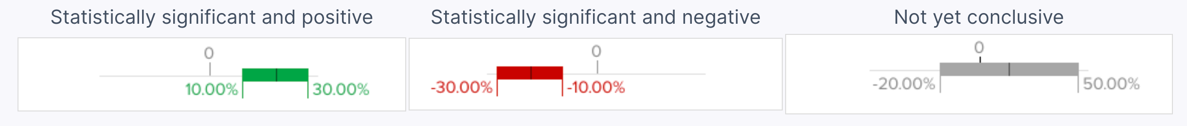
- Statistical significance. It shows the statistical likelihood that the improvement is due to changes you made on the page, not chance. Until the Statistics Engine has enough data to declare statistical significance, the results page states that more visitors are needed and shows an estimated wait time based on the current conversion rate. Read more about it in Sequential testing
Good to know
Intempt uses CUPED to decrease the variance of experiment uplift, increasing the accuracy of your experimental results. Read more about it CUPED
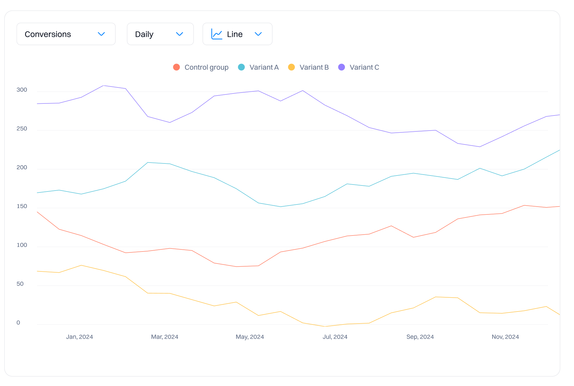
Data graph
The graph allows you to visualize the data collected by your experiment.
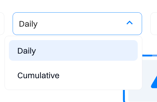
Aggregations
You can view the results in the chart based on different aggregations:
- Daily - all results will be displayed on a day-to-day basis. This means you will see time-series data, such as the conversion rate for a specific day within a timeframe.
- Cumulative- all results will be summed and incremental. For example, if on day 1 you had 1000 sample size (unique views) and on day 2 it was 2000, on day 3 you will already see 3000 unique users—this is a cumulative result.
Good to know
For experiments, we recommend using cumulative agreggation as its more useful in correctly interpretting the data to make the decision on the winning variation.
1. Stability over time
- Overview. Smooths out daily variations and anomalies, such as day-of-week effects or one-time events.
- Impact. Provides a more stable and reliable measure of the true effects of the tested variations.
2. Trend analysis
- Overview. Allows observation of trends over the testing period, which is valuable for long-term experiments.
- Impact. Helps understand how performance changes as more data is collected, aiding in detecting shifts in user behavior.
3. Reduction of noise
- Overview. Aggregating results cumulatively reduces noise, enhancing the sensitivity of statistical tests.
- Impact. Crucial for accurately detecting true differences between variations beyond random fluctuations.
4. Confidence in results
- Overview. Cumulative data leads to narrower confidence intervals as more data accumulates.
- Impact. Provides more precise estimates, increasing confidence in the statistical significance of the results.
5. Handling non-stationarity
- Overview. Helps identify and adjust to changes in user behavior due to external factors like seasonal changes or market trends.
- Impact. Ensures the results remain relevant and reflective of current conditions.
Graph view
When reviewing an experiment graph or chart in A/B testing, you can select various metrics such as Conversion, Conversion %, Lift, and Sample Size. These can be visualized daily or cumulative, providing different insights into the performance of your experiment. Here’s what each metric represents:
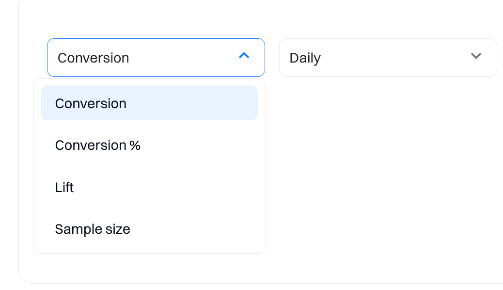
1. Conversion
- Daily. Displays the number of daily conversions for each variation, offering a day-by-day activity view.
- Cumulative. Shows the total accumulated conversions from the start of the experiment, illustrating a rising curve as more data is collected.
2. Conversion %
- Daily. Indicates the daily conversion rate as a percentage of the total users participating in the experiment that day.
- Cumulative. Presents the overall conversion rate over time, calculated as total conversions divided by the total number of participants up to each day.
3. Lift
- Daily. The daily performance comparison of the test variation against the control group is expressed as a percentage.
- Cumulative. Accumulates lift data throughout the test, showing the overall effectiveness of the variation compared to the control.
4. Sample size
- Daily. Reports the number of users or sessions counted each day for each variation, highlighting distribution across the testing period.
- Cumulative. Depicts the running total of all participants in the experiment, ensuring that the sample size is on track for statistical reliability.
Example graph interpretations:
- Conversion graphs. Daily views might show variability with spikes on specific days, possibly due to weekly trends or special events.
- Cumulative conversion % graphs. Typically smoother, these graphs provide a clearer picture of trend lines over the entire experiment period.
- Lift charts. These can pinpoint periods where the test variation outperforms or underperforms significantly compared to the control.
- Sample size graphs. Essential for monitoring the adequacy of data collection and distribution of experiment participants over time.
Troubleshooting
Before starting your first client-side experiment, please ensure you follow these recommendations so the content is rendered properly:
- Don't change the same element or section on your website in multiple experiments. This can create content rendering conflict that will cause unreliable A/B test results.
Updated 1 day ago